
My thoughts on General Sans
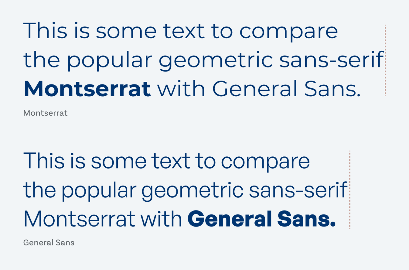
You know that there are tons of geometric soulless sans-serifs out there – looking at you, Roboto. But I feel that General Sans by the Norwegian type designer Frode Helland is different. Comparing it to beautiful, and overused Montserrat, which is geometric too, you see what I mean. General Sans is rather compact, more rational, and stricter. It saves on space without looking too condensed. Also notice, that ascenders rise up to the exact height of the tops of the capital letters, which makes an orderly impression and is also beneficial for compact line-heights. I see all this this as an advantage for mobile and app design, where space comes at a premium (with one caveat, see below).
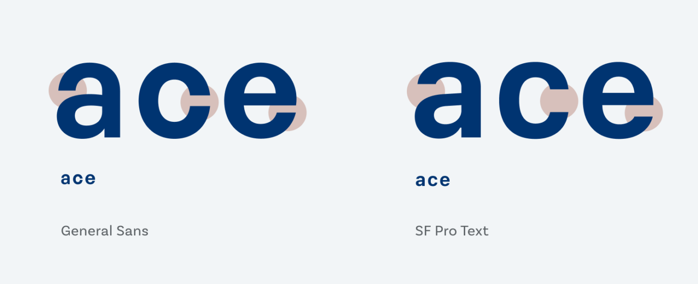
General Sans is a good choice for display, and long reading text, if you have a project that benefits from its vibe. What I like about that typeface is, that besides looking so orderly, it still comes with its quirks. Like the top bow of the lower case a that bends a long way down and almost meet the bowl. Or that the G is almost closed and has no spur. Which brings me to these extremely closed apertures – the caveat. They can be problematic in text set in smaller sizes (like 12 px and below), for example in a user interface. Letter shapes become unclear and are easier to mix up. So bear that in mind, when you choose it.
Recommended Font Pairing
Because General Sans is hard to use for functional text, I recommend using another geometric font like Atkinson Hyperlegible for it.

- Headings
- Copy


Learn more about pairing typefaces using the Font Matrix.
What do you think? Is General Sans something for an upcoming project? Tell me in the comments below!
I think that General got a wrong name. Compact is more appropriate. Monserrat is the font I hate and I don’t usually or at all hate anything. I’m about the discipline and order, but also a creative play. So Compact, pardon, General Sans is a good mix with rounded lines while set in an organized system.
And just before your second paragraph, I thought that little c will look like a circle in the smaller sizes. So not an ideal for the UI.
Oliver, my eyes are tired of Sans. I admire your mastery for seeing all the differences between!
😂 I guess we are all a little tired of the sans-serifs. But there are interesting details in each and typography is all about the details added up, right? But serifs will follow 😉!
Hi Oliver,
I just want to thank you for your knowledgeable, enjoyable type reviews.
Thank you, Joaquin, for your kind words 😊! I’m glad you enjoy them!
Guten Tag, Oliver!
Every Friday morning a nice surprise, thank you very much!
Although, in this case…
Like Jana, above, I do not like Montserrat; for me it is too wide and too ‘open’ while, on the other hand, the capital M and G look cramped. What I do like about it is that it uses circles for round shapes. General Sans doesn’t and for me that’s a disadvantage. And I do not like the small open spaces you write about, in particular also not of the lowercase g.
However, dependent on the application, General Sans has a more serious disadvantage: it does not support tabular numbers.
Triggered by ‘Mr. Typewolf’, Jeromiah Shoaf, I have this week been looking into the font Outfit (https://github.com/Outfitio/Outfit-Fonts), which seems to be a really nice alternative, but which has another serious drawback: there is no italic version…
Guten Abend, Henk 😉!
Thanks for sharing your thoughts and for pointing me to Outfit! What a nice blend of Kabel, Josefin Sans, and Futura. A great suggestion for an upcoming Font Friday.
I love how you point out what you’re missing in these fonts, because this shows you always have to think about your application and what needs are. I rarely need tabular figures for a blog design, but for UI design I mostly do. The opposite goes with italics. I need them for long reading text, but for a UI I might just skip them.
Off subject, but just to let you know I enjoyed the live you did this past week. It cracked me up how you tried to do each critique in 2+ minutes but didn’t always make it. I liked that you just plowed on with a great sense of humor. Keep it coming with your expert advice and wonderful humor!
Oh, Connie, this is so kind of you! So glad you enjoyed it as well 🤩!
Can I get the name of the font that you used for the subeadings in this page? like the “Leave a Reply”
Thanks!
Sure, Joan! It’s Magnet. I also use a crazier version for the big headings on this site.
Thank you so much, Oliver.
What are some potential use cases where General Sans might outperform other geometric sans-serifs?
In my opinion, for some tight headings in web or app design. Also branding projects. Especially the bold weights stand out wonderfully.