
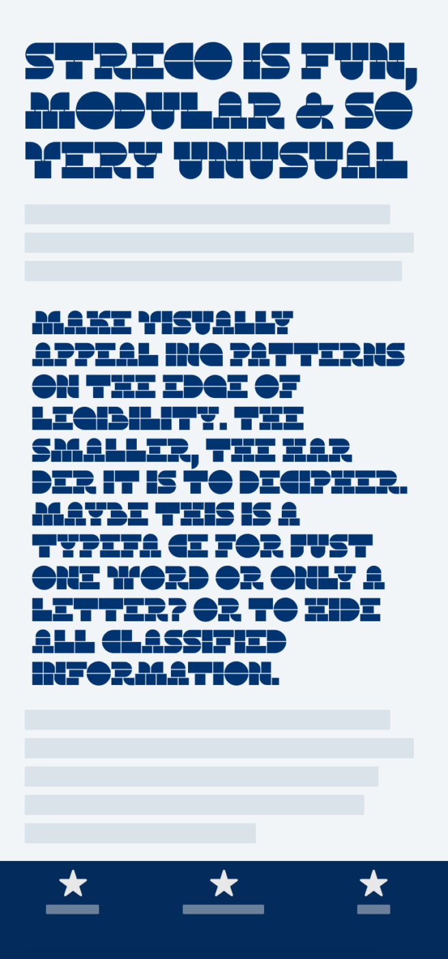
My thoughts on Streco
The display typeface Streco designed by Sophia Tai, explores the brink of legibility with this modular, geometric design. So this is the exact opposite of last week’s feature, which was all about ideal character recognition 😅. Streco is a typeface in progress, available on Future Fonts, in Superfat and Superfat Stencil, with more styles planned. But from what is there already, I was very much intrigued.
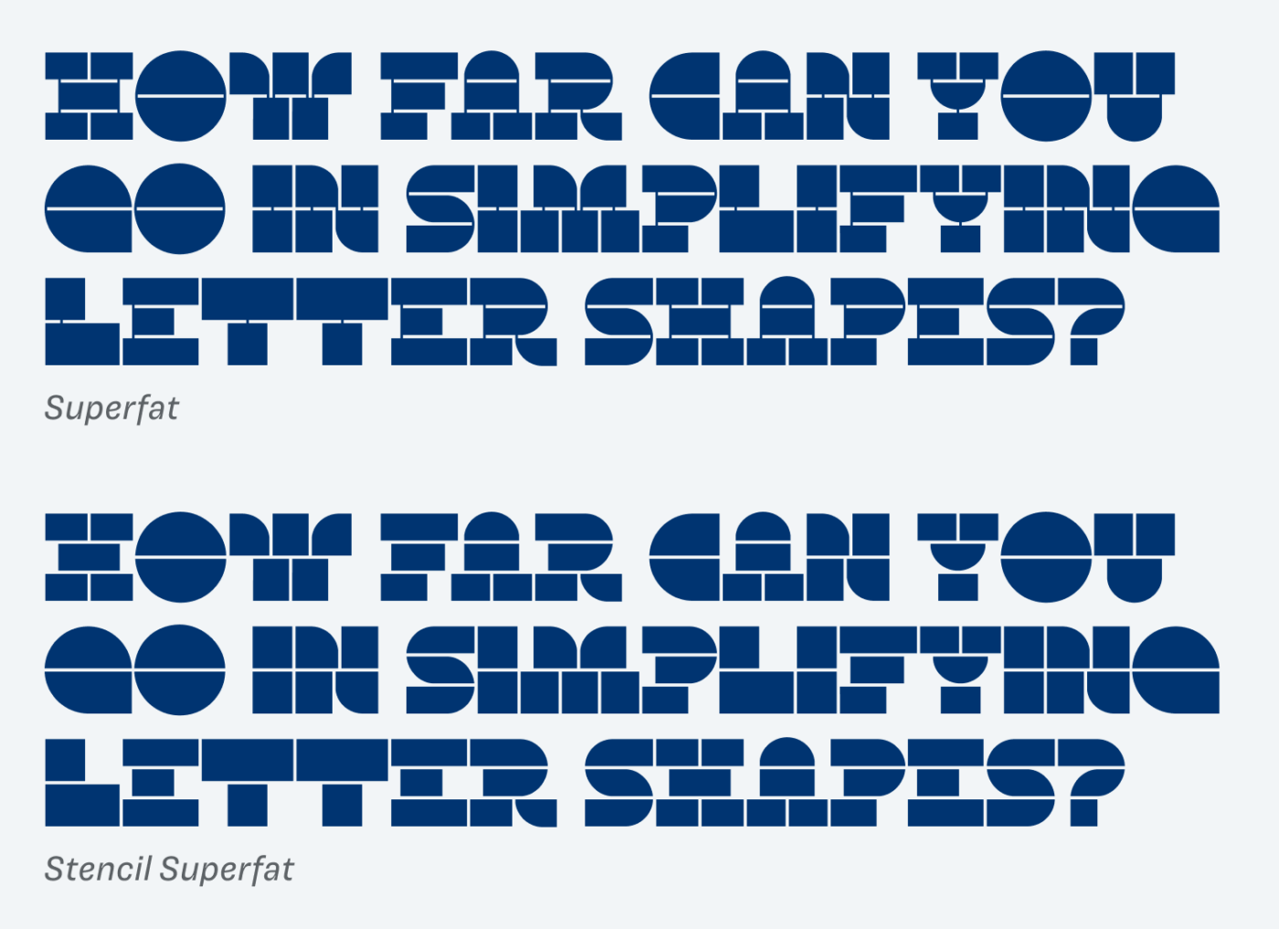
I find it fascinating that you can still recognize characters, even if they are that simplified (like that g-nious G). The challenge that comes with that, is the risk of creating a typeface that looks too blunt or boring. Not with this one. Streco Superfat keeps a certain elegance with the extremely contrasting vertical strokes, reminding me of an overexaggerated slab serif at times. Also, the soft curves contribute to a more sophisticated look.
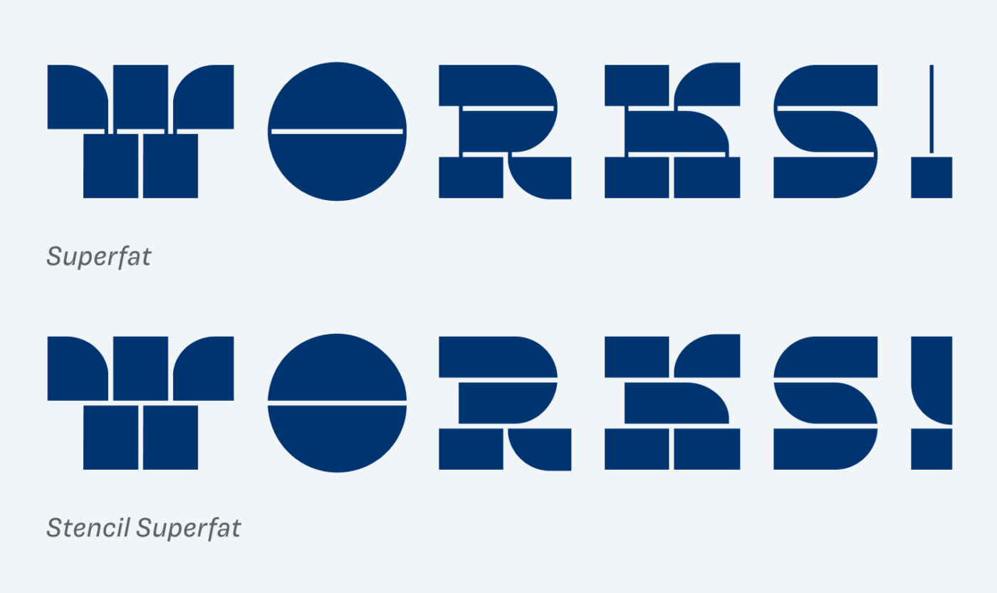
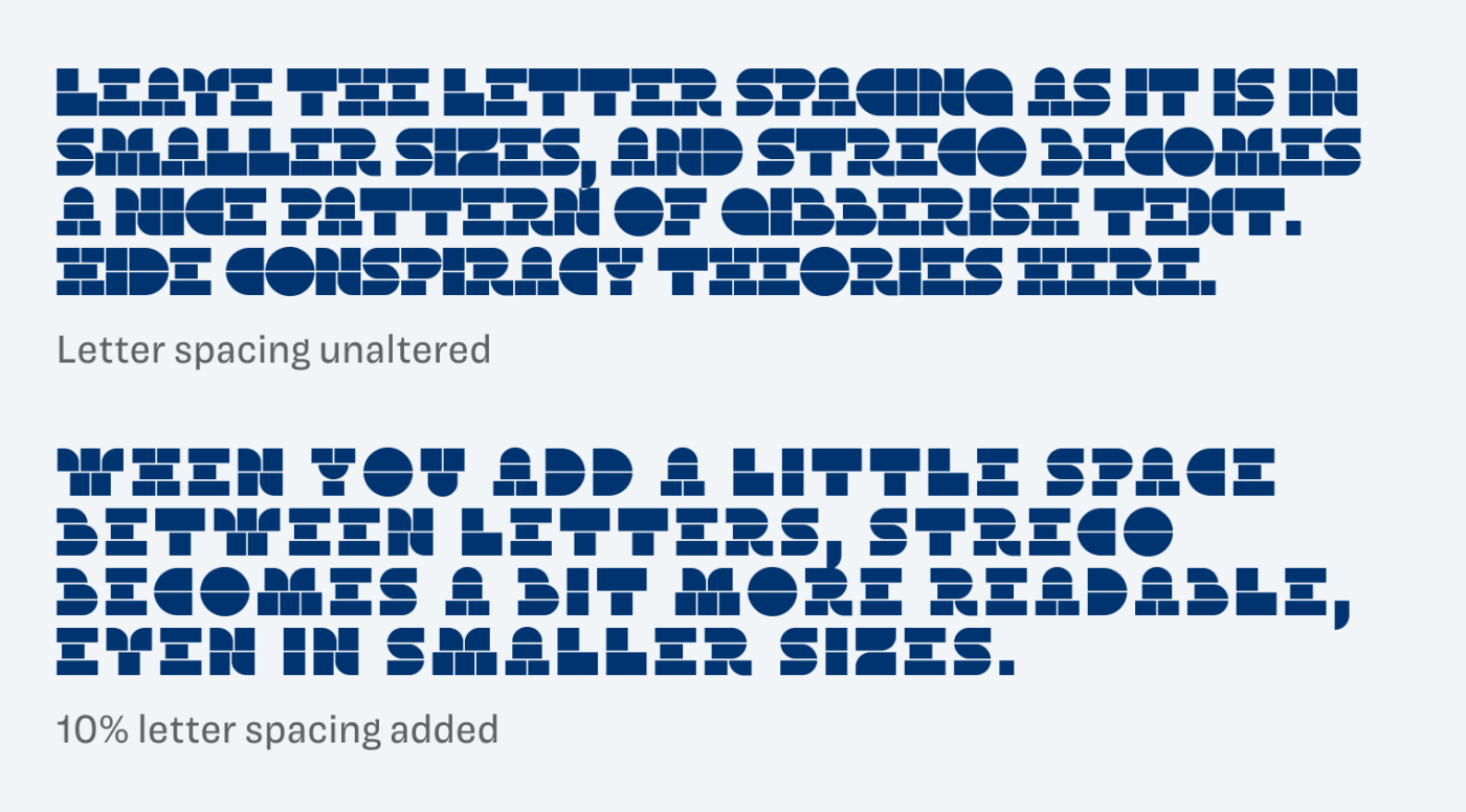
Even though the vertical strokes are almost nothing, removing them changes the impression. The stencil style immediately feels simpler, like stacked building blocks. And it definitely is better suited for smaller sizes. Speaking of smaller – in Streco’s case, very small is already everything around 30 to 40 px. Because it is so dense, it turns more into a pattern of shapes, when you set more text with it.
I imagine Streco being used in short big titles, a graphical poster, or an attention grabbing drop cap. But also in small sizes in a graphical background pattern that reveals some secret text on the second sight? Overall it is such a cool concept, and I’m looking forward to seeing it being extended with additional characters and weights.
Font Pairings with Streco
Streco is hard to categorize, but I’d say it’s a wild geometric display typeface. Pair it with one of my suggestions below for body text and UI text.

- Headings


Learn more about pairing typefaces using the Font Matrix.
What do you think of this week’s typeface? Let me know in the comments, and share it with me when you used it in a project!
There is nothing sophisticated about superfat😆 You’re becoming surprising Oliver! I can’t even recognize E, and W is annoying. R and K are rebuses, a masterpiece itself! Yes, my first thought was S? match is a super design itself. You can take just one letter and go with it in graphics.
For me, it’s totally illegible. But it’s great for pattern design. The style is the cowboy.🤠
Haha, surprises over surprises and challenging comfort zones here 😅.