
My thoughts on Charter
I want to start a new year of Font Friday recommendations by honoring a typeface that is not the new hot shit. It actually is pretty old for digital typefaces, but one of my absolute favorites. The slab serif Charter was designed in 1987 by Matthew Cater for the Bitstream foundry. If you don’t know Sir Matthew Carter, you definitely should get familiar with him! This man is a legend, and also the one behind super popular Verdana, Georgia, Tahoma, and many more.
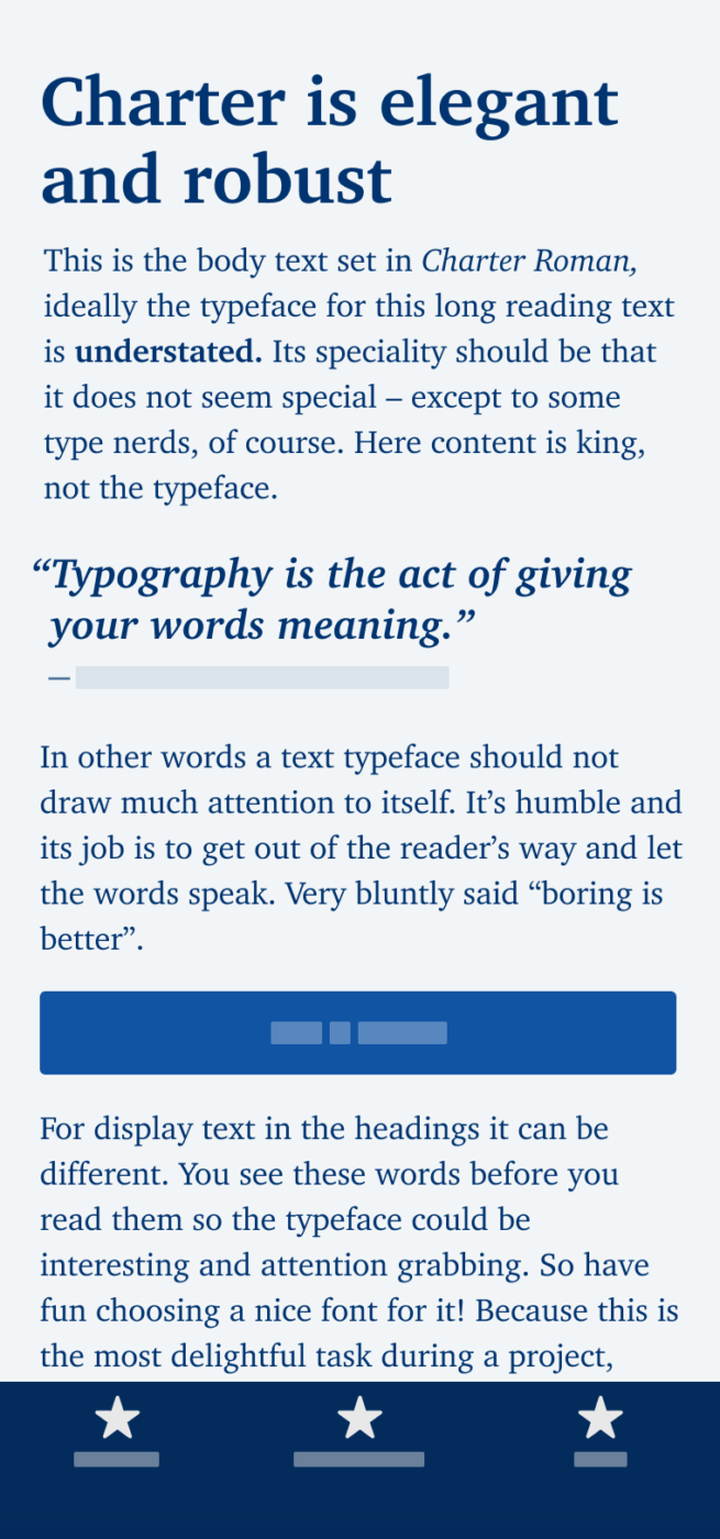
Charter was optimized for printing on the low-resolution 300 dpi laser printers of the 1980s. This makes it ideal for nowadays screens, standard office desktop monitors with lower pixel density included. It is well suited for long reading text and headlines. For small functional text, it’s too thin.
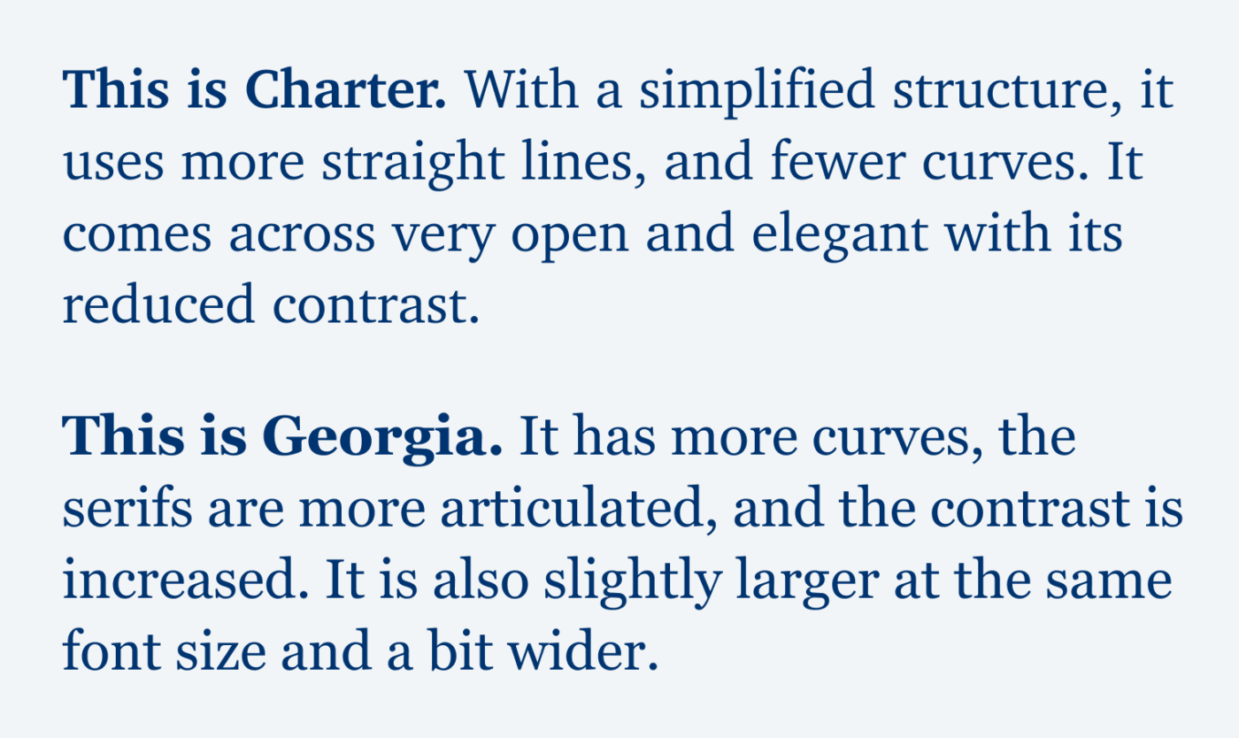
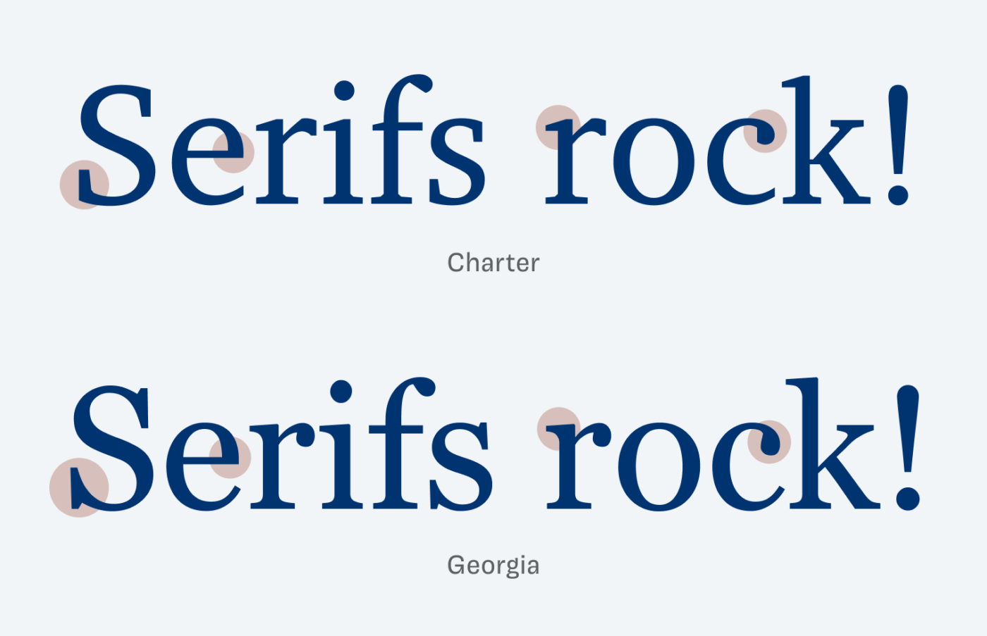
After designing Charter, Matthew Carter moved on to make Georgia, which is similar, but creates a very different vibe. When you take a close look, Georgia appears wider and larger, because it was optimized for smaller sizes and low resolution screens back in 1993.
Given its incredible quality, I think Charter is among the best free fonts out there and still not overused. On macOS and iOS, the fonts are already installed. If you need web font files, get them here from Matthew Butterick’s brilliant website. Henk pointed out, that the character set is rather limited in this free version. So if you’re in need of more characters (like the € symbol), you should either have a Mac with an extended version of Charter, or purchase the OpenType font family here.
What do you think? Is Charter something for an upcoming project, or have you used it in the past? Tell me in the comments below!
Thank you for introducing the Charter.🔦💎 I can’t believe I’m only meeting it now! It looks like a more masculine type, with characteristic robustness at r and k. Your sharp eye highlights everything!
Also didn’t know it’s the same author of reputable Verdana, Georgia, and Tahoma. But also Sitka, do you know Sitka Display!? Oh, It’s a very gentle type. And even Miller (Display) a fashion lover? Wow!
Charter is a well-grounded, serious type with an attitude that silently sells value. This is for news publications and informative magazines.
Oh! Skita and Miller are both very elegant serif typefaces 😍! Thanks for sharing this with me, Jana!
Hi Oliver,
Happy New Year!
This is a matter of taste, but for me Charter is a very pleasant typeface to look at.
Unfortunately the character set is rather limited. For example, and most important, the Euro character (usually code point U+20AC) is missing. Interesting enough, the character we used in the past for the Dutch currency guilder is present; U+0192.
By the way, this does not apply to the Charter character set on MacOS; this contains many more characters (1833 instead of 228) including, of course, the Euro character.
Best regards and thanks, once again, for pointing out to us the topography gems you encounter!
Henk
Thank you, Henk! That’s a useful addition to the article. Just updated it.
Great, I knew Charter before and did not know there is a free license. I only knew the commercial ITC-version. Thanks for this hint!
Of course! Glad I could tell you something new, Markus 😉!
I really like this one. I’m always looking for nice serifs for readable body copy, and there is an elegance to this one that I really enjoy–thank you!
Happy you like it, Emily! ☺️
Got here from the email about “West”. 😱
Going *further* West now for my comment… see you soon.
Damn … it’s always one link that’s wrong 😉.
Hah – and I almost never click on the email co. generated links.
As you mentioned the rather limited character set in the free version of Charter I wanted to draw your attention to the free font XCharter by Michael Sharpe. As far as I can judge it is identical to charter but with a much more extended character set including cyrillic letters. I recently used XCharter in a book project, and Michael Sharpe was so kind to add missing glyphs and correct kerning problems on my request.
Another free alternative is the font Charis SIL which is also based on Charter but seems to have changed some details. Matthew Butterick considers these to be questionable design modifications. What do you think?
Very cool, Ulrich! Thanks for these additions, both look good as far as I can tell.
Hey,
I’ve been trying to use Charter in my website.
Question – Which font pairing would you suggest with it? Where I would use Charter for the heading only. I would need another font for long reading text to go with it.
Yes. I did think of using Charter itself. I would love to. But the WOFF2 font I downloaded from the link above messes up with my CSS padding. Padding-bottom is smaller than padding-top (in mobile) , hence leaving no symmetry in the elements. I did come across tools like Capsize, but I don’t want to use it.