Top 3 Fonts for Body Text
Today, 2021 is coming to an end, I want to appreciate the 48 past Font Friday recommendations by giving you my personal top 3 for body text. If you’re not sure what to pay attention to when choosing a typeface for body text – I made this video that will give you an insight.
There were so many great typefaces to choose from, it was hard to make up my mind. So I followed my heart and taste. All of them are variable fonts, what shows that it really established in the past years! What was your favorite typeface for body text in 2021? Let me know in the comments!
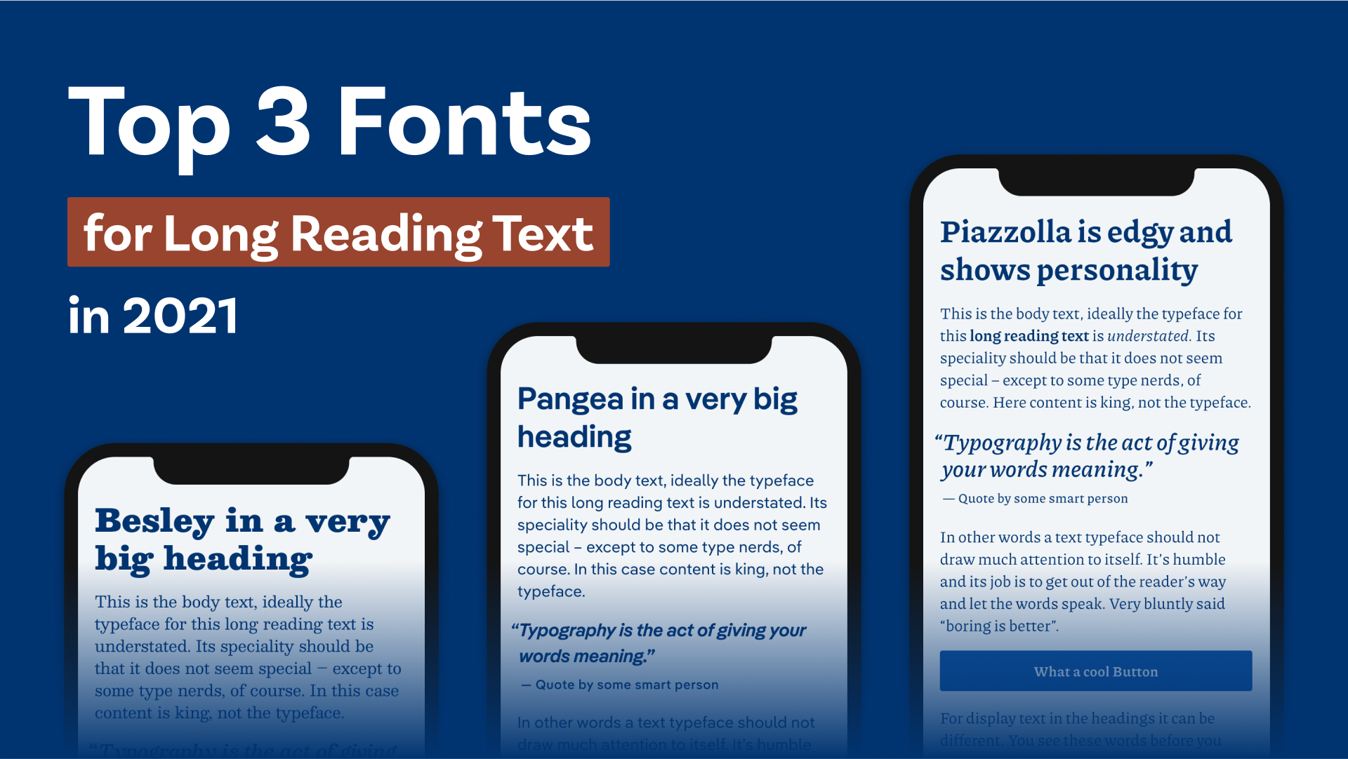
3. Besley (free font)
Slab Serif
12 Styles (instances)
Regular to Fatface with italics
License
free
Why I picked it
I love when classic typeface get reinterpreted and updated. Besley captures the vibe of Clarendron, the vastly popular original, but with more consistency, fitting italics and that all in one beautiful variable font. Full Besley review
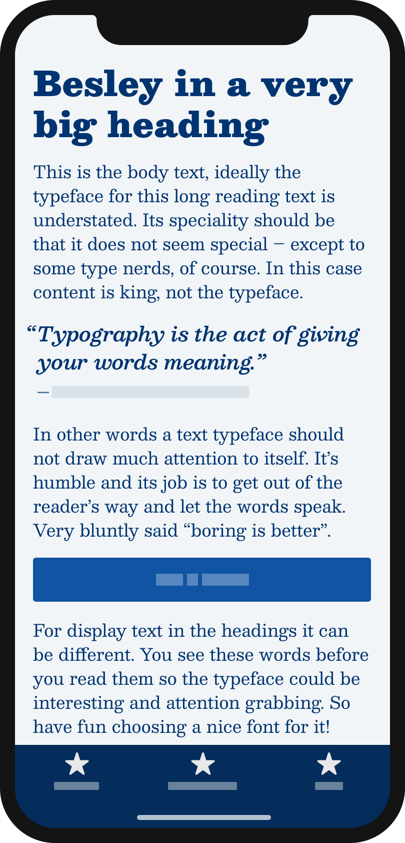
2. Pangea
Sans-Serif
by Christoph Koeberlin on FontWerk
20 Styles (instances)
Pangea: Light to Bold
Pangea Text: Light to Bold
all with matching italics
License
from € 50 (web & app)
Why I picked it
I love Pangea because it’s clean, but not sterile. As a variable font with optical sizing, and plenty of alternate characters, it gives you so many possibilities to adjust it to your needs. And I know from your emails, that many of you enjoyed it as well. Full Pangea review
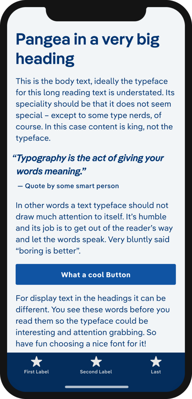
1. Piazzolla (free font)
Serif typeface
by Juan Pablo del Peral at Huerta Tipográfica
Over 54 styles (instances)
8 weights from Thin to Extra Bold with matching italics in three optical sizes.
License
Free
Why I picked it
Very calm and quiet at reading sizes, but the larger and contrasting it gets, the more personality it shows. The optical sizing makes Piazzolla perfect for contemporary web design. Dear typography lord, I get too excited when thinking about it! Full Piazolla review
Well, there are some crazy solo + freelance souls that read Newsletters especially when it’s about type! So here I’m, while all of you are sleepin’ still drunk from the last night. Festive New Year to Pimp My Type community🙌🏻💗
I can’t choose my favorite child Oliver! A list of 3-5 would be okay. But I discover a new type every day ’cause – a constant visual analyst across the web globe.
The latest one I fell in love with is Role Serif Display Pro (Print magazine’s website).
As a font of the year, I’m choosing a practical one who has a bright future in publishing circles and threatens to become a contemporary classic! 👏🏻It’s a new version of an old-timer Times New Roman… NEWSREADER!
Bye for now😉
Yessss! Newsreader is awesome! And thanks for Role Serif! Just looked at Role Serif Text and it’s super nice as well, will work for screens too. A good idea for an upcoming Font Friday, maybe 🤔. Have a Happy New Year, as well!
Look forward to seeing Role Serif Text featured in Pimp My Type!
I’m working on one brand identity and for Primary typography, I’ve chosen Newsreader. Now I’m questing for a proper Secondary Sans Serif🤔 that will pair with NR and be free at the same time. NR has a strong character!
I have more type ideas for your series!