
My thoughts on Pangea
I have to say it this bluntly – Pangea is the wet dream of a UI typographer (retweet me on that). Especially the variable font drives the possibilities to adjust and fine-tune your type to the max. But let’s start from my conversation with its designer, Christoph Koeberlin.
Pangea is a geometric sans-serif, you know, like Futura (but not really). And there are a lot of them out there, right? But not a lot as variable font, Christoph said. Not enough that go beyond Latin script and also provide Cyrillic, Greek, and Hebrew. Not enough that consider optical sizing (that it looks good in any size). All these were reasons for him to create this beauty. And not such a soulless dry geometric sans-serif, it’s still friendly and approachable.
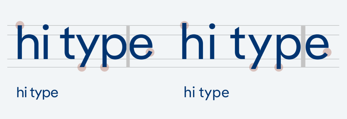
You now might say: “Dude, what are you writing about? Why do I even need this stuff?” – Fair enough. If you have control over optical sizing you can adjust your text for a given application. This means to make it more readable for small sizes and better looking for larger sizes. The openness of shapes for body text and functional text is key, more about it here.
You’re already blown away, I know, but now imagine that you can micro adjust all these settings in the variable font. Boom! Check out this tweet by Christoph to grasp what possibilities Pangea Varbiable gives you. If that’s too exciting for you, you don’t need to use it, you still can just pick Pangea or Pangea Text and keep it simple, that’s the beauty.