Variable fonts are the font technology made for the digital era. They have the power to bring more typographic richness to the web at a lower file size. But with new possibilities and advantages new challenges and complexity arise. So what’s so hot about the next big thing since the introduction of web fonts (at least to all type nerds) and how can you use it?
This article will give you a primer on variable fonts on the web and guide you through your first steps by answering the following questions:
- What are variable fonts?
- What can you do with them?
- Isn’t stretching a font a bad thing to do?
- What advantages do variable fonts bring?
- How do you use them on the web?
- What are some potential pitfalls to look out for?
- When should you start using variable fonts?
Ready for some sexy web typography? Then let’s dive into it.
What are variable fonts?
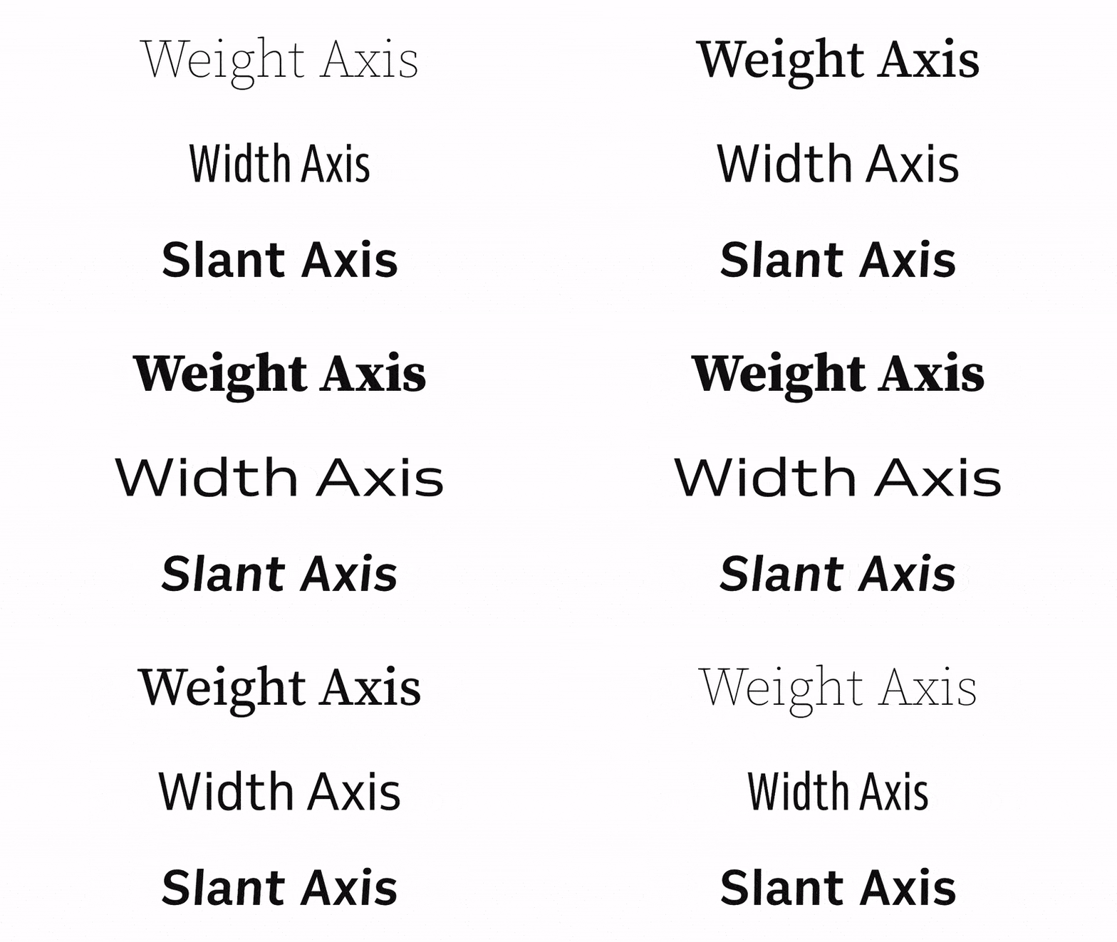
A variable font file is one font file that can behave like multiple fonts is how John Hudson explains it. Traditionally every single font weight or style, e.g. italic, bold or light expanded is stored in one individual file. Now in a single OpenType variable font file, you can store multiple font styles and that in a relatively small size.

The small file size comes from the fact that each character only has one outline. The points that construct this outline have instructions how they should behave (or move) to create, for example, another weight. The individual styles then get interpolated, which means they get drawn dynamically inside the browser. This also makes it possible to generate styles in between, for example, semi-bold and bold.

The interpolation can happen in very small steps along various axes, like on a weight axis. This creates an enormous gradation of possible styles. There are still named instances like regular or font-weight: 700 that work, but you can also select any design in between.

A variable font can contain multiple axes. You could add a width axis to your weight axis and get even more styles. Venn by Dalton Maag, the variable font used in these examples, supports weights from 300 to 800 and widths from 75 to 125%. This means if you multiply these ranges (500 × 50), you can get 25,000 styles out of Venn alone. Not bad for a file of 112 KB.

What can you do with variable fonts?
This always depends on the design of the typeface. Type designers are provided with various axes that can be adjusted dynamically to change the font’s weight, width or whatever they want. There are five reserved or registered axes for the most common cases:
wdthfor widthwghtfor weightitalfor italicslntfor slantopszfor optical size.
Most variable fonts provide a weight axis and the width axis seems to be very popular as well. But there can also be custom axes, giving type designer possibilities to change the thickness of serifs or the height of ascenders and descenders or whatever they come up with.

Isn’t stretching a font a bad thing to do?
When a variable font changes its width, weight or other dimensions, it does not get stretched or distorted, as opposed to dark techniques like transform: scaleX(0.5). This happens because it only changes within its set and designed boundaries. It is not deforming or defacing the typeface by creating an aesthetically horrible mutant that chases every designer in their nightmares.
Why is stretching or distorting typefaces a problem at all? Type designers carefully balance every letter form, so that it fits aesthetic demands. This effort gets lost when a typeface is thoughtlessly deformed by scaling. The differences might be subtle, but they have an enormous impact on the overall appearance and feel of a typeface.

What advantages do variable fonts bring?
They can bring more typographic richness to the web.
Web designers can make use of more different styles to highlight certain parts more interestingly. Websites might be able to treat typography more in an editorial design way, with a broader visual variety and more personality. I created a demo site where I tried to get rid of the limitations of only using three to five different styles and ended up with 18 different font styles. Clearly this version is more distincitive and alive than a reduced one, only applying three styles. You can see the difference by switching between both.

Smaller file size
Variable fonts can bring a smaller file size for more typographic options. If you use three or four weights of one typeface, you might get the benefits of a smaller file size with a variable font. For example Süddeutsche Zeitung Magazin loads 236 KB of fonts for their magazine website. Four of them are just different weights of Work Sans, which add up to 166 KB. If they would replace them with one variable font, it could most likely have less than 80 KB and save more than 50% of bandwidth.

Granular influence
Variable fonts bring granular control on how to render fonts. For example, you can fine-tune the weight of your text in tiny steps and maybe font-weight: 430 looks best under the given circumstances. Since this is just an additional option, named instances like font-weight: bold will still work.
Make text fit better
If a variable font has a width axis to be manipulated, you can make the text narrower on mobile to fit more words into one line to provide better readability. On a wide screen, you can extend a typeface to make better use of the space. I did this in a browser example to illustrate that.
It’s animatable
All the axes can be animated through CSS. This can create cool effects and bring more life to your content. You’ve seen some animations I’ve screencasted in this post already and the Microsoft Edge Demo page for example shows this very impressively when you scroll down to the heading of a new section.
Optical size is back
Optical sizing is a concept from print design, that aims for best legibility on small sizes and most personality on larger sizes of a typeface. In times of metal type, everything was optimized for the specific font size. Through digitization, where you create one design that should fit all sizes this got lost. Now it comes back with variable fonts. An example: At small font sizes the strokes could be thicker; which means there is less contrast, which makes text more readable. On the other hand, on larger sizes, there can be more details visible and therefore more contrast. This change can happen gradually and again, only one font file is used.

How to use variable fonts on the web
1. Find available variable fonts
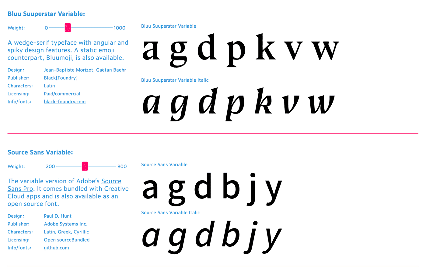
This technology is quite new, so before you can jump into using a variable font, you’ll first have to find one. A great place to start is v-fonts.com by Nick Sherman. Here you can find plenty of available variable fonts and try them out. Many of them are Open Source and can be downloaded from Github. There is also a great List of available variable fonts by Indra Kupferschmid.
2. Integrate the variable font in your style sheet
Browser support is pretty okay with over 65% in the second quarter of 2018. Current versions of Chrome and Safari (on MacOS 10.13+), all browsers on iOS 11.2 and Chrome on Android support it. Firefox has it behind a flag and Edge will follow within the next months. That’s all pretty amazing for a technology that has been announced just one and a half years ago. In the following parts, I will focus on the code that works for browsers that support variable fonts. There is a great article by Richard Rutter about how to use variable fonts in the real world where he covers how to serve fallback fonts for not supporting other browsers.
Integrating a variable font is pretty straight forward and nothing too unusual if you’re familiar with @font-face. You only have to change the format to woff2-variations or truetype-variations (depending on your font file). This will become the standard, but currently only Safari supports it. To cover Chrome and the flagged Firefox you need to add another source where you set the format without the variations-part. Supporting browsers will still be able to access the variable features.
@font-face {
  font-family: 'Venn';
  src: url('Venn.woff2') format('woff2-variations'),
       /* will be the standard and works in Safari now */
       url('Venn.woff2') format('woff2');
       /* for the other supporting browsers */
}
3. Find out the font’s axes and ranges
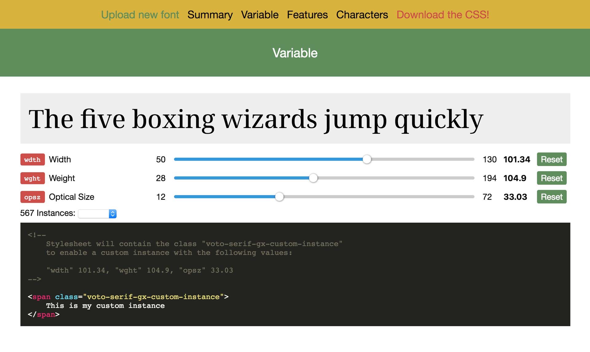
Every font has different axes and ranges depending on its design. If you don’t know already what capabilities your font has, you can drag and drop it into the great tool Wakamai Fondue by Roel Nieskens. You can even generate your css and use it afterward.

4. Styling variable fonts
As Richard Rutter writes the CSS4 Fonts Module will add new values for high-level properties to work with variable fonts.
font-weightwill take any number from 1 to 999font-stretchwill take a percentage number. 100% is normal, 50% is ultra-condensed and 200% is ultra-expanded. Keywords will still work. And yes, it’s a horrible name for typographers, because it does not stretch the font, it changes its width within the designed boundaries.font-stylewill take a new oblique angle value fromoblique -90degtooblique 90deg. Of course,font-style: italicwill still work. 90 degrees is only the maximum and might look pretty crazy, 8 degrees will be the maximum for most typefaces.font-optical-sizingis a new property and will take a value ofautoornone. By default, browsers will turn optical sizing to auto and you would have to set it to none if you don’t want that.
Not every variable font will make use of those options, depending on the design of the font and what range it supports. After running some tests, I discovered that Safari supports font-weight and font-stretch and it will automatically turn on optical sizing if available. But using font-style: italic resulted in distorted text and did not access the variable font’s italic axis.
At that moment those high-level properties are only partially supported, and if they are, only by Safari. So to access the variable font’s features reliably, you’ll have to make use of this low-level property: font-variation-settings. There you’ll have to use certain four-character tags (like the ones you saw before, when I explained the registered axes):
p {
  font-family: "Venn"; font-variation-settings: "wght" 550, "wdth" 125;
}
This code changes the font-weight to 550 and the width to 125 percent. In the future, you will achieve the same result by writing the high-level properties:
p {
  font-family: "Venn";
  font-weight: 550;
  font-stretch: 125%;
}
And of course, there can also be custom axis to any variable font. These will always be accessed through the font-variation-settings property. This for example:
h1 {
 font-family: 'Decovar Alpha VF', sans-serif;
 font-variation-settings: "TRMC" 0, "SKLA" 0, "SKLB" 0, "TRME" 0;
}
would result in this (I added some animation to make it more visible):

What are some potential pitfalls to look out for?
Variable fonts are great but, of course, with new technology come new things to pay attention to.
Too many options
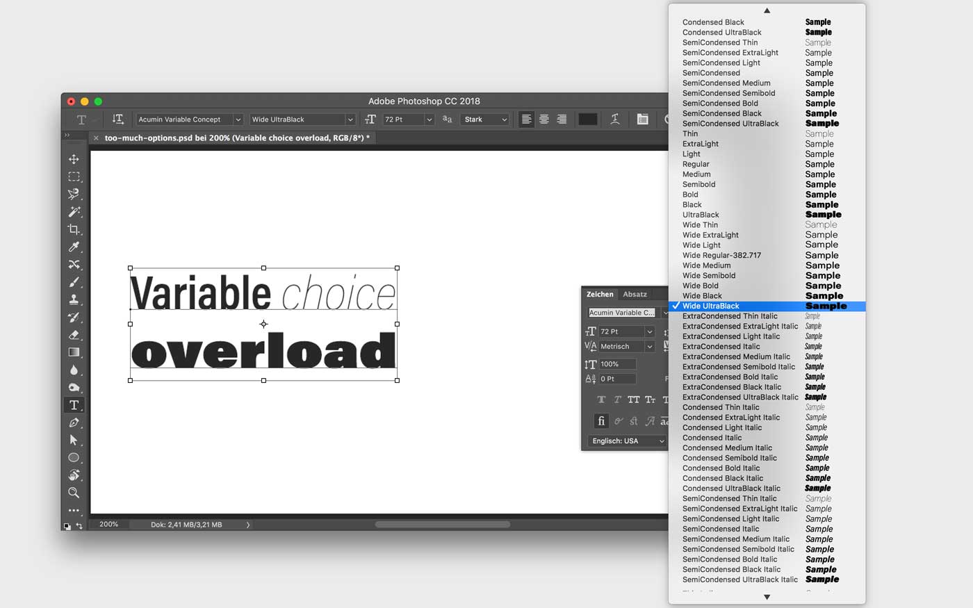
It gets harder to choose when having offered a lot of possibilities to change something in the slightest way. Even though there are still saved instances, like semi condensed medium, a variable font will contain a lot of them. Even when I look at the drop-down of these saved instances in Adobe Illustrator, I’m overwhelmed by so many options.

A change of mindset might help – only using the defaults and adjusting them when needed, but this also means:
More typographic knowledge is needed
A lot of things to choose from means you have to be aware of what you want to get and why. It is also easier to mess up and easier to have inconsistencies in your design. This also comes to evaluating what a proper font is. Of course, you could just use the named instances like before and ignore the additional options. Then the one thing that changes is that you only have to load one single font file.
There’s not always a performance gain
If you only need one single font style, the variable font file will be larger. Most of the time you will start saving file size when you need three or four different weights or widths of a font family. And there is another thing:
You will might still need two files for roman and italic
True italics are not just angled versions of the roman upright style, they have very different construction principles and therefore letter shapes. This is also the reason why there are practically no variable fonts with an italic axis. They might have a slant axis, but these fonts are very rare. The variable fonts I’ve seen so far all have a separate file for the italics (see examples on v-fonts.com), which means you might have to load a whole other variable font.

It will depend on the licensing models
Only when multiple styles are necessary, people will be willing to pay for a variable font. A variable font can’t be any cheaper than a whole font family with individual static files. It offers more so why should it cost less? It is also more complex designing and testing a variable font. So why should type designers hurt themselves by giving it away cheaper? At the moment most variable fonts are either open source or technology previews. Some foundries offer them in bundles with the static fonts. Currently there are only very few variable fonts you can buy on their own at a price of roughly $ 700, which is the price you would pay for a whole font family. I think it will be very interesting and more affordable for subscription based models like on Typekit. Also, Google Fonts could save a ton of bandwidth when they will start serving mostly variable fonts.
When should you start using variable fonts?
2018 is the year variable fonts will be supported by all major browsers. Especially the adoption on mobile is happening pretty quickly, where there can be a great benefit considering bandwidth. I expect by 2019, variable fonts will be used as an alternative to static fonts. In the beginning, I think people will mostly replace static fonts with variable fonts to save on file size. Big players like Adobe and Google will be pushing this so that they can save on bandwidth as well. At the moment there is nothing announced, when this will happen.
But the file size thing is the least interesting part to me. I think designers have to change their mindset when using variable fonts. I accepted the limitation of only using two to five different font files, and in most cases, it will make sense to stick to this, at least for body text. But having a bit more flexibility can be beneficial. When I was designing my demo site with 18 different styles, it was hard to break out of my routine. You can really fine-tune a lot to get rich and nuanced typography, especially for headings, quotes or other call-outs, this makes sense. On the demo site, you can certainly see that with the variable font it has much more personality than with just three different styles.

Static fonts will still be valid and if you only need one or two styles, they will be smaller than a variable font file. At the moment it is not that easy to find good fonts and you would have to add fallbacks with static web fonts for browsers that have not caught up yet. I could imagine it moving in a direction where progressive enhancement means a variable font or no web font at all, at least for certain parts of your typography.
So, when should you start using variable fonts? I suggest getting your hands dirty with them right now, maybe on a small project just to try it out. Use system fonts as fallbacks and try to design for variable typography. Because only then variable fonts will show their full potential. And that lies beyond the possible file size reduction, it lies in giving your words a better typographic voice.
This post is an adaption of my talk Conquer Variable Web Typography. If you are interested in hiring me to give it at your event, contact me! I also offer Web Typography Workshops where variable fonts are covered.
Update November 2018: Half a year later variable fonts are now supported in all mayor browsers. If you want to get practical but don’t want to risk it all, use web fonts as first fallback. I wrote an article how you can do just that: Implementing a variable font with fallback web fonts.


Thx for good read! PS: you have a missing space there: “properties are only partially supported, and if they are, only by Safari.So to access”.
Thank you so much! Space added 😉
Twice “stlyes” instead of “styles”.
Fixed! Thank you & thank you 😉
Great article, thanks! I noticed there’s a small grammatical error in one of the captions:
The font menu in Adobe Photoshop with Acumin Variable Concept. It shows 90 named instances from ExtraCondensed Thin to Wide UltraBlack Italic – **that are a lot of choices.**
I imagine you mean “das sind viele Möglichkeiten”, which translates to “that’s a lot of choices.”
I hope this comment doesn’t come across as pedantic- the rest of your writing is impeccable. Thanks again.
Always happy for feedback! Thank you, I fixed it.