

My Optician Sans Font Review
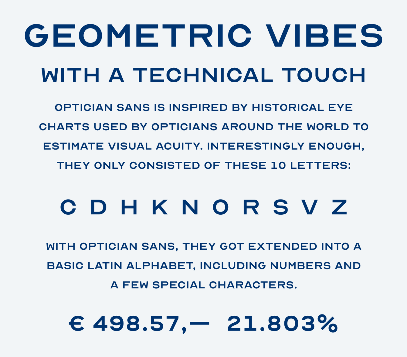
After we spent some time thinking about what makes a typeface legible, let’s do the opposite with this week’s font recommendation. The display typeface Optician Sans is a free font, inspired by historic eye charts, which are designed for ambiguity. Otherwise, they would not make much sense when testing for visual acuity. Interestingly enough, these historic charts only consist of ten letters, and Optician Sans turned them into a basic Latin alphabet.
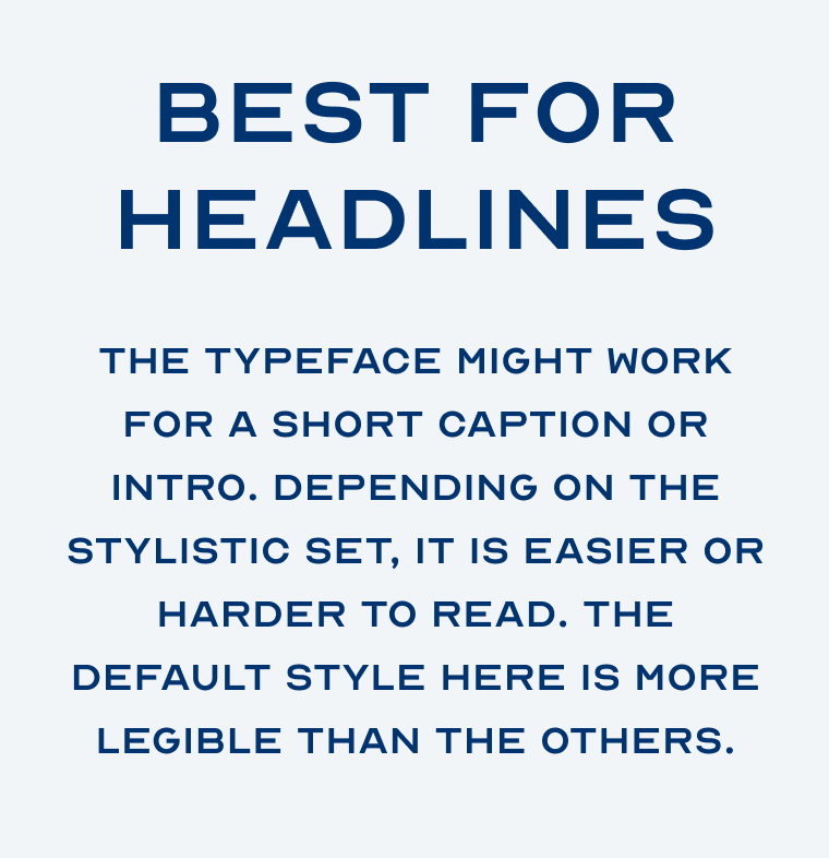
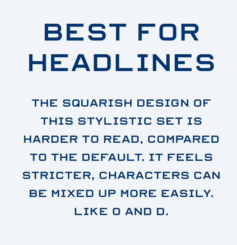
The typeface comes across as both clean and geometric, but also technical and clunky, covering the quirkiness of its origin. And you can make it even weirder by utilizing its two additional stylistic sets. While not being very legible, the default style is still the clearest. Squarish stylistic set 1 makes it easiest to mix up letters, especially “D” and “O”. This is also the kind of typeface you will most likely have seen on an eye chart. I certainly have, as I got myself a pair of new optical sunglasses lately.

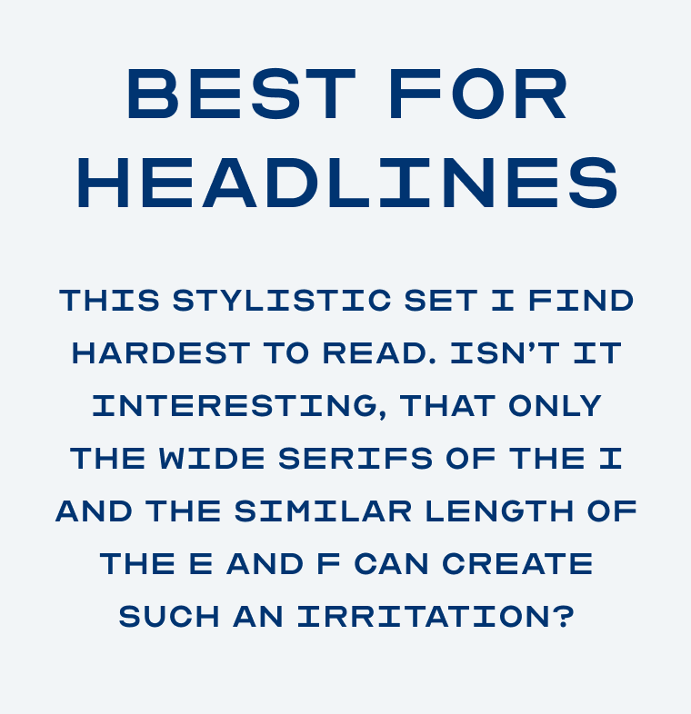
And now comes the part that fascinates me most. Compared to the default style, stylistic set 2 only replaces three letters, but this has a tremendous impact. The long serifs of the “I” and the equally long arms of “F” and “E” are so irritating to the overall rhythm of the text. While stylistic set 1 has more ambigous characters, I still find it more pleasant to read. How do you feel about this?
Unfortunately Optician Sans is only covering basic Latin script, and a few special characters. So no umlauts, dollar sign, or any accents. But next to English you can write Norwegian, since it was created as a part of the visual identity for optician Optiker-K in Norway. And maybe the cool headline or logotype will work with the given characters?
Font Pairings for Optician Sans
Optician Sans is a geometric, linear sans-serif. For body text, it would pair well with Montserrat or any other of these recommendations, ironically Atkinson Hyperlegible too.

- Headings


Learn more about pairing typefaces using the Font Matrix.
Do you have another font recommendation I should share? Tell me in the comments!
You should have featured the M and G, especially G as it’s a true legend letter, Oliver!
Some letters are extremely wide such as D, E, F, H, etc., and others are narrower G, M, W, Y, U… I wonder what it would look like if there is other text using more of the narrower letters but the author intentionally chose the most used letters to be wide.
You got me thinking of the optician’s letter. I have an eye examination in May 🤓
Thank you for the inspiring Font Friday!