
My thoughts on SFT Schrifted Sans
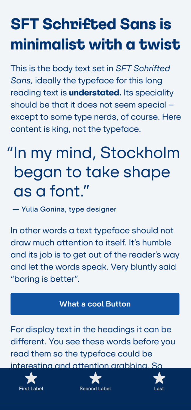
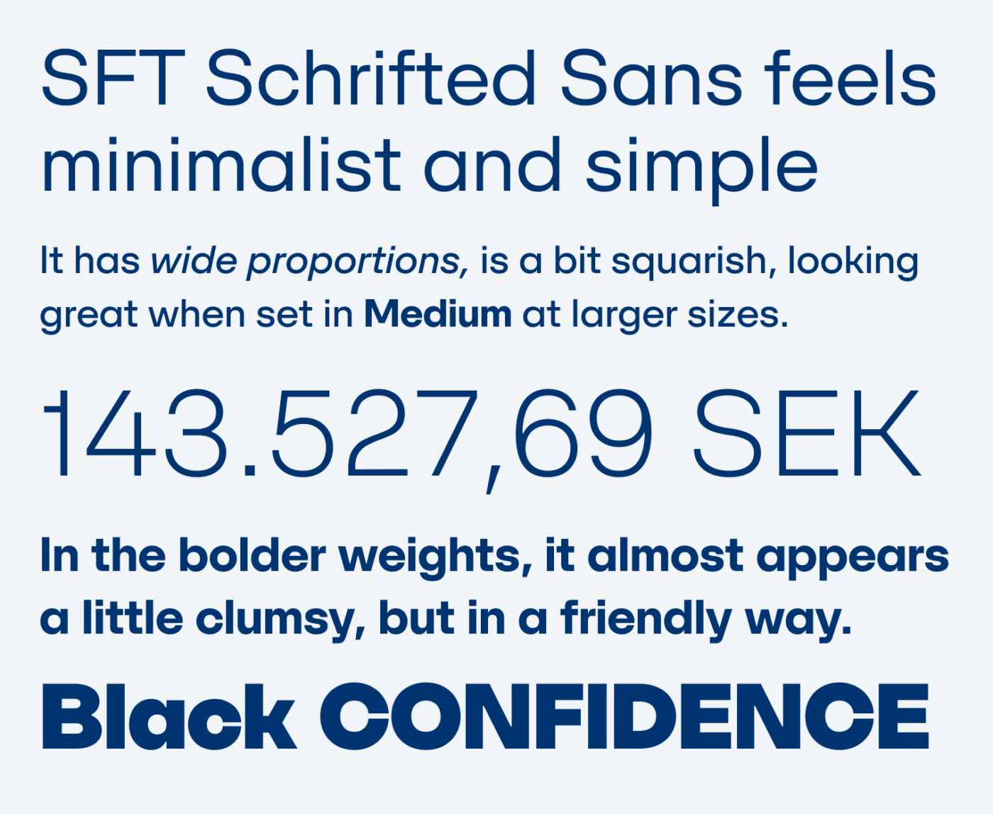
This is one of the most interesting typefaces I’ve spotted recently. SFT Schrifted Sans is clean and minimalist, but with a twist – yay, that rhymes! At first glance, it is very simple and functional, looking beautiful set in larger sizes in Regular or Medium weight. Also, the numerals are gorgeous.
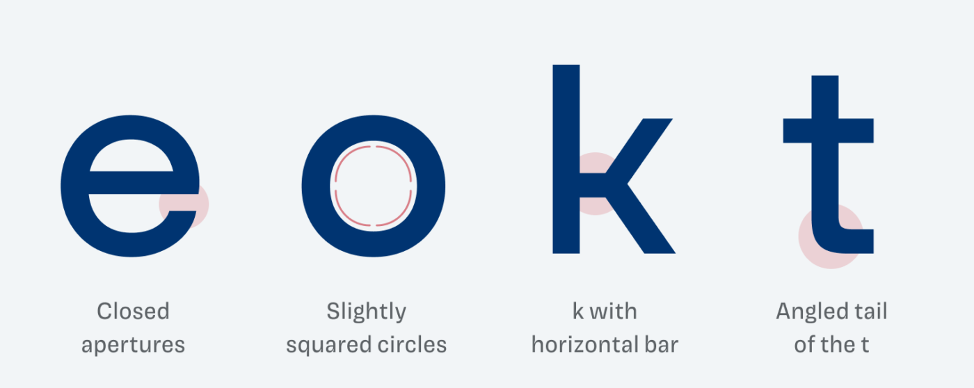
When you look closer, specific details are interesting enough so that SFT Schrifted Sans stands out among other geometric sans-serifs. The closed letter shapes are balanced out with quite wide proportions. Also, a somehow squarish appearance shines through, represented by in the slightly edged circles, angled ascenders (f) and tails (t, y).
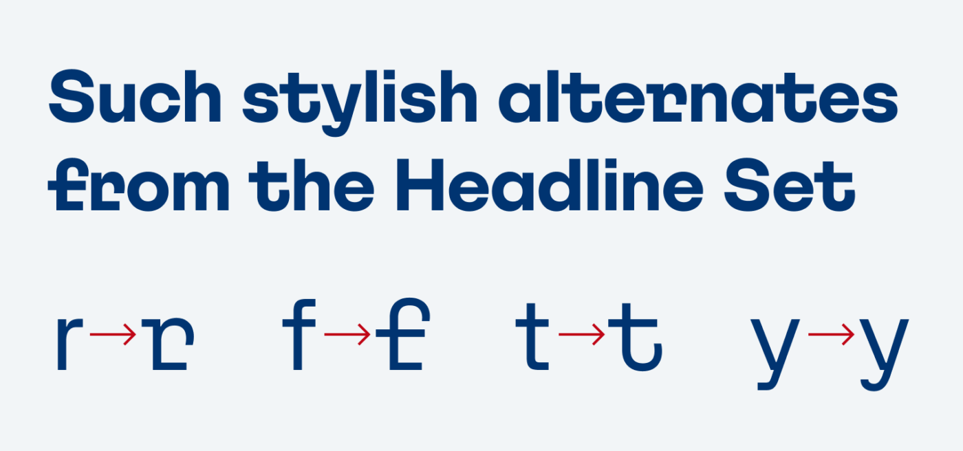
The typeface was inspired by the impressions the city of Stockholm made on Yulia Gonina, its designer (read the backstory). You can see how much love and attention to detail Yulia put in SFT Schrifted Sans, when discovering the stylistic alternates. The Headline Set breaks with the simplicity by adding playful serifs and turning the angled tails into exaggerated curves.
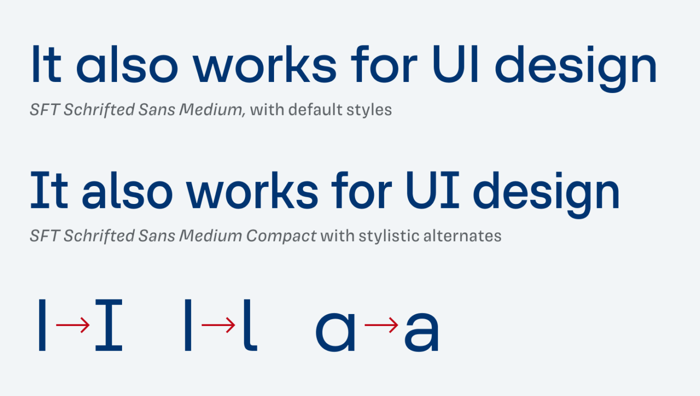
The typeface also comes in a compact version, making it useful for UI design as well. Stylistic alternates provide you with a serifed I, a hooked l and a double-story a. All features that contribute to better legibility, which is crucial in UI design, as you can learn in the UI Fonts Checklist. However, the quite closed apertures, and medium x-height could be critical in very small sizes.
Overall, SFT Schrifted Sans is a versatile typeface, that performs in a large variety of use cases. From elegant or striking headings, to calm running text or sober functional text.
Recommended Font Pairing
SFT Schrifted Sans lies somewhere between a geometric and a rational linear sans-serif. Combining it with a dynamic, contrasting, serif typeface like Andada Pro for body text, would be a good approach.

- Headings
- Copy
- UI Text


Learn more about pairing typefaces using the Font Matrix.
Thanks to Pavel, for recommending SFT Schrifted Sans to me! If you have a suggestion for a typeface I should review, tell me in the comments!
With alternates, everything flows…
It’s interesting how, all the specifics of this ___ Sans (sorry, it’s a difficult-to-pronounce name) such as horizontal bar K, angled tail T, squarish, and especially closed apertures are my least fav in any font, but when looking as a whole, it’s fine Oliver!
Thanks for the font pair recommendation, Ananda Pro could bring some sophistication and emotion.
Vocation, holiday!?
I’m workin’, anyone resonates👀
Btw. your website & Font Fridays are much easier to explore now. ✨🪄