
My Laca Font Review
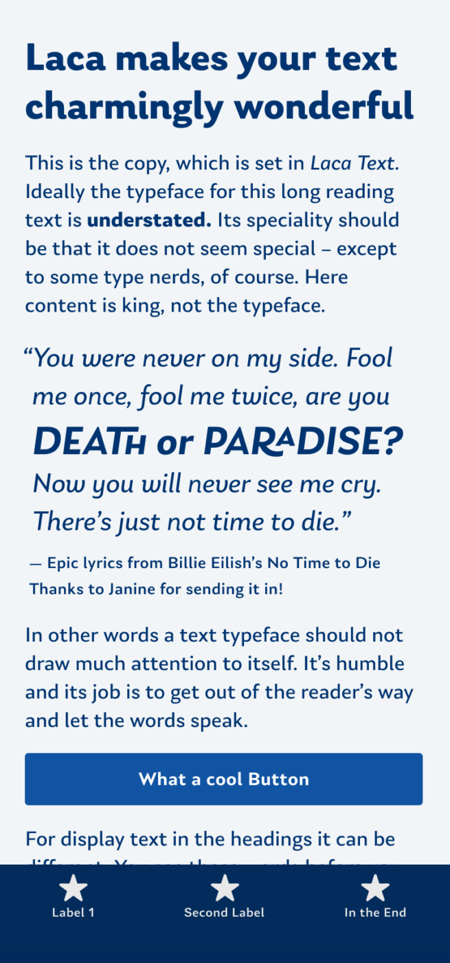
What a treat to the eyes! This charming and playful sans-serif typeface was inspired by vintage Portuguese soap packaging. And you can definitely feel this, when looking at Laca, the display style of the superfamily. But also Laca Text conveys this certain warmth and friendliness. Let’s discover some of their details.
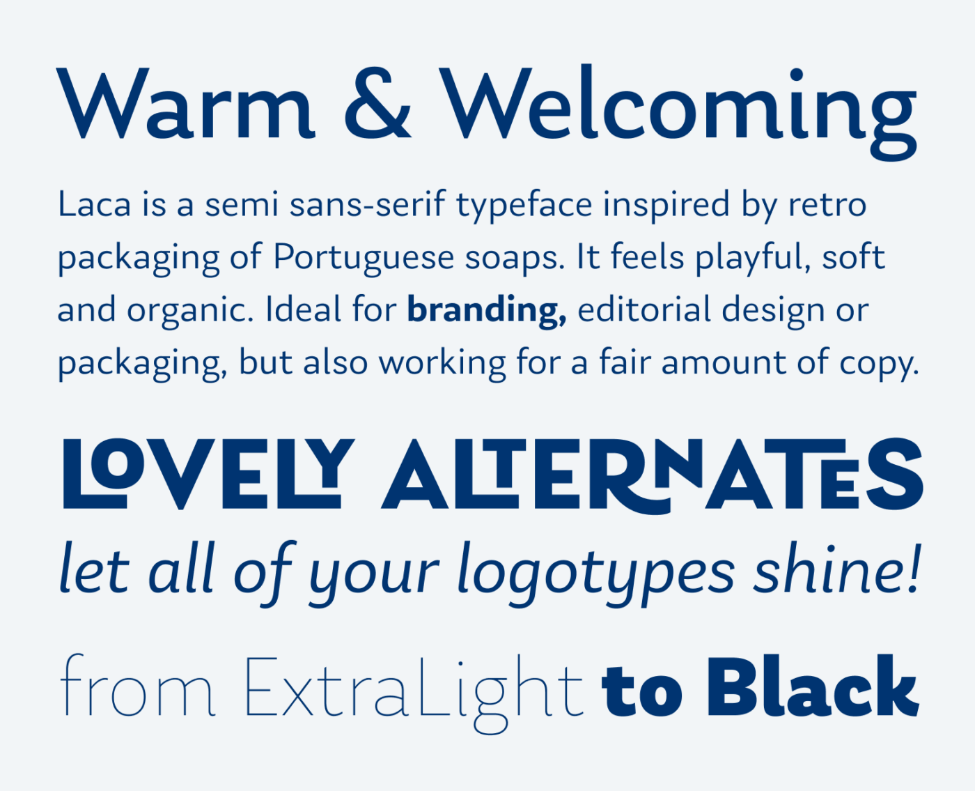
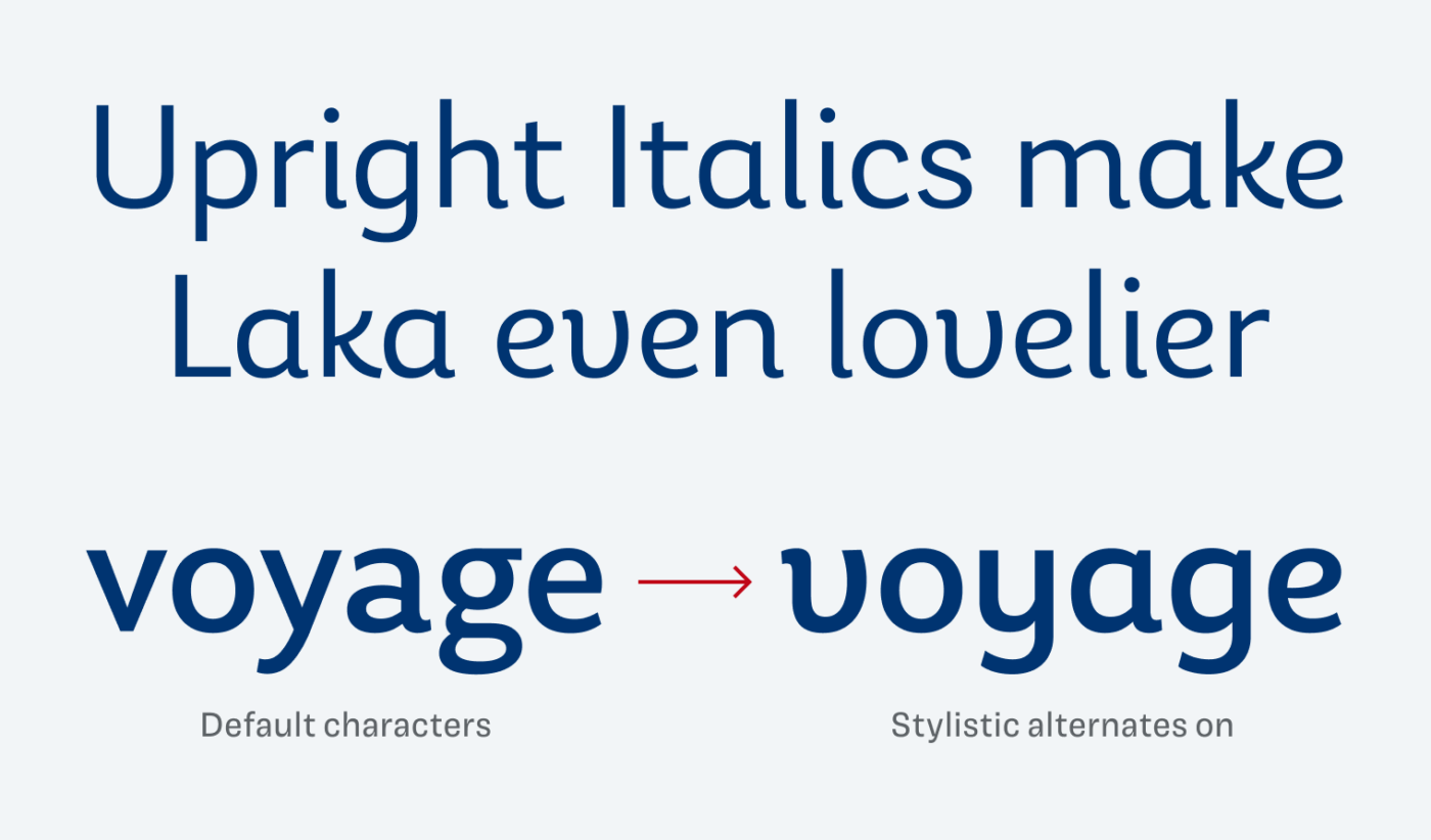
Laca is made for branding, packaging or editorial design. Compared to Laca Text, it has an additional weight (Black), also covers Cyrillic and Greek script, and is equipped with OpenType features. Be bold and turn all caps text into striking logotypes by activating the rare ligatures. Or be more gentle, by turning the stylistic alternates for upright italics on.
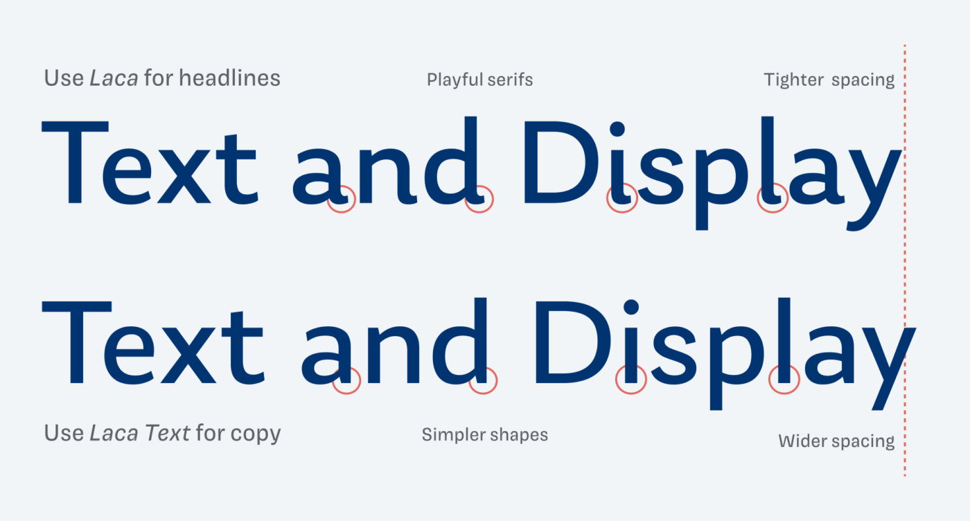
But there are other, subtle differences that tell apart the display and the text style. Laca is more playful with its curved tails, a bit sturdier strokes and compact spacing. Laca Text has a bit simpler letter shapes, slightly taller lower case letters and wider spacing.
Yes, Laca Text is more restrained, but for extensive copy or UI text, it still might be a bit over the top. In these cases, I recommend pairing it with another typeface.
Font Pairings for Laca
Laca is a dynamic, linear sans-serif typeface. Pair it with quite similar Captura Now for UI text or the dynamic, contrasting serif typeface Coline for extensive copy.

- Headings
- Copy
- UI Text


Learn more about pairing typefaces using the Font Matrix.
How do you like this charming typeface? And do you have another font recommendation I should share? Tell me in the comments!
Laca is un-pairable 😂 Nothing can (com)pair with her naivetee!
Cute i and l 😍 Laca is a choice for your Lovely girls Oliver. Maybe some birthday poster, hm?
LOL, love your puns!