Display, Serif typeface

from Pangram Pangram Foundry
designed by Valerio Monopoli

Variable Font

1 axis: Weight

16 Styles

8 Weights: Extralight to Black
with matching italics

Best for

  • Headings (display text)
  • Long reading text (body text)
  • User Interfaces (functional text)

License starting

below $40 (one style)
below $450 (bundle)

Specialty

This expressive serif typeface will bring a quirky personality and wild energy to your headings, titles and logos.

My Migra Font Review

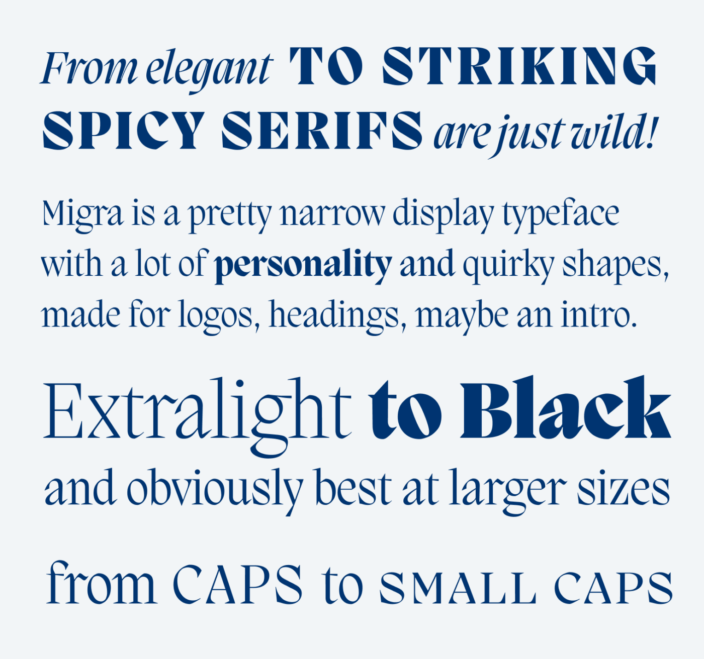
When looking at Migra, I was immediately taken by its wild energy. With its narrow proportions, the steep angle, fast curves, snappy shapes and spiky serifs, this typeface seems confident, daring and bold – even when set in Extralight 😉. But what exactly gives it that look? I had to go deeper.

From elegant to striking, spicy Serifs are just wild! PP Migra is a pretty narrow display typeface with a lot of personality and quirky shapes, made for logos, headings, maybe an intro. Extralight to Black and obviously best at larger sizes. From Caps to Small Caps
I love the contrast of the snappy italics and the bulky, extra bold caps. Migra also comes with small caps – an all too rare pleasure with many fonts.

What Migra does extremely well is playing with opposites. Look at the lower case “r” for example. It can be snappy and spiky at its entry stroke, while being soft and flowing at the arch. Also the heavy stroke contrast and the sometimes curved, sometimes wedge shaped serifs, are two more characteristics of the typeface.

Snappy and round shapes at the lower case “r”, a steep angle at the lower case “o”,  the capital “M” shows a curved serif to the inside on the left and a Wedge-shaped serif on the right, while it comes with very contrasting strokes. The lower case “x” has serifs that are only facing inward.
Playing with opposites: Migra pairs thick and thin, wild and flowing, curved and wedged.

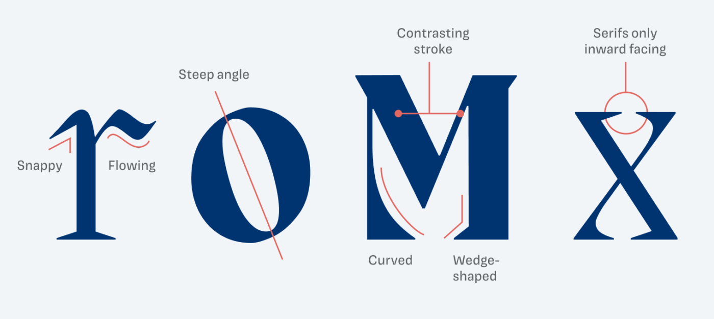
In itself, this might not seem so special, but you see how much Migra is breaking with conventions when comparing it to classic Times. Where Times plays it soft with a drop terminal, Migra goes wild. At letters with diagonals, Migra becomes even more interesting by only showing inward facing serifs.

Comparing the lower case “r” and “x” of Migra with Times. Migra has wedge shaped serifs, Times bracketed ones.
See how Migra breaks conventions by comparing it to classic Times

Because Migra is that expressive, I recommend using it only for a little text in larger sizes. That’s where it can emphasize your message, brand or headings ideally. For anything else, look for a nice companion.

Font Pairings for Migra

Migra is a dynamic, contrasting serif typeface. Among others, this lets it pair well with calm and legible dynamic Darkmode for body text.

Migra
Migra
  • Headings

Learn more about pairing typefaces using the Font Matrix.


Thanks to Jana for pointing me to Migra! Do you have another font recommendation I should share? Tell me in the comments!

Typographic power to your inbox

  • Font Friday: I recommend one typeface per week, free fonts included.
  • Type Tuesdays: articles & videos that up your design game.
  • Join 2500+ typography enthusiasts, unsubscribe anytime.
Edition #159, published

Leave a Reply

Your email address will not be published. Required fields are marked *