Sans-serif typeface

designed by Rasmus Andersson

Variable Font

2 axes: Optical Sizing, Weight

18 Styles

9 Weights: Thin to Black
with matching italics

Additional Scripts

Cyrillic, Greek

Best for

  • Headings (display text)
  • Long reading text (body text)
  • User Interfaces (functional text)

License

Free and Open Source

Specialty

Let your content go beyond UI text. With this updated version of popular Inter, true italics and optical sizing bring great advantages.

My Inter 4.0 font review

Inter on Font Friday? “What’s next, Roboto?” you might say. Made for Figma and used by countless others, Inter is one of the most popular typefaces for UI design. So not very original. But still, the update to Inter 4.0 is worth being explored, since it makes Inter look a bit less like … Inter. But is this good?

Rigid, Robust, Restrained. This is what we know Inter for, like a contemporary Helvetica. Not exciting, but robust. With a recent update, Inter 4.0 got more versatile and a slightly different flavor. It now supports optical sizing from text to display sizes and finally true italics. Making Inter less Inter finally with true italics, now in Large. In tiny sizes, Inter still performs very well when the stylistic set “Disambiguation” is turned on. But compared to previous versions, Inter 4.0 is also a bit tighter spaced in smaller sizes.
Inter version 4 now covers true italics, optical sizing, and new stylistic alternates.

The biggest change is that there now are true italics included, making the typeface a bit friendlier and softer. Originally, Inter was equipped with a slant axis, which more aligned with the aesthetics of a neo-grotesque sans-serif that Inter is.

True Italics for me? The previous versions of Inter were slanted. Not wrong, but feeling more rigid. Inter 4.0 now comes with true italics. They make it more organic and softer.
With true italics, the lower case letters like “a”, “f” and “e” change.

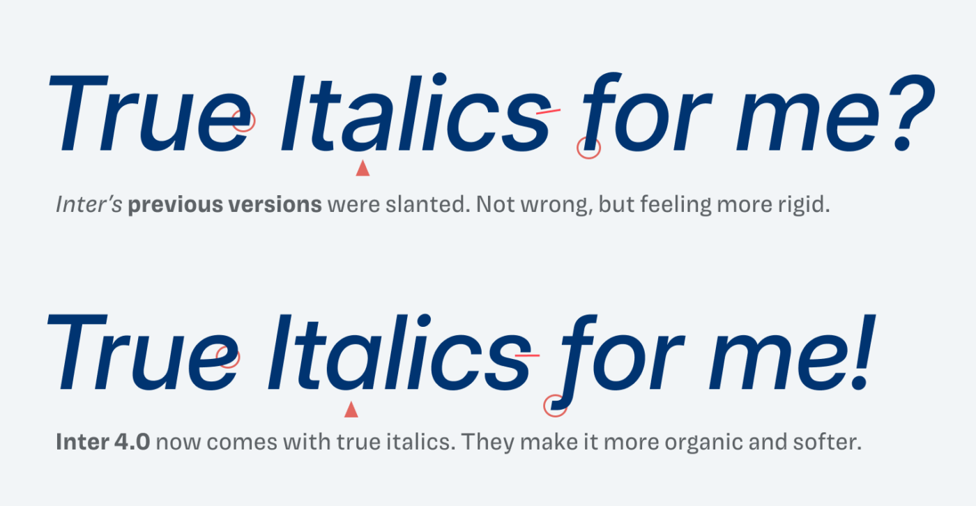
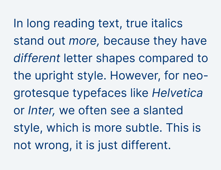
While the slanted style is more subtle, the true italics stand out more when used in long reading text for emphasis. Compared to its predecessor, this brings an advantage, making Inter 4.0 suitable for more text heavy applications now. But see for yourself by comparing these samples.

In long reading text, true italics stand out more, because they have different letter shapes compared to the upright style. However, for neo-grotesque typefaces like Helvetica or Inter, we often see a slanted style, which is more subtle. This is not wrong, it is just different.
The slanted style in previous versions of Inter blends in more.
In long reading text, true italics stand out more, because they have different letter shapes compared to the upright style. However, for neo-grotesque typefaces like Helvetica or Inter, we often see a slanted style, which is more subtle. This is not wrong, it is just different.
The true italics used in Inter 4.0 are a bit more striking.

One of Inter’s problems is, that it didn’t work in large sizes. As an interface typeface, it soon looks dull and tends to fall apart in sizes of 24 to 30 px and beyond. With version 4, the designer Rasmus Andersson addressed this issue by adding an optical sizing axis. The larger Inter becomes, the shorter x-height gets, while letter shapes close, and the spacing gets tighter. This results in a more refined look of your titles and headings.

Optical Size: 14 compared with 32. The previous versions seem too loose and quite dull in large sizes. Inter 4.0 is more refined and tighter spaced thanks to the optical sizing
Thanks to optical sizing, Inter 4.0 is now a fair choice for headings, too.

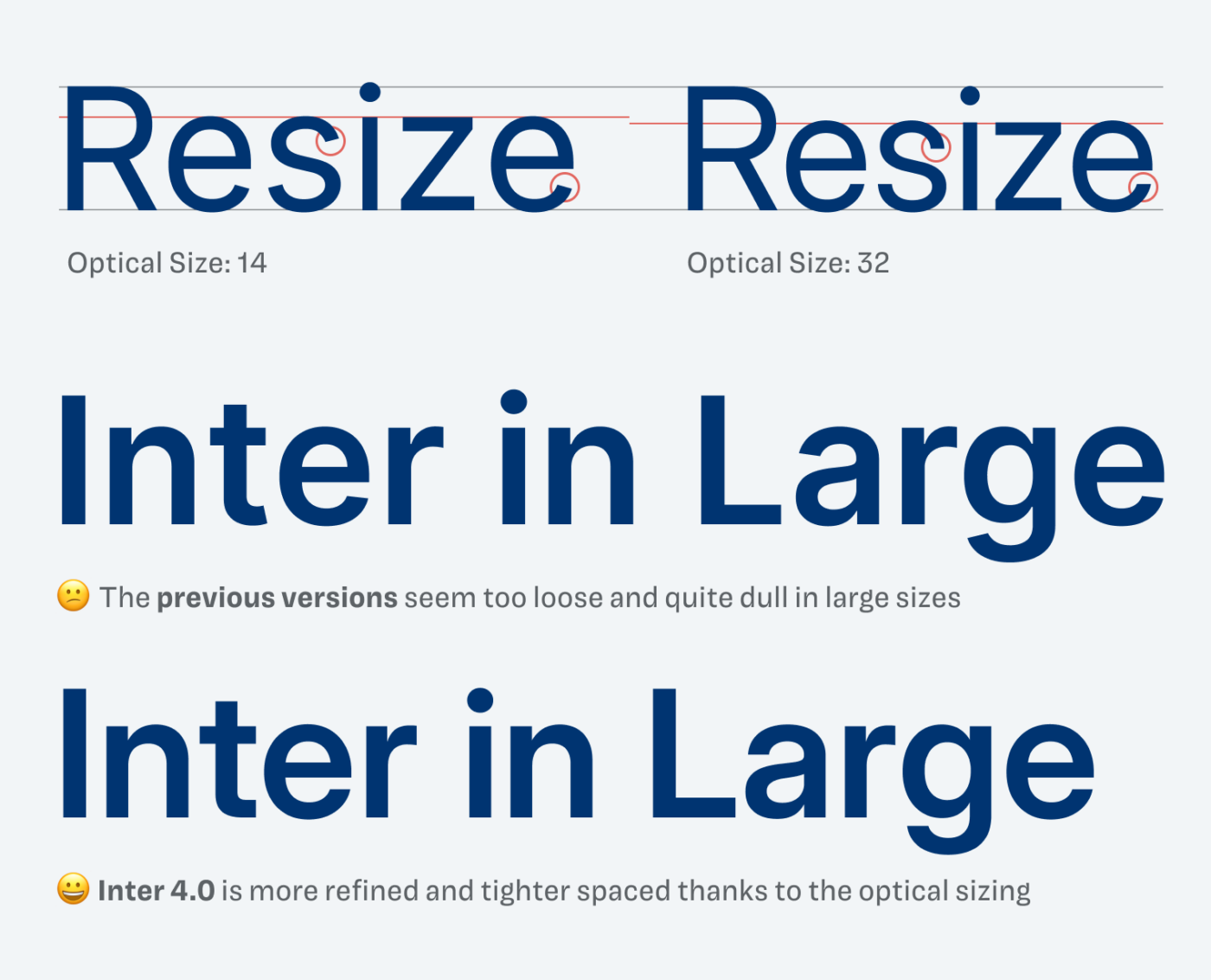
What’s an improvement for display sizes, might not be as ideal in smaller sizes. Inter 4.0 is tighter spaced compared to the previous version. Not dramatically, but you can sense it. So better increase the letter spacing in sizes below 14 px.

In small sizes, I feel like the previous version of Inter is a little bit better to read. It is a bit more spaced out. I recommend increasing the letter spacing below 14 px with Inter 4.0.
In smaller sizes, Inter 4.0 is a bit tighter spaced now.

New with version 4 are also some additional stylistic alternates, which can highlight that softer look established by the true italics. For supporters on Patreon, I explain a bit more about this, why I’m not so sure about these, and how to use them best.

How to use the new stylistic alternates of Inter 4.0 best. For supporters on Patreon.

Note that Inter 4.0 is not on Google Fonts, there you find the previous version. And due to all these updates, I assume that it will not be simply updated either. With the slant axis being removed, and the changed spacing, it would result in many possible text shifts and reflows.

Overall, these are some drastic changes. Not everything got better, but most things improved. Inter 4.0 will work for larger text and body text better, but for me, it remains a UI typeface. And since it’s so overused, I’d recommend combining it with something interesting.

Font Pairings with Inter

Inter is a rational, linear sans-serif typeface. For headings, you could pair it with the wild, dynamic, contrasting, serif typeface Migra, or quirky, rational, slightly contrasting, sans-serif Bricolage.

Inter (free)
Inter (free)
  • Headings
  • Copy
  • UI Text

Learn more about pairing typefaces using the Font Matrix.


How do you like the update? And do you have another font recommendation I should share? Tell me in the comments!

Typographic power to your inbox

  • Font Friday: I recommend one typeface per week, free fonts included.
  • Type Tuesdays: articles & videos that up your design game.
  • Join 2500+ typography enthusiasts, unsubscribe anytime.
Edition #162, published

Leave a Reply

Your email address will not be published. Required fields are marked *