It’s Q&A time! Is a font unpopular because it’s too popular? How to find out, and should you use it then? This article will help you solve your font picking dilemma, by illustration an actual use case.
Martin asks:
“Is Titillium Web rather unpopular? If so, why? I’m seriously considering using it as a headline font on Webdesign Journal.”
From a general perception, I can’t tell you if Titillum Web is unpopular. It is not a bad typeface, see more below, and definitely not hated, like Comic Sans. But it is very much used. So could it be unpopular because it is so popular?
How to find out if it’s a popular font
If it’s about absolute the numbers, and a Google Font, go to Google Webfonts Helper, and you’ll see straight away on which place in popularity a font ranks. If you want more details, check out the Google Fonts Analytics to see its usage in relation to other fonts.
Titillium Web is on Rank 36 in popularity of 1595 fonts in total, used on 740,000 websites. Quite many!
Is it bad that a font is popular?
If you pick a typeface that is heavily used, like Roboto, or Open Sans, you risk blending in with all the others. If you want that, all good. But if you want to stand out, better choose something more unique. But is Rank 36 really that popular? Compared to Roboto (Rank 1, used on 600 million sites) or Open Sans (Rank 2, on 110 million sites), the 740,000 sites suddenly don’t seem to be that much.

Hear this from the guy that said Stop using Open Sans: It’s not only about the typeface, it’s what you make of it. You can choose a vastly overused Google Font, and still win if you use it in an interesting way:
- Pick a certain weight or style that stands out.
- Use unexpected stylistic alternates.
- Or pair it with another typeface.
The combination can make a very common fonts cool again. When using them in different roles (e.g. headline, body text) it can elevate your design to higher grounds (more about pairing fonts).
Check if the vibe and quality fit
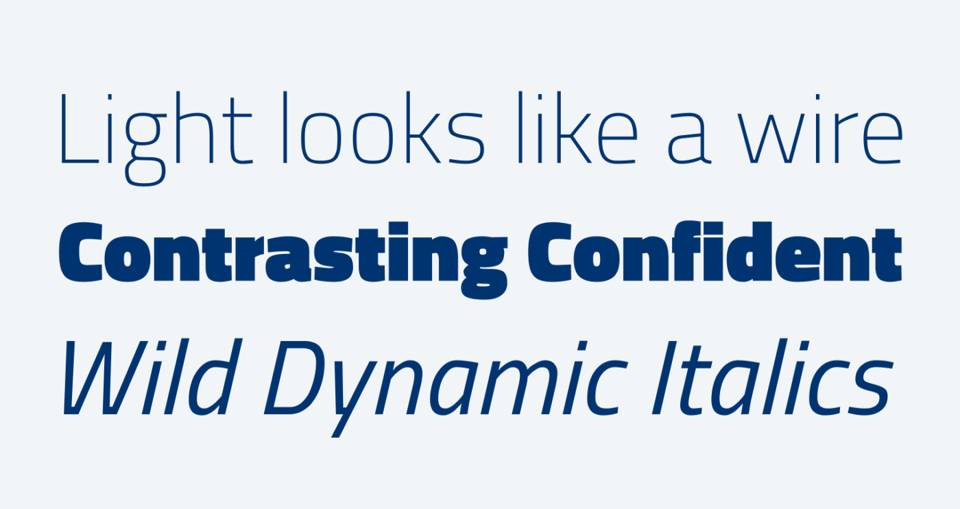
See if the mood the typeface sets is something you want to convey. Titillium is a nice typeface, I used it myself. It has a techie vibe to it, seems modern and cool. The Light weight reminds me of a bent wire, the Black weight is very confident with its tiny counters and heavy contrast. The typeface has a good drawing quality, is interesting enough to stand out, but subtle enough not to annoy.

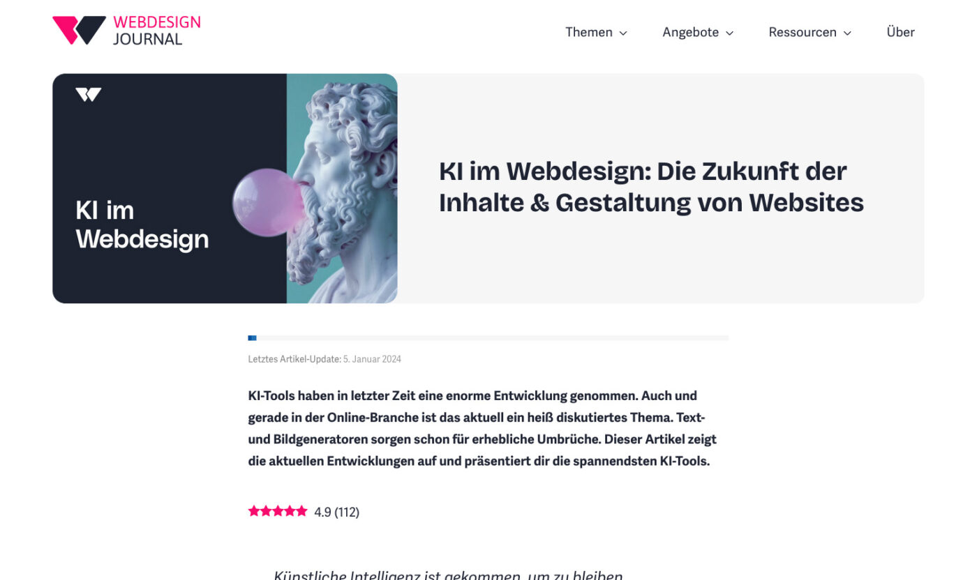
In Martin’s case, he would use Titillium Web for the headings and pair it with Adelle Sans for the copy. This works well.

So you can make Titillium Web more interesting. Of course, besides the feeling, there are also functional criteria that you should conciser.
Stand by your decision
If you want to use Open Sans, and Open Sans only, and you love it, and it’s the best – good for you (sarcasm off … I guess). The person that will question your decision most is probably you. If you want a second opinion and some ideas, I also offer coaching calls. But my adivce is to make up your mind, and then go with it, because reconsidering every decision in your design process will make it very cumbersome.
And what did Martin do?
Something totally different 😂! He picked Bricolage Grotesque, a quirky sans-serif font. That’s a great combination too, because it’s similar to the typeface used for the body text, but more eccentric.

See more about this in this Reel on Instagram or post on LinkedIn, where I also share how to adjust the width so that it fits more text into one line.
And what do you think? Are popular fonts a faux pas? How do you like Titillium Web? Tell me in the comments!

Nice post. I’ll add that even though Titillium [Web] is a nice Italian typeface, it’s difficult to use it on Italian websites…
The problem is that it’s now the official font for government websites!
See https://designers.italia.it/design-system/fondamenti/tipografia/
So, not only popular, but also a bit “boring” to us!
Oh 😬… well, that’s a good addition, Giovanni. How much impact one company or institution has, I did not consider in my post. I should add this: Depending on how and where it is used in a certain area and/or industry, might influence your decision 😉.
Hi Oliver,
I was wondering if Libre Franklin would be a suitable body font to pair with Titillo Web headings. What’s your opinion on that?
Great question, Maarten! Not so ideal 😅, but I’ll make a short video about that and explain it in the upcoming weeks! Stay tuned 😉.