A landing page is mostly text, and yet typography is often neglected! This results in an unnecessary barrier between your message and its audience. In this video and article we will review an actual sales page and redesign it. I will give concrete advice, that you can use to level up your own web designs with the power of typography.
Content before design
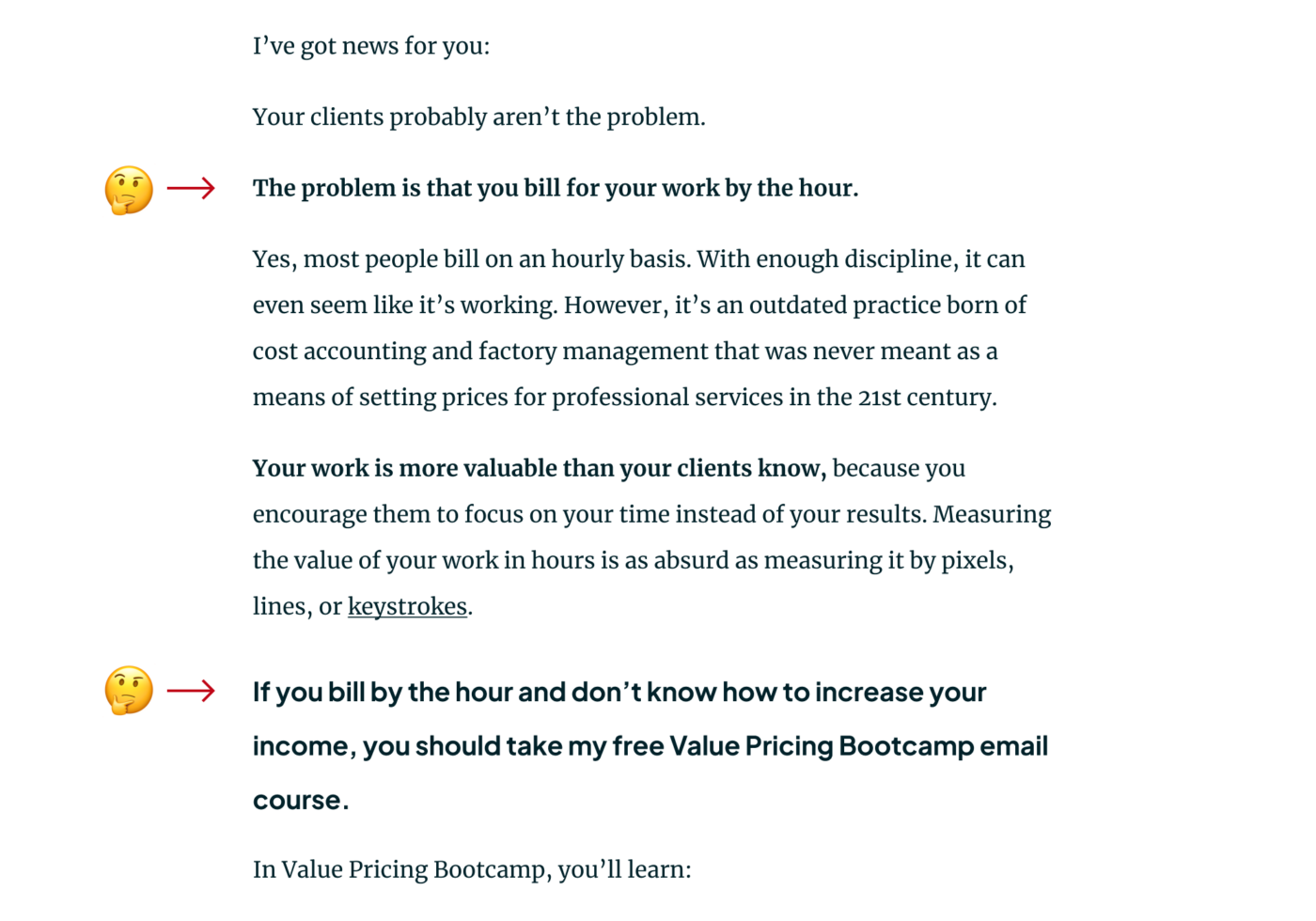
Before we can jump to the design, you need a solid structure and well-thought-out text. And Jonathan Stark – who submitted his website for typographic review – certainly does. His message is precise and clear. No wonder, he also teaches how to structure the text of an ideal landing page. I learned a lot from him for creating the content of my own sales pages, and his Sales Page 101 podcast episode gives you the essence.
This sales page design has some issues
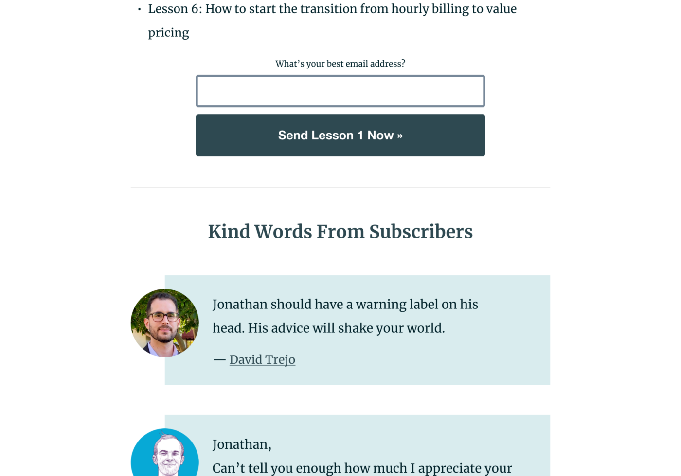
When it comes to the visual appearance of Jonathan’s sales page, there is quite some unused potential. Let’s take a closer look at it, and distill a few actionable tips from my assessment.
Problem 1
Very distracting from the page content is the flashy top banner, which is not connected to the primary call to action of the site. So decide what’s the most important element in the top section of the page and then design everything towards that, don’t distract from it.
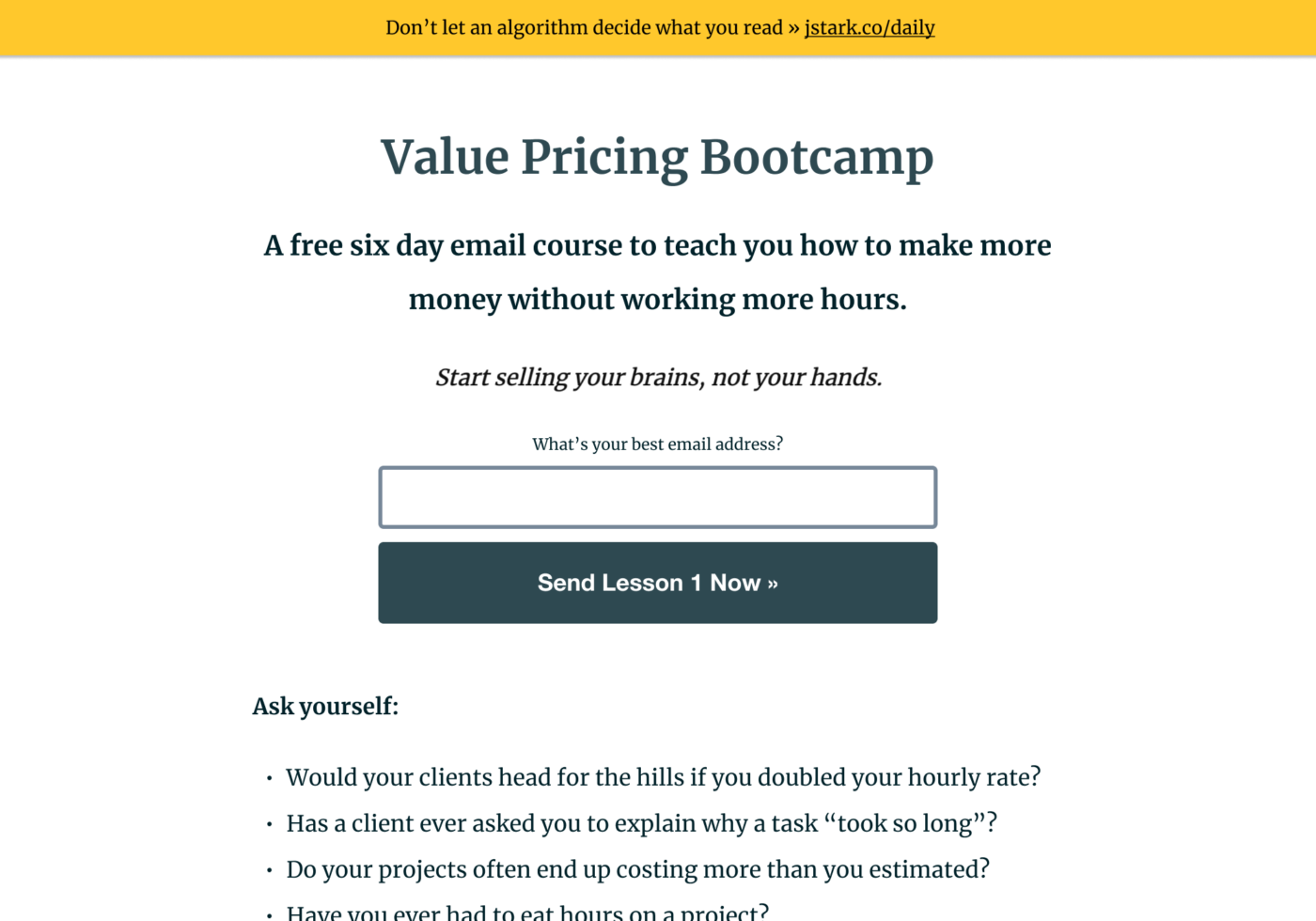
Problem 2
There are many different elements very tightly grouped together and therefor competing against each other:
- You have the H1,
- followed by another heading,
- some skewed artificially italicized 🫤 text,
- a sign-up form (probably the most important part),
- followed by bold body text,
- and an unordered list, where your eyes finally can relax a bit.
What already looks messy on desktop, is even worse on mobile, because there it is much tighter spaced, making it even harder to focus. This shows, you should strive to use as few different elements as possible.
Problem 3
Moving on, you see that hierarchies are not always that clear. Some text is formatted differently but not different enough, leaving you wondering if it’s body text or a heading. Try to make different things look clearly different, or similar things look the same.
Problem 4
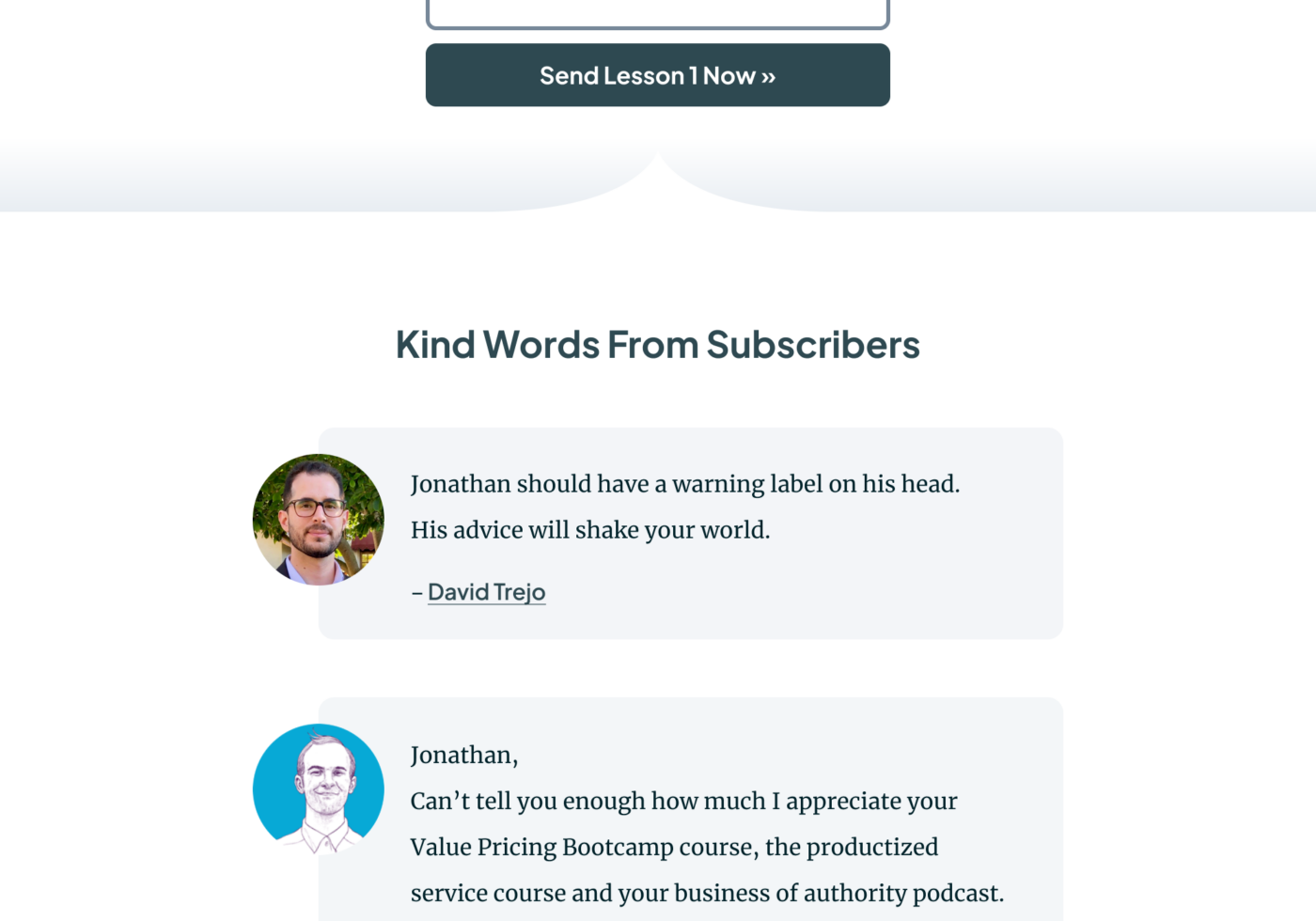
Even though, the testimonials work well, the various page sections blend together a lot. This is more obvious on other landing pages from Jonathan, where it is mostly text. To visually structure is better, I recommend making individual sections clearly stand out.
Assessing the type choice
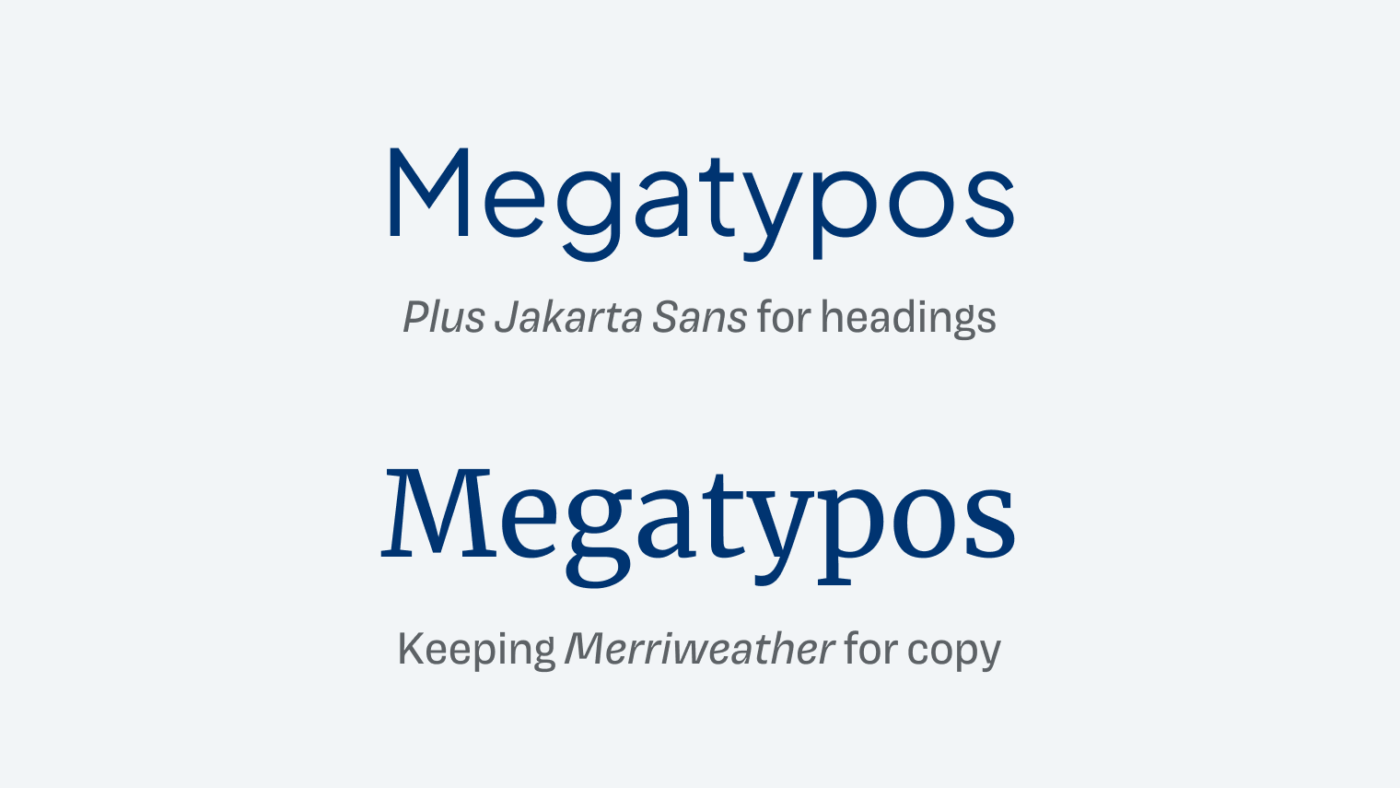
When it comes to the font choice, Jonathan uses Merriweather. Not a very unique or original type choice, but very solid and readable, performing well in body text. The downside is that he uses Merriweather for everything, which gives the site a somehow standard look.
My overall assessment
I appreciate the essential, no bull shit design, but in this case it’s not intentional enough to feel minimalistic. It kinda shifts towards looking untreated, while not giving the content the meaning it deserves. So let’s see how to pimp that type!
Refining the Basic Design
We don’t wanna get rid of the overall feeling of the site here, just refine it. Since Merriweather works well for copy, let’s keep it and pair it with a second typeface for headings. I picked Plus Jakarta Sans, a clean, geometric, linear sans-serif typeface with some interesting touches, that is so different that it does not get in the way of traditional Merriweather. I also reviewed Plus Jakarta Sans in the weekly Font Friday blog and newsletter.
Pairing these two typefaces already has a lot of impact on:
- the overall visual impression of the site,
- it makes the hierarchies a bit clearer,
- while giving the page a more nuanced look.
Next to the headings, I applied Plus Jakarta Sans to the big button, replacing the browser default sans-serif Helvetica. I also resolved the artificially italicized sub-sub-heading with Merriweather’s true italics. This is so much more elegant now ☺️.
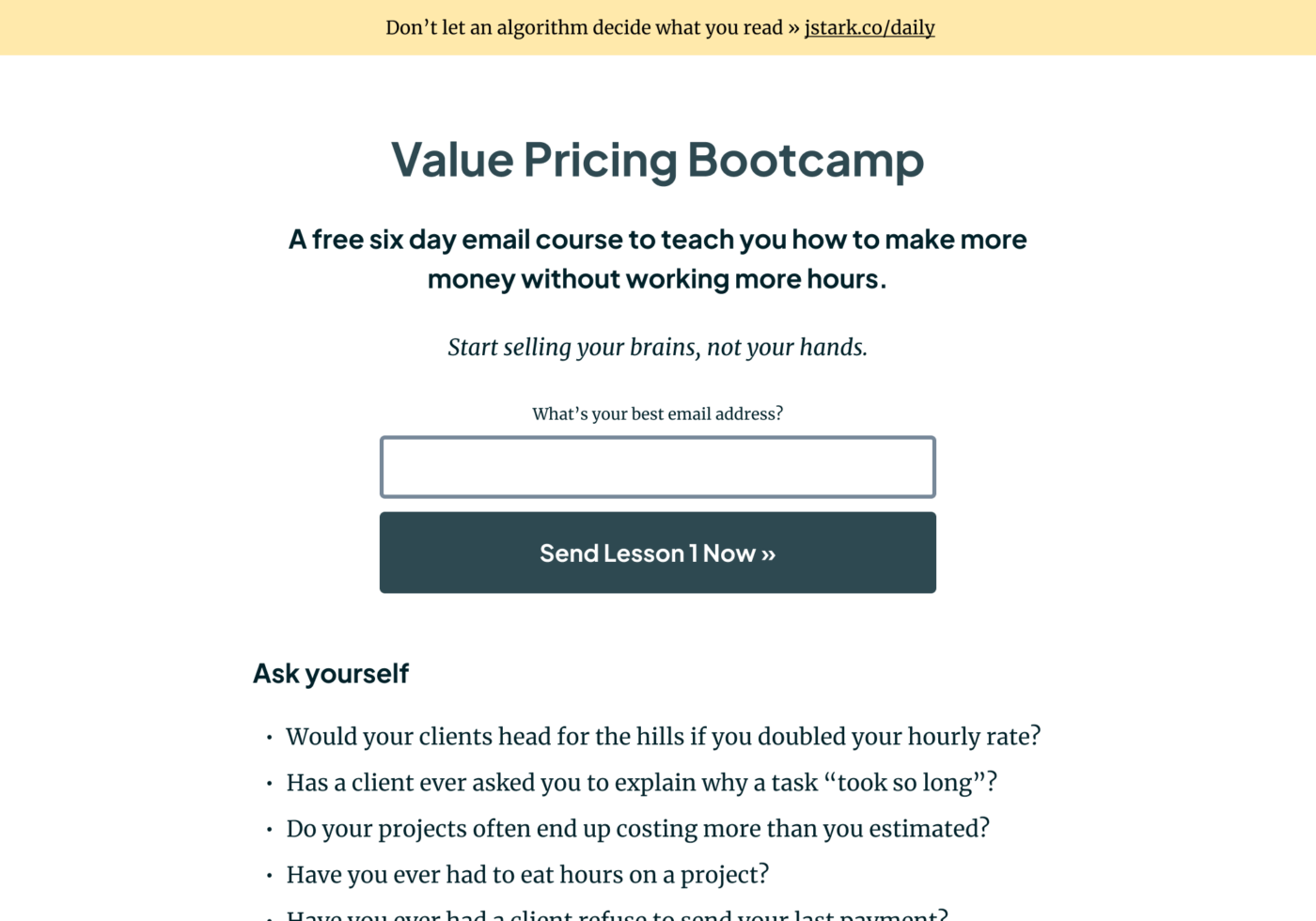
Now with these basics in place, time to put the first of four tips into practice.
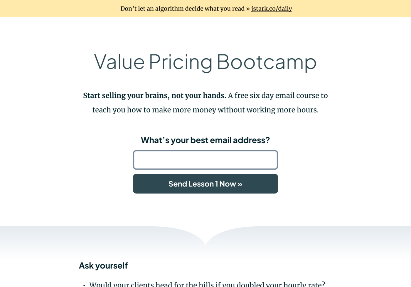
Tip 1: Highlight the most important element
Most relevant in the top section of the site is the form, but right now, everything is competing with the flashy banner. So before we can properly emphasize it in the next tip, let’s tone is down the banner by desaturating it and removing the shadow. It will still stand out because of its position and background, but it’s less distracting.
Tip 2: Use as few elements as possible
We also have an issue with the subtitle and the italic text below. It’s just too many different elements in too little space. Here’s what we will do.
Step 1
Let’s make the title more dominant by increasing the size, but also reducing its weight to Light, so I won’t feel that dull.
Step 2
Maybe the subtitle does not have to be a heading, and we could reuse the body text here? And the italic text, which actually nowhere on the page can be found again, could be a great opener for that subtitle, only set in bold.
Step 3
Coming to the important form, the label could be bigger so that it will introduce the CTA more prominently. I’ll reuse the style for the headings. Let’s also increase the border radius of the input and button, so it better aligns with the geometric shapes of the heading font, and make both elements more compact and give them the same height.
Step 4
If we double the space between our elements, everything has a bit more space to breathe, which gives the visitor also more room to focus.
Comparing it to the previous design, the redesign of the top section is way more streamlined. To see the next tip in action, we have to scroll down a bit.
Tip 3: Similar text should look the same
Even though the headings and body text are less similar now thanks to different typefaces, the bold copy could still be mistaken for a heading in the middle of the section. This is bad because, when headings stand out less, it hinders readers to easily skimp the page and find what they are looking for.
There are two approaches to solve that. The first one would be by formatting it differently. We could always combine the bold text with a paragraph. The second option is instead of bold body text in a single line, we could consistently use the H3 style. Let’s do that.
But still, it’s not as clear as it could be. And this is because of the spacing. The line height is way too loose for a heading, so let’s decrease it. And by doubbeling the space before the headings, things are more obviously grouped, which emphasizes hierarchies.
Even though the text of the second heading might be a bit too much, it now works much better.
Tip 4: Let sections clearly begin and end
This plays into hierarchies and grouping things as well. We already solved that quite a bit by adding more space between sections in step 4 of tip 1, and there are lines that additionally separate the sections. However, maybe we could do it a bit more interestingly? I’ll use a subtle gradient, sometimes with a pointy shape separator that additionally draws the eye.
When looking at it closer, the top section stands out even more, while giving the site a more sophisticated look. The pointed shape below the form gives visual clues to continue, and the form in the middle is more highlighted as well.
Bonus Tip: Reuse visual styles
When you look at the testimonials section now, it seems somehow foreign to the rest of the redesigned page. Let’s reuse our established design elements here, so it will better fit to the overall aesthetics of the site. We will:
- Pick a less contrasting background color taken from the middle of the gradient.
- Apply the rounded corners from the form to the box around one testimonial.
- Use the same font size from the copy (17 instead of 18 px).
- For the names, we will reuse Plus Jakarta Sans.
In context with the rest of the site, the important testimonals integrate much better better now.
Conclusion
The original design was not horrible at all, but it was not ideal either. With these changes, that mostly circle around purposefully using typography and spacing, it makes a tremendous difference. We did not change any imagery, nor did we rearrange the layout, an yet it goes a long way. Leaving a more nuanced and sophisticated impression of Jonathan’s site, that clearly guides visitors by perfectly marrying content and design.
So, when you revisit your own sales page, make sure to:
- Highlight the most important element
- Use as few elements as possible
- Make similar text look the same
- Let sections clearly begin and end
- Reuse visual styles where you can
If you want support in revamping the typography and design your own site, consider a coaching call. Also if you found this useful, please share it with a friend who might benefit from it!
Which of the 5 tips is most important to you? Or did I forget somehting? Tell me in the comments below!
I agree with all of your changes except removing the blue-green color from the testimonial boxes. I think choosing a tint of that color or desaturating it slightly would make it fit with a quiet and stately overall vibe while leaving a pop of contrast color so that everything is not so gray.
That’s a fair suggestion, Jill. Thank for sharing your thoughts ☺️!
🙌🏻Oliver! Thorough redesign, 360 approach.
These are all, in the first eye, subtle changes that lead to an efficient look. Just changing the header font and applying the same on the button makes a different feel that invites me in.
The sole change of the font reinforces how much impact fonts have on brand expression.
My question is, is it okay to decrease the line height in headings but keep the line height in body text?
This “Let sections clearly begin and end” has the most impact in my opinion but also “Reuse visual styles where you can” for consistency and cohesiveness!
Thank you for sharing this. You bet I’ll share this with the world. 5 ⭐
Yes, I think you should make the line height more compact with headings. When it’s the same size as body text and usually very close to it, you can make it a bit larger, since then usually more words fit into one line. The problem with large headings and large line heights is that they tend to fall apart, as it happened in the second heading here.
Thank you for going the extra mile 🤗
Thanks for putting this together, Oliver!
Thanks for your appreciation, Cloe! 🤩 Can you use it for a current project?