Jan wants to know what font pairs well with Bricolage Grotesque? He created a corporate design for a school and asks if combining it with Lato or Noto Sans would work. Let’s take a look at it!
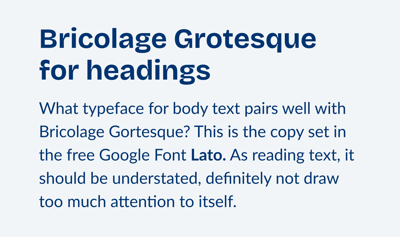
Bricolage Grotesque is best for headings
Bricolage Grotesque is very, very striking and interesting. Because of the strong contrast and the organic, unique letter shapes, it works brilliantly in headings. For long reading text, it would be too distracting, so it needs a companion. But is it Lato?

Before we can make up our mind, let’s examine Bricolage Grotesque. Even though it seems quite soft and wonky, when looking at its construction, the typeface is rather rational. Letters are fairly closed, looking at the “s” and the “e” and “a”. Also, the stems of the “M” are vertical.

Learn more about it in my detailed Font Friday review of Bricolage Grotesque.
You can pair it with Lato
Compared to Bricolage Grotesque, the letter shapes of Lato are a bit more open. Its form model lies between rational and dynamic, I’d describe it as a quite dynamic typeface (learn more about form models in the font matrix article). This is why it also comes across as gentler and friendlier.

The combination works, because it is similar enough, even though I would not use it very closely together.
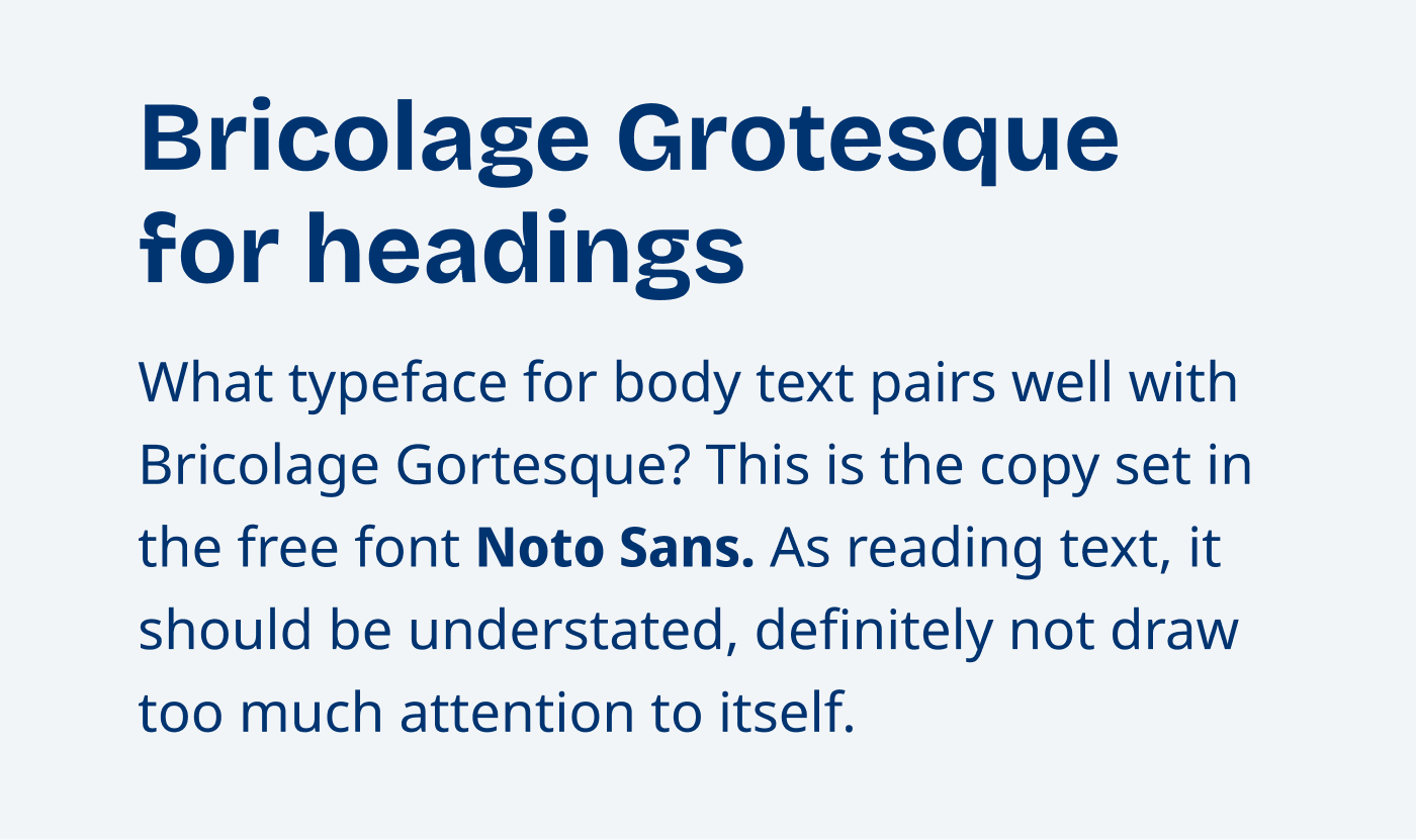
Don’t pair it with Noto Sans
When pairing it with Noto Sans, things look different. Compared to Lato, Noto Sans is a truly dynamic typeface with very open letter shapes.

And this is why I would not suggest this combination, but both form models are very far away. It is different from its construction, but then again very similar on first impression. And this is irritating.
Pairing it with Public Sans is even better
If you really want to stay in the same lane and use something that is like Bricolage Grotesque, only for body text, Public Sans would fit. It is also very rational, when examining the “e”, the “a” and “s”. Also the tone of voice is much more restrained.

I recommend this font combination when you look for a simpler Bricolage Grotesque. Overall it seems a bit stricter. When you want it to be a bit friendlier and warmer, use Lato.

And what did Jan do? He eventually settled for using Inter, which is – like Public Sans – a ration typeface. Good choice, Jan! If you want to become better and more confident in pairing fonts, check out my online course Pairng typeface like a Pro, but I recommend starting with the Font Matrix article.
Do you have a question? Put it in the comments or submit it here!
While Public Sans seems the most similar to Bricolage Grotesque, I envision Lato as a better counterpart because it provides the dynamic and, therefore, is more interesting.
Noto Sans? Without a soul, dry font? Nah😏
Well put! Both work well. Depending on how you want it to be.
Noto Sans = Open Sans 😉.
I think Figtree could also be a good typographic match with Bricolage Grotesque.
100%! That a great combination, Mikel!
What about Chivo? I love it with Bricolage Grotesque, I use them on instagram posts, they’re a very simmilar vibe but Chivo let’s me use italics and stuff
Thanks for your comment, Diana! In my opinion, Chivo is a bit too similar to Bricolage, so it’s a bit tricky to combine them. But if you’re using it in different roles and styles (like italics), it might work out!