Andrea sent in the web design of Wear Health for typographic review. While the hierarchies work well, and I understand the font choice for the mood he wants to create, I suggest removing the faux italics.
TL;DW: Faux italics are artificially created italics by the browser. They are distorted, without optical corrections, which is bad. The browser creates them, because the needed font file is not provided. If you want italics, add the file. If you don’t, then change the styling. But don’t let your fonts get hurt.
The design briefing
- The key audience is corporates and enterprises
- Their top 3 values are future, reliable, human centered
- The atmosphere of the website should be future, industrial, resilience
Font choice
- Martian B for the headings
- Mule/Mulish for the body text
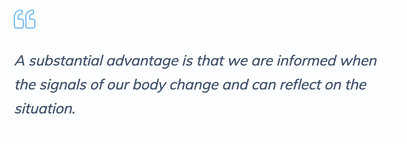
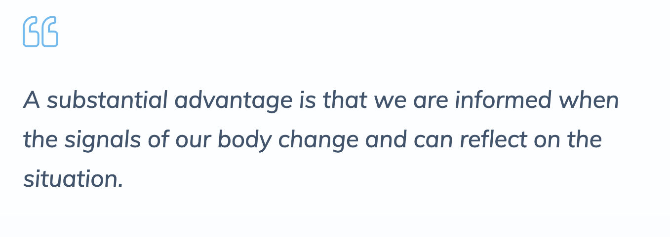
Faux italics look off
Of course, you have to have an eye for it and with the typeface Mule it’s particularly hard to recognize, since the true italics are very subtly. But once you’ve seen it, it will haunt you. My recommendation would be loading the proper italic fonts or styling the quotes differently, by using the upright.
What’s your opinion on this? Happy to hear your thoughts in the comments blow! Here you can submit your design for a free Type Check.
Sharp eye to recognize the faux italics on a sans serif.
Thank you, Matt 🤓!