My thoughts on Plus Jakarta Sans
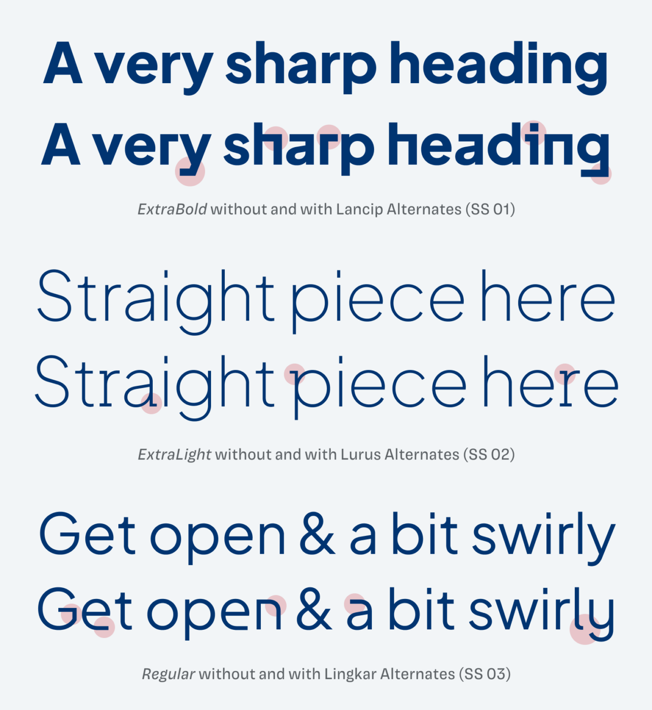
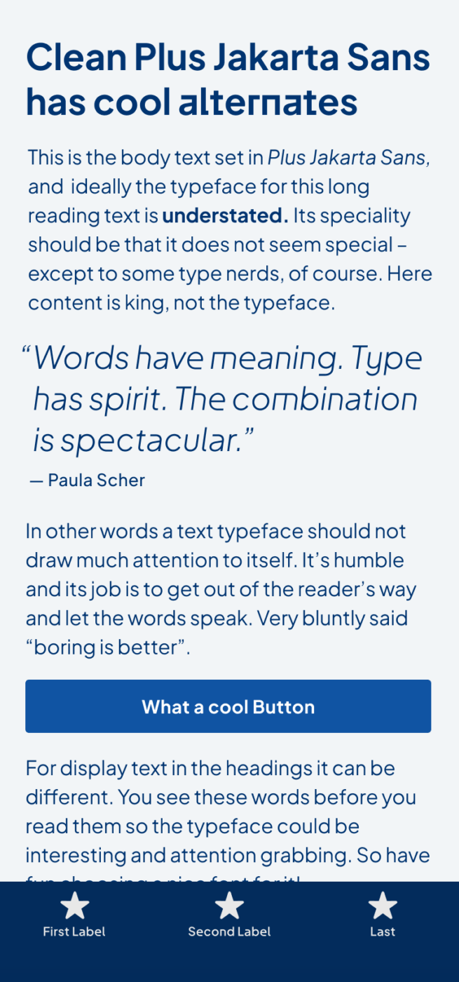
Geometric sans-serifs are appreciated for their cleanness, calmness, and claimed neutrality. But they have been very popular in recent years, so you might say: “Come one, not another geometric sans!”. But Plus Jakarta Sans has something, that helps you break out of the uniformity, when you want to. It’s a free variable font, also available on Google Fonts, and was designed by Gumpita Rahayu from Tokotype. What makes it special are the various stylistic sets it comes with. Activate them via OpenType features, and see how they totally change the mood of the typeface.

The Lancip alternates (which means sharp) turn rounded tails or descenders (y, g), and shoulders (n, h, r) into hard edges. Lurus alternates (straight) add little serifs to a few letters (p, r, a, j) and make it a bit more stable. This is the most subtle adaption. And the stylistic set 03, Lingkar (swirl) make everything more rounded (y, u, n), but also opens up the apertures of the a and e. This could be helpful and clearer in smaller sizes. So plenty of room for discovery, especially in display styles. For continuous reading, the alternates they might be too distracting or bulky.
Recommended Font Pairing
I recommend mixing this geometric, linear, sans-serif typeface with Rowan, a dynamic, contrasting, serif typeface.
- Headings
- Copy
- UI Text
Learn more about pairing typefaces using the Font Matrix.
What do you think? Is Plus Jakarta Sans something for an upcoming project? Tell me in the comments below!


I am a little confused on this one. It says above that it is free, but costs $64 (web & app), which I took to mean free for desktop only.
When I visited the GitHub page and also on Google fonts I could find no reference to any licensing costs or limitations. In the licence section for the font at Google it says “You can use them freely in your products & projects – print or digital, commercial or otherwise.”
Have I missed something?
Sorry Ashley, I have missed something 😅. It’s free. I wrongfully did not update that section when I copied it from a previous post. You can use it anywhere for free.
Its compact, rounded letters are so colleaguesque, working as a single force. A little from Roboto and a little from Karla, than Bariol serif in ‘r, f’, anyone?
But there’s is something sophisticated in Jakarta, Oliver, isn’t it? Besides being a sans serif sterile species.😁 Something refined… On top of that, a surprising effect from the alternates is just🍒 Love it, take it! The interesting thing is, I read your Newsletter on mobile-first, then on the desk now. It looked much better on my phone. I think it’s a good solution for UIs.
Plus Jakarta Sans mdxcbiodnxvkdiwpaeoa com’ oooon, what’s the name? Okay, it’s free anyway, it’s worth… so I’ll forgive them this bad naming.
Thanks for your thoughts, Jana! I think the naming is Indonesian. It’s definitely unusual 😉.
This one is such a beautiful font. My only concern was the width of the space. I felt like words were not spaced out enough, especially in longer text.
Interesting perspective, Carl! It could become a bit blurry in smaller sizes. But if it’s on a website, you can correct that with CSS using the
word-spacingproperty.Thanks for the reply. That would definitely be the ideal solution. And I could also set the minimum word-spacing to 120% in Adobe Indesign.
Will look into it!
Thank you
Its a great font. I’m currently trying to gind another free serif type to pair it with. Any insight ?
Happy you like it, Raul! It took some time, but I just updated the article with a section for a recommended font paring 😉.