
My thoughts on Rowan
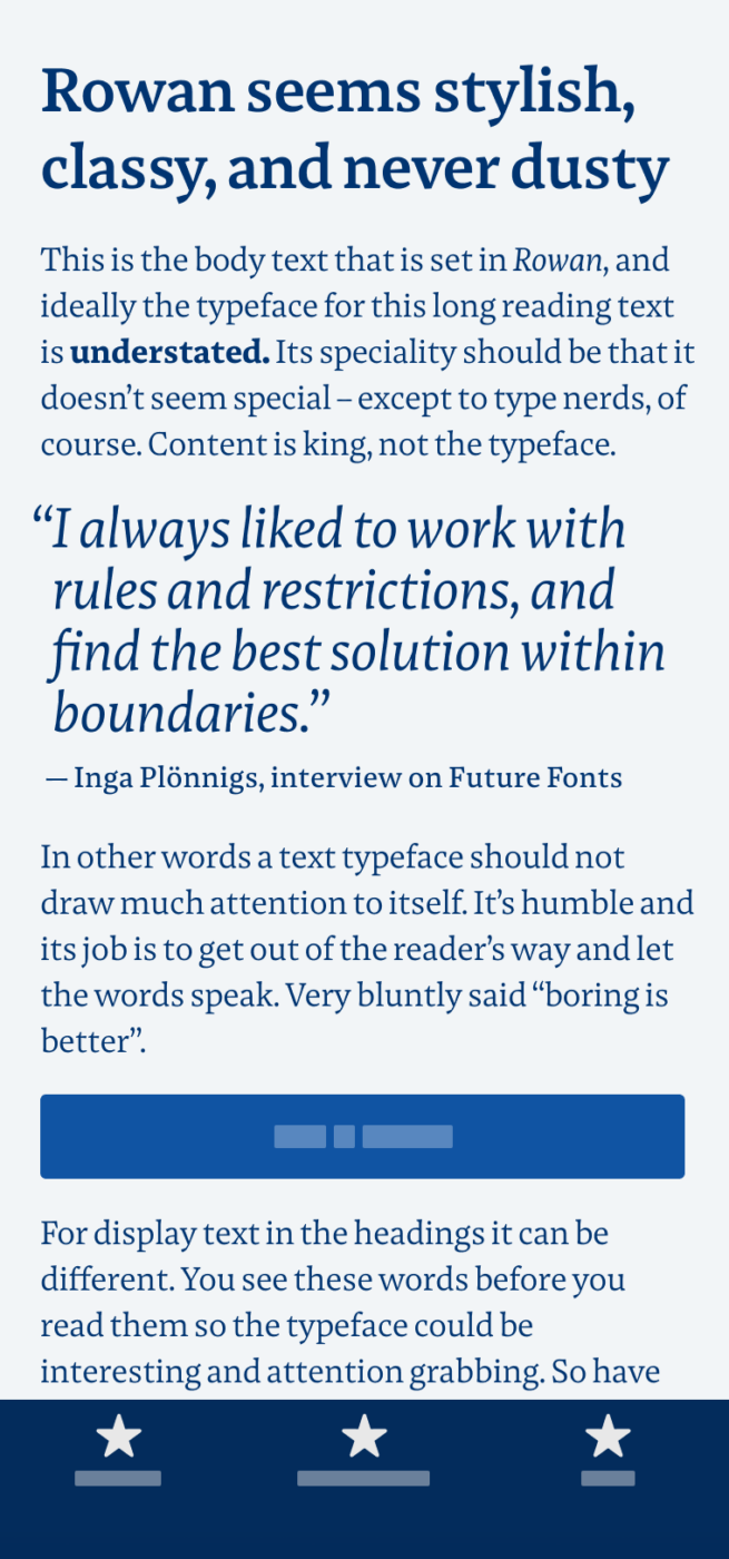
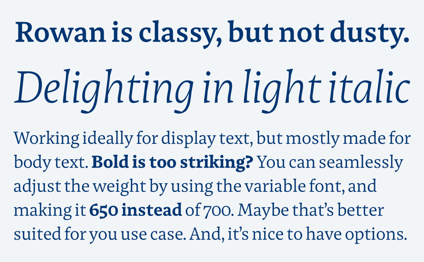
The stylish free serif font Rowan is delightful for several reasons. It has something traditional, warm and classy. But not in a dusty or old-fashioned way, it seems fairly sophisticated and contemporary. The moderate contrast and slightly edgy design contribute to that, giving it a unique, but not distracting appearance. All that with the capabilities of a variable font.
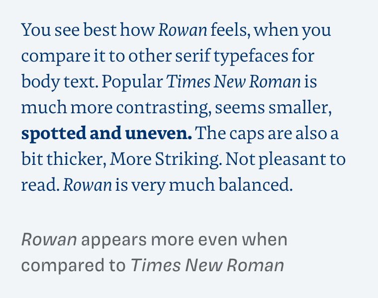
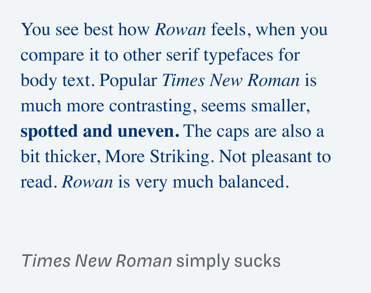
When it comes to evaluating if a typeface is suited for a certain application, a good approach is to see how it performs versus other popular choices. Comparing it to Times New Roman, it becomes evident how uneven, spotty and unsuited this overused classic is. Especially for body text and on the web. Rowan appears sturdier, and more readable.
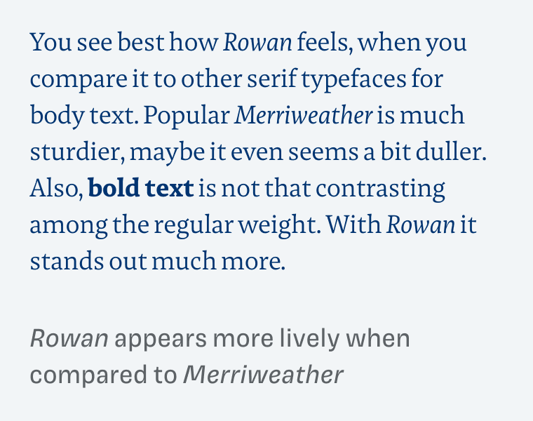
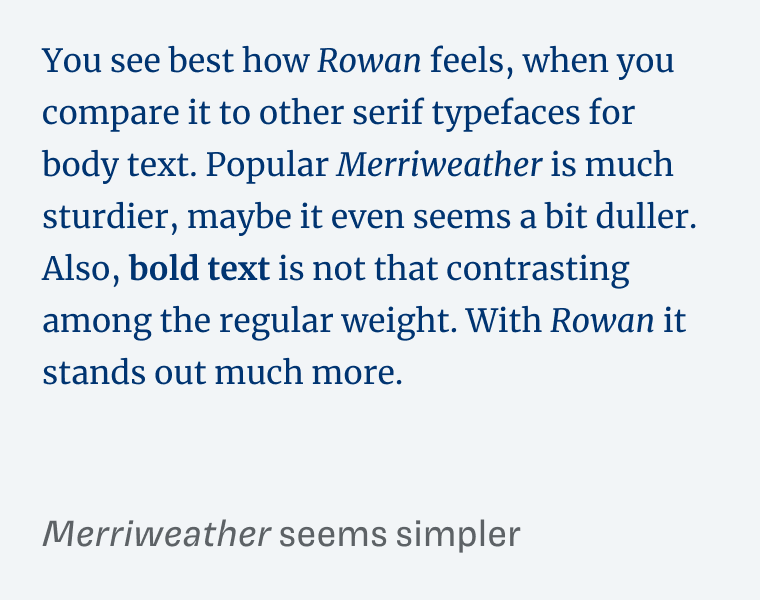
But when compared to the popular Google Font Merriweather, Rowan suddenly almost seems delicate and tender, while the bold text stands out stronger among the Regular weight. So between these two overused extremes, Rowan claims a more unique and practical middle ground.
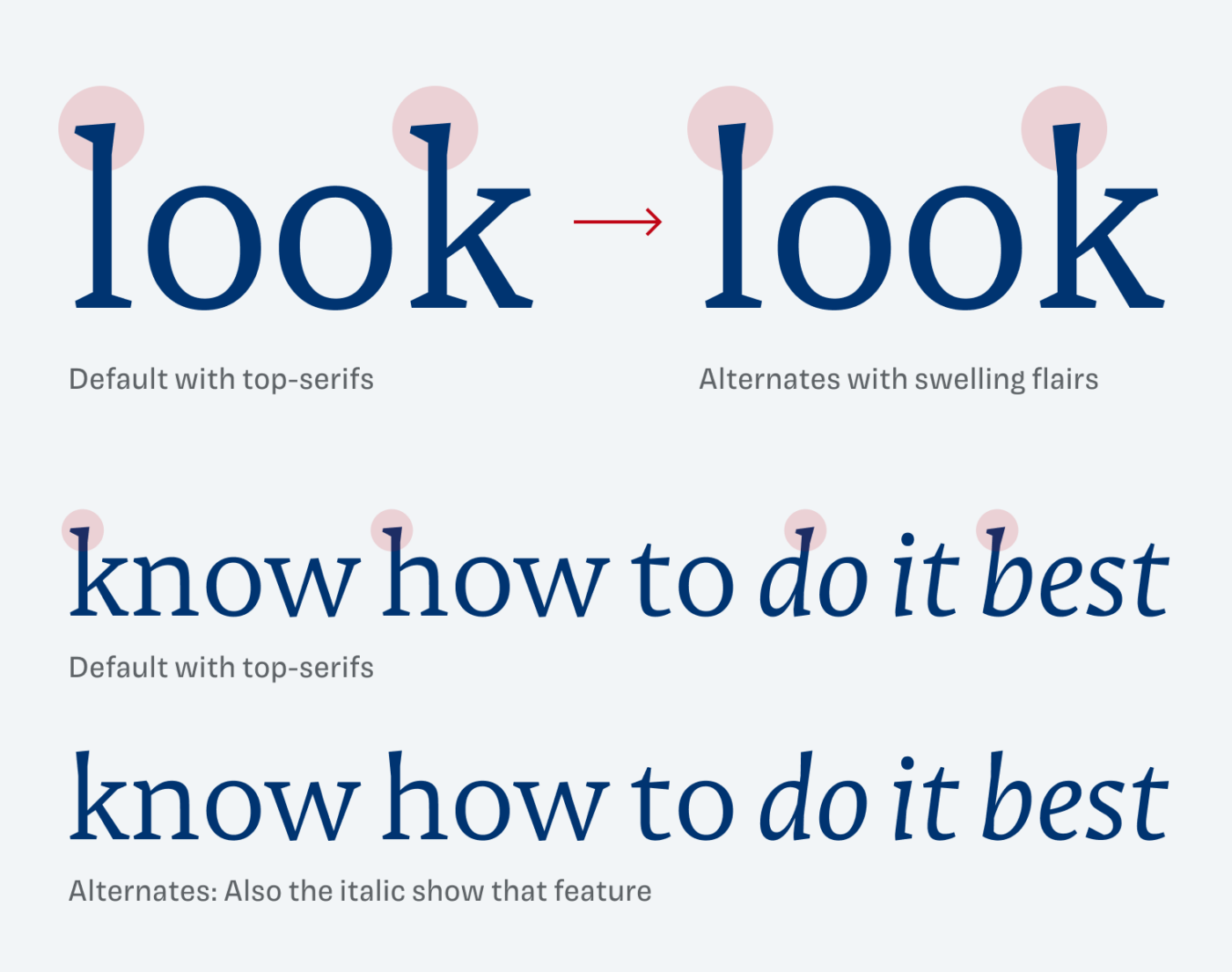
An adorable little feature are the stylistic alternates that remove the top-serifs of certain ascenders, turning them in to swelling flairs at the top of the stems. I can imagine this being useful for headings or other display text. For long reading text, I recommend avoiding it.
Quick side note, Rowan was designed by Inga Plönnings, the same brilliant woman behind Magnet (the typeface on this site used for headings and captions). So if you need a traditional but not dated typeface for your next copy or headings, Rowan definitely is a good way to go.
Recommended Font Pairing
Looking for an interesting typeface for headings? Choose the eccentric stencil typeface Ella. Or make it more modern by combining it with geometric Plus Jakarata Sans.

- Headings
- Copy


Learn more about pairing typefaces using the Font Matrix.
Many thanks to Lorcan, who is also a valued Patron of Pimp my Type, for suggesting Rowan to me. If you found a great typeface for an upcoming Font Friday, write it in the comments 😉.
TNR is elegant while Rowan (what a nice name) is a noble, modern guy with an attitude and grounded.
I don’t like Italics though.
With quirky top serifs, it’s so compact when we look at a whole word. Fav letter, little y!
I’m happy that PimpMyType as a personal brand is finally growing, well-deserved. I dream of becoming a small ⚙ of it once it grows into a world-famous brand 🤩
Haha, that’s so lovely from you, Jana! Well, you are part of it since … since the tiny seed. Now it’s a small seedling 😉.
Thanks for the shout out!
Inga Plönnigs is also responsible for another free font on Fontshare, the bright sans-serif Plein. I also really like how her edgy Messer looks on Future Fonts. I would be interested to hear what you think of it .. maybe a future choice 🙂
Nice, nice. I have the feeling, that it won’t be the last time Inga appears on Font Friday.
I quite like Rowan but find that the space between words needs to be increased for long text. Have had to stop using it on kindle because it can’t be adjusted there. It also taught me that MS Word has no function for this.
(Source Serif is the best I’ve found so far for kindle. Need to open the .otf up and see how many kerning pairs – suspect relatively few because the letter spacing looks good to start with. )
That’s interesting with the word spacing … Yes, word does not offer that while it’s so simple in CSS, and InDesign 😉.
Wieder einmal danke ich dir für den tollen Tipp.
Aber gerne, Lena!