

My thoughts on Magnet
What drew my attention to this extravagant beauty was – of course – the crazily compressed Backslanted heading style, as seen on top of my example. What then convinced me was the very robust Standard style, but one by one. Magnet is a quite fresh release by Frere Jones Type, designed by Inga Plönnigs. The sans-serif type family has a very unconventional energetic feel to it with its two styles.
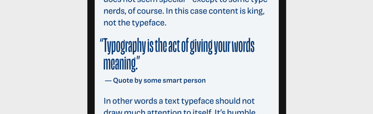
The compressed heading styles are fun, intriguing and can create a lot of atmosphere with its three angles (backhanded, upright, and slanted). For usage in digital applications you really only can apply them at a fairly large type sizes. (in my example it’s 72 px for the heading). I tried to set the pull quote in Magnet Headline at 40 px, but it just does not work, it gets too dense and hard to read. I suggest using it for very short, large display text only.
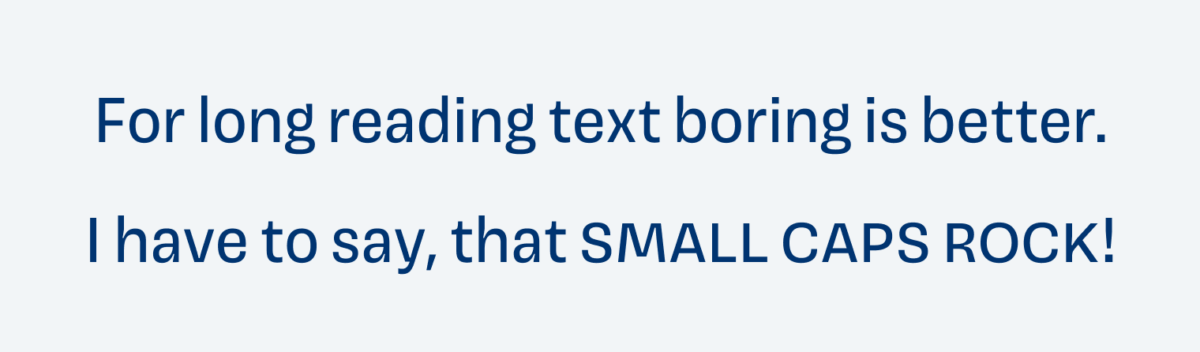
Magnet Standard has a large x-height, the letters are distinct enough (not super distinct if you do the Il1 test), and are designed with sturdy strokes. This make it suitable for your app or UI design. Some letters are more attention grabbing, like the lowercase g with its upwards pointed ear. But overall it’s not too much, so it can work in longer reading text without being distracting. I would not use it in super text heavy applications though. Magnet Standard comes with a lot of handy features, like small caps, tabular figures and old-style figures, and some alternate forms for specific characters which make it very versatile. I have to say, that small
Overall Magnet is a great blend of dense and loose, thin and tick, straight and angled. It has some unique characteristics but still is restricted enough in its Standard style. I see it best in display text and functional text for an app or UI.