
My Beatrice Font Review
The sans-serif typeface Beatrice by Sharp Type is extremely contrasting and unusual. Why? Because this super-family sets its own rules for contrast. It does not follow the standard, where horizontal lines are thinner than vertical ones. Neither is it a reverse contrast typefaces, like Stadio Now or Antipol. It is something different.
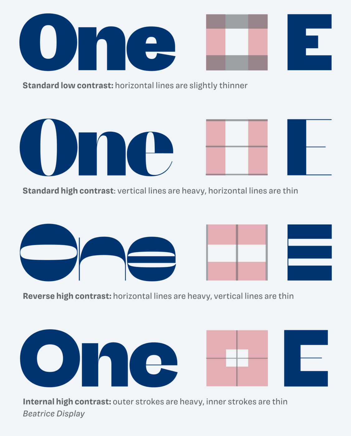
For Beatrice Sharp Type coined the term “Internal Contrast”. With this system, stroke emphasis is set by the location of the stroke in relation to the center of the letter-shape. Outer strokes are thick, inner strokes are thin. This results in a charming, playful and striking typeface.
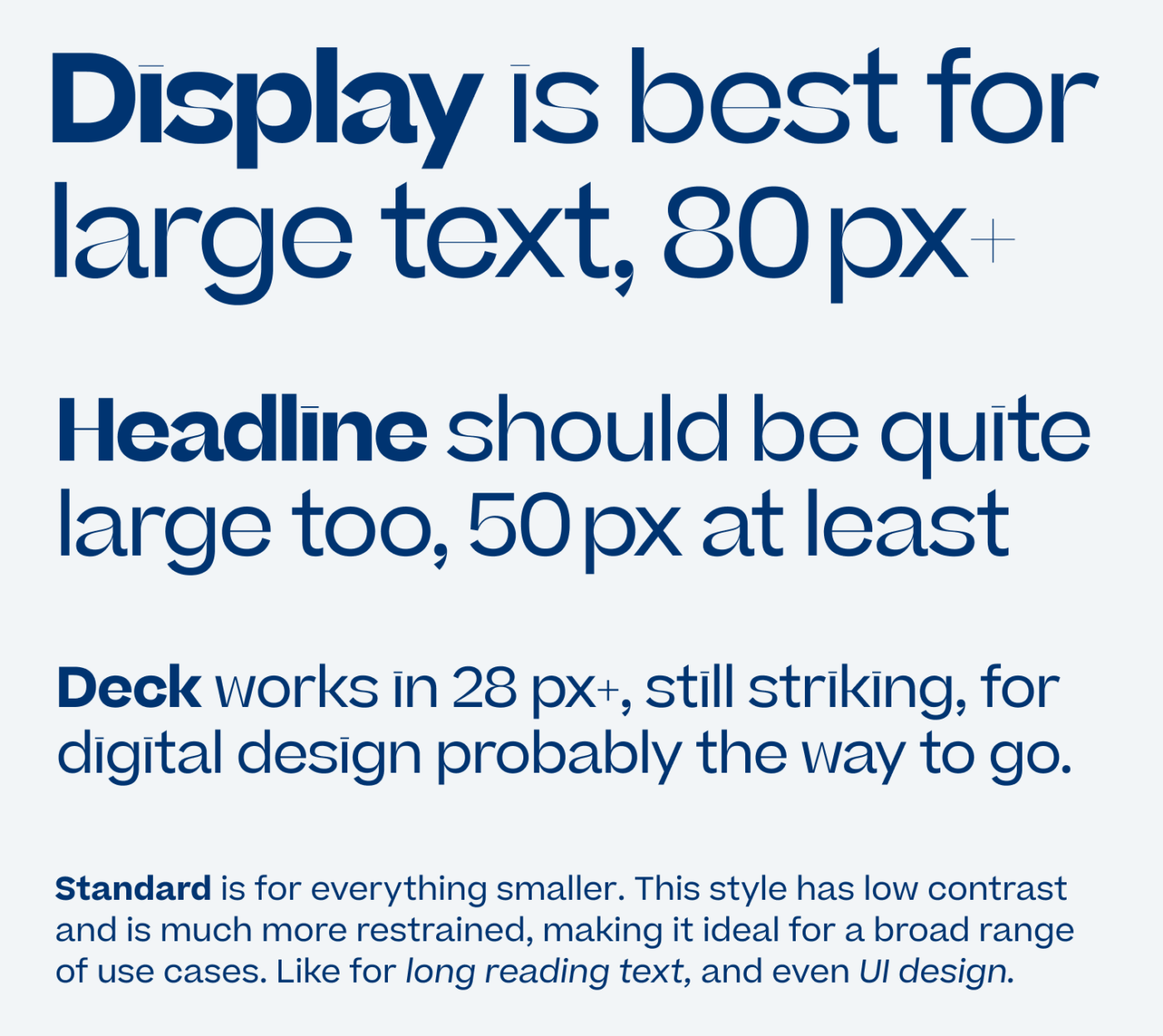
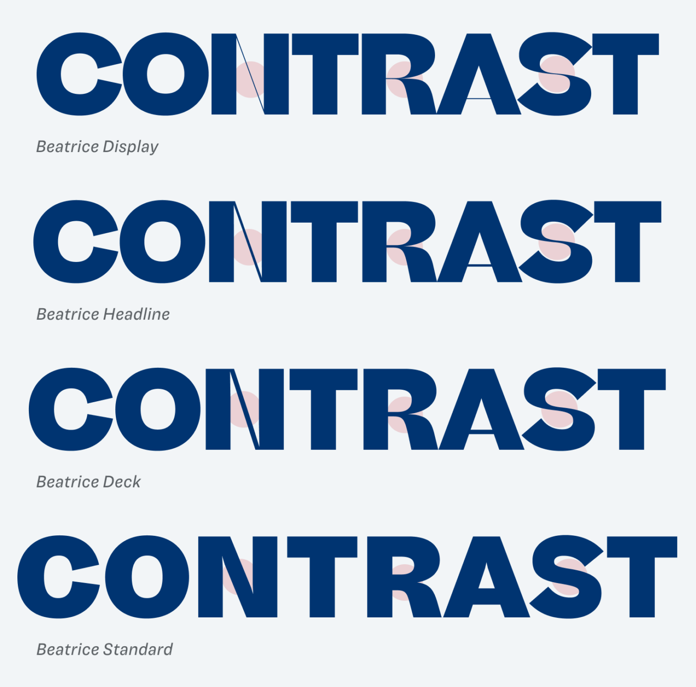
And since high contrast only works for very large text, Beatrice comes in four different optical sizes. Display is the most flashy, with its hairline strokes, and should not be set smaller than 60 pt or 80 px. This makes it rarely useful for web design. Luckily, there is also a Headline and a Deck style, which work in sizes between 30 and 80 px.
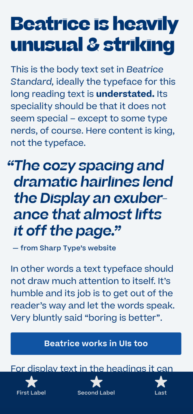
When it comes to body text, Beatrice Standard is the way to go. It is almost calming, not so say boring, but that’s what it’s supposed to be here. The large x-height and the study shapes make it very versatile, even for UI design.
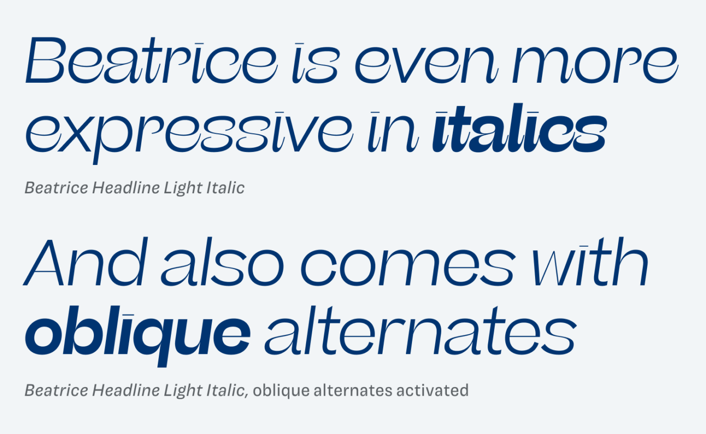
Another thing worth highlighting, are the expressive italics. They are very organic and playful, breaking what is expected from a typeface that is built upon the foundation of the sober American Gothic. If that is too much for you, Beatrice also comes with oblique alternates. Overall, a typeface with heavy opposites and surprises, shining in loud identity projects, and still performing in quiet copy.
Font Pairings for Beatrice
This rational contrasting sans-serif typeface has so many styles, that you definitely will get most out of it when you make use of the Beatrice superfamily. However, if you want to give an even weirder twist, pair it with Kyiv*Type Sans.

- Headings
- Copy
- UI Text


Learn more about pairing typefaces using the Font Matrix.
What do you think of this week’s typeface? Write it in the comments! Also, if you have a suggestion for an upcoming Font Friday 😉.
I’m overwhelmed by the beauty of maDame Beatrice😱
Straight to the list of this year’s favorites!!
Happy Easter to your family 🎉 Next weekend is the Eatser in my country.
Back to Beatrice, I can’t choose which option is the best. Italic is surprisingly super, which I didn’t expect from such a heavy-lifting, pardon, type! Oblique alternates are a true masterpiece.
Even in the Display version the contrast between thick and thin works, despite being opposite. And it’s not grumpy.
words: “large” where a, r, and g dance, then word “oblique” where i is an identity itself…
So many breathtaking details, thank you for this delight, Oliver!
Here are some suggestions to explore and maybe see in the future FF👇🏻
Lenora
Noe Display
FS Siena by Fontsmith
Have a fun little holiday🙌🏻
“And it’s not grumpy.” 😂 LOVE that, Jana! Lenora has wonderful contrast, too! Noe Display is a bit more aggressive, but still appealing. FS Siena, very noble in its simplicity. Thanks for the suggestions!