My thoughts on Pritzious
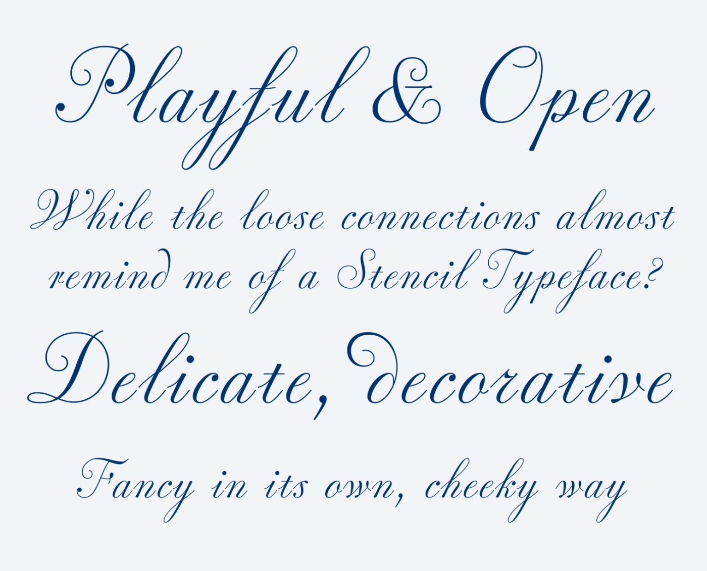
I love it when a typeface embraces a limitation, and makes something interesting out of it. Pritzious by the Italian designer Valentina Casali, released by CAST Foundry does exactly that. Based on historic scripts around the 1760s, it is so unusual, because it is not connected due to technical limitations of that time.

Valentina exaggerated that by intentionally opening the connectors of some letters. Something you normally would not see, since most script typefaces wants to imitate fluent, calligraphic handwriting. Because of that unexpected feature, at times, it almost feels like a stencil to me.

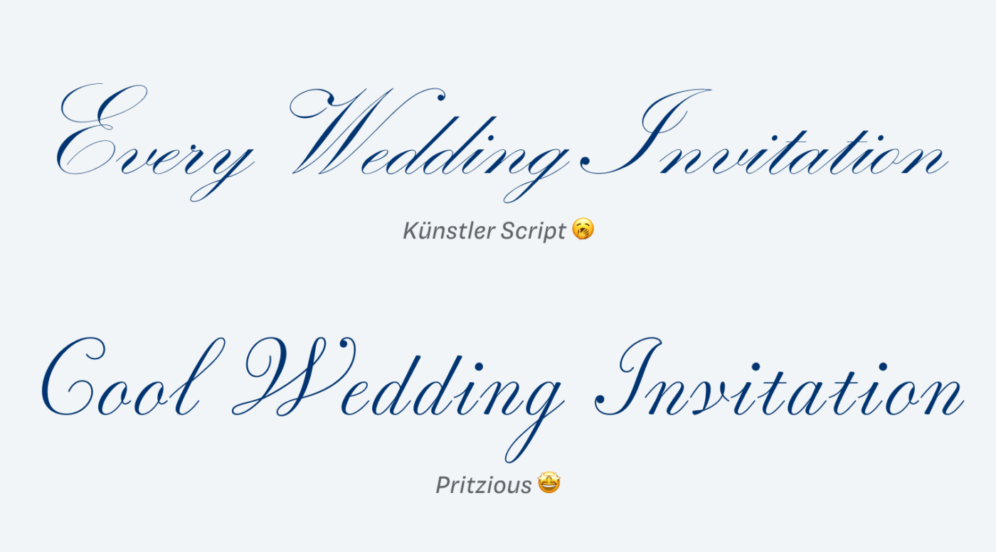
So these loose connections give Pritzious a more casual, contemporary, even cheeky vibe. A certain airiness, and charm, that is only highlighted by the delicate and playful letter shapes. You’ll get what I mean when comparing it to other script typefaces. See below and yawn.

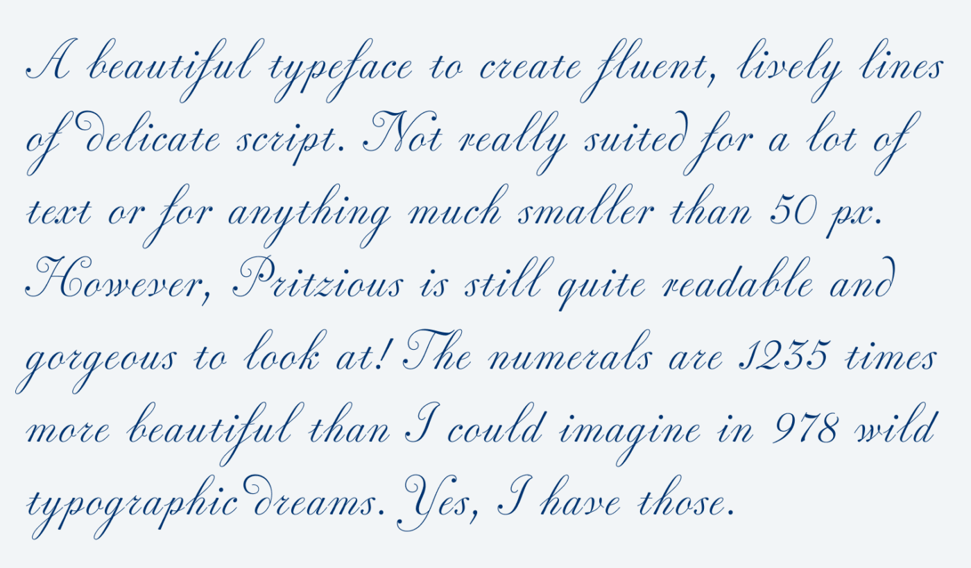
When it comes to the application, Pritzious it is made for display text, the larger, the better. I recommend not setting it smaller than 50 px on screen. Thanks to the open design, it is more readable than other script across multiple lines. Still, use it for a little text only.

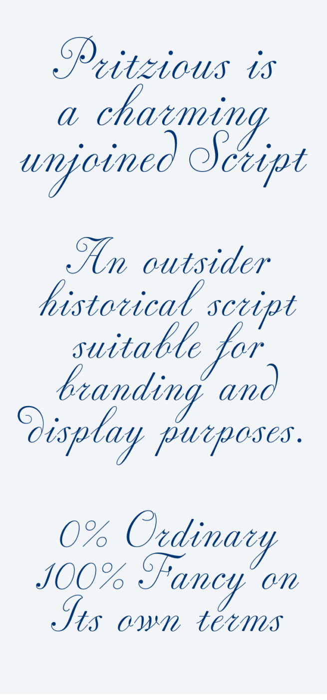
Pritzious comes with a few stylistic alternates, initial and terminal forms, and additional swashes for the uppercase A and K. Also, the numerals are so beautiful to look at. It is a typeface made for elegant but playful moments. I recommend it for brands or applications that should feel fancy, but with a contemporary touch and a certain twist.
Font Pairings with Pritzious
Pritzious is a contrasting script typeface, only suitable for larger sizes. Pair it with one of my suggestions for body text.
- Headings
Learn more about pairing typefaces using the Font Matrix.
What do you think of this week’s typeface? Write it in the comments! Also, if you have a suggestion for an upcoming Font Friday 😉.


I cannot describe it correctly, but it very aesthetic but still kinda unreadable. Or like really hard to read. But i think that fits for almost every Script Typeface.
But sometimes you just want to have something aesthetic, because everyone knows thats a Wedding Invitation and just has to look beautiful. 🙂
Gotta dress for the occasion 😄. Absolutely, Patrick. It still is hard to read, easier than other script typefaces, but compared to a simple sans-serif, definitely a challenge 😉.
Oliver, Thanks for this!
I would love more reviews of script fonts that are connected with contextual ligatures–but I understand the audience may be limited.
Let me see what I can come up with, Scott. But it will probably take some time 😉.
I notice that it is currently used in the banner of Typographica.
Right! Thanks for sharing that, Lorcan!