
My thoughts on Onest
Onest is a free typeface designed by Dmitri Voloshin for the country of Moldova. The soft, a bit squarish design, gives it a lot of character, combined with a few particular letter shapes like the curved y, the simple u, or the k with a crossbar.
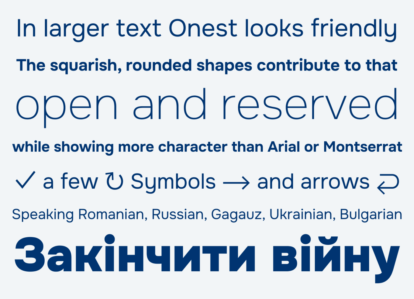
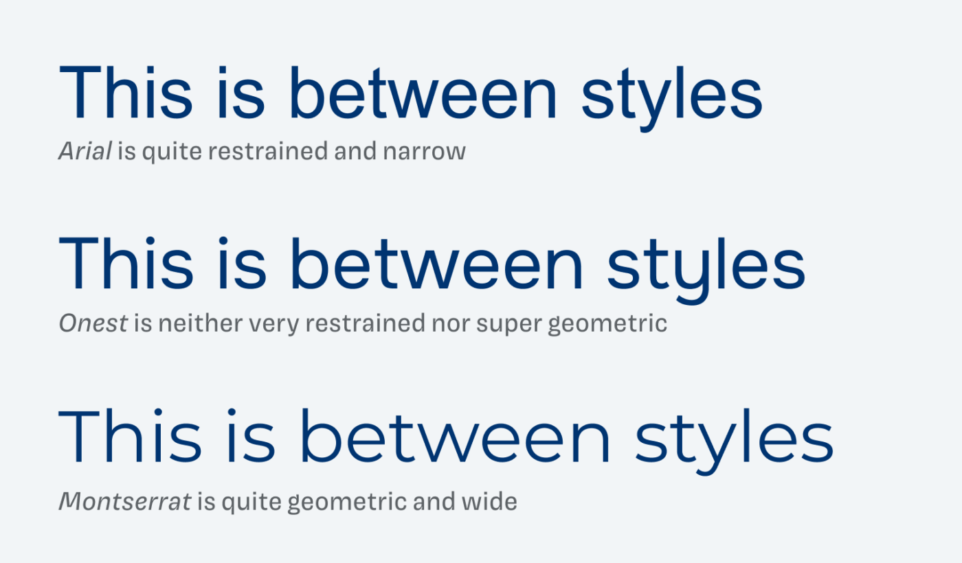
The typeface is living between popular styles. Next to default Arial and seen enough Montserrat, Onest shows the influences of both, while marking its own spot.
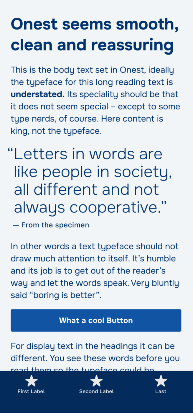
I love the stylistic alternates that make Onest a font of all trades 😉. But especially for app or UI design, this comes handy. When activated, certain characters become more distinct, so they will work better in smaller sizes.
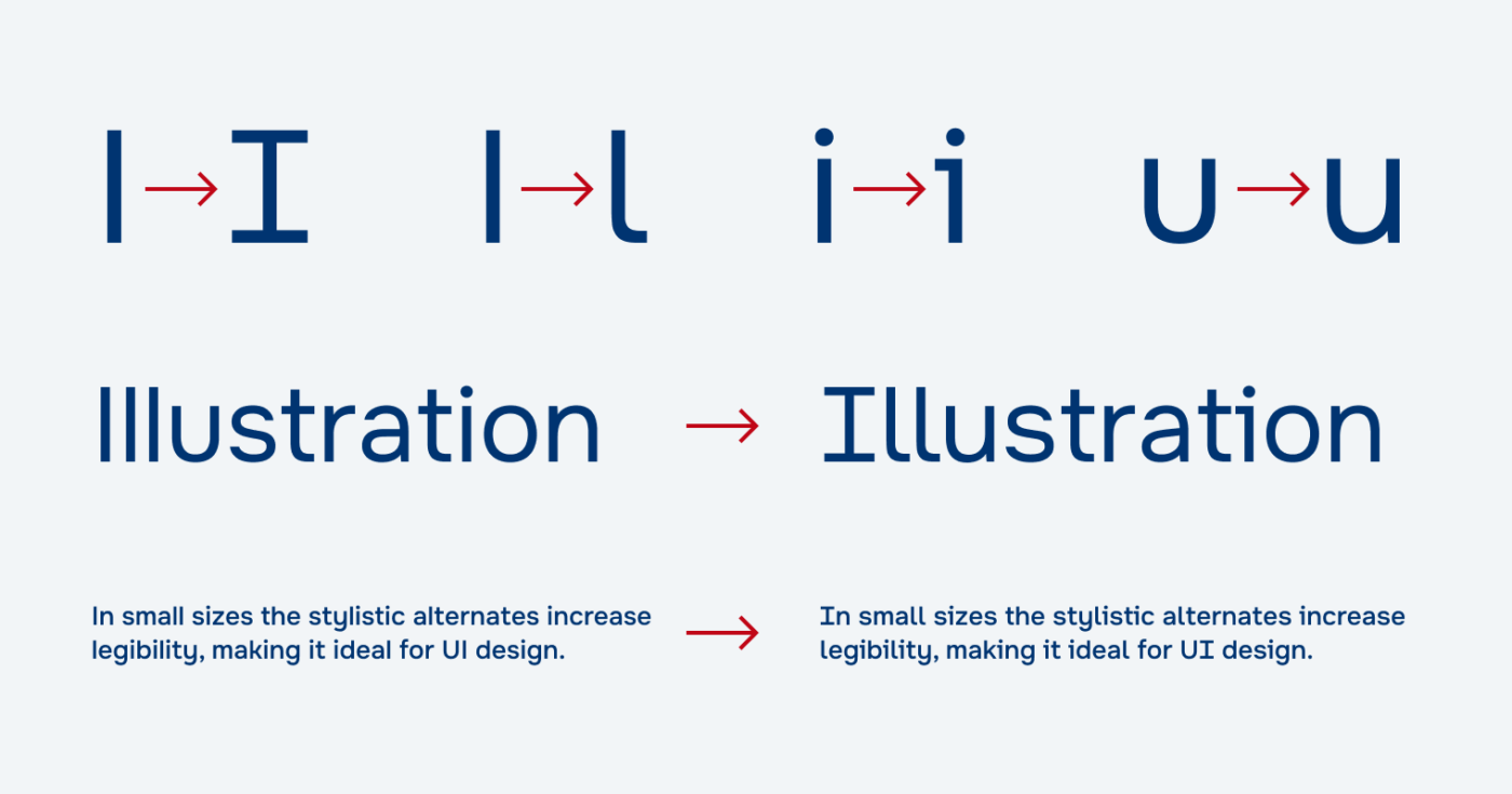
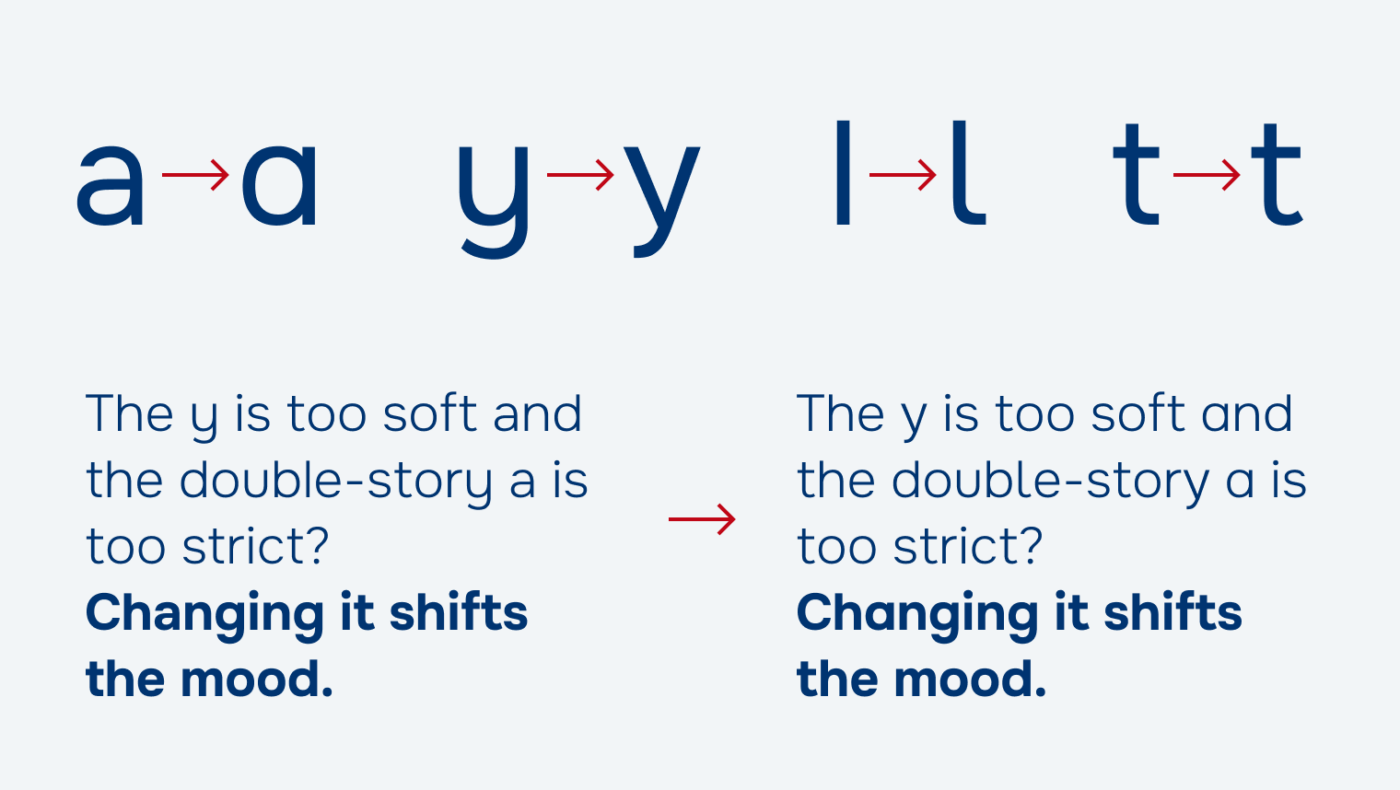
In some cases, that curved y could be too much – or even annoying. Then you can swap it out by activating another stylistic set. For body text, it is great to have this option, showing again, how versatile Onest can be. Many thanks to Kryštof for recommending this typeface to me!
Recommended Font Pairing
Guide the soft geometric appearance of Onest into an even more approachable direction by combining it with wobbly Sniglet.


Learn more about pairing typefaces using the Font Matrix.
What do you think of this week’s typeface? Write it in the comments! Also, if you have a suggestion for an upcoming Font Friday 😉.
Wow … The Moldovan government has high ambitions for this typeface! It is very interesting seeing how they talk about it. The potential emotional/psychological impact of typefaces is fascinating.
Absolutely, Lorcan! Many states should follow that!
This is a great UI font. Thanks for reviewing it, Oliver!
Or course, Scott!