Display typeface

from The League of Moveable Type
designed by Haley Fiege

2 Styles

2 Weights: Regular, Bold

Best for

  • Headings (display text)
  • Long reading text (body text)
  • User Interfaces (functional text)

License

Free and Open Source

Specialty

A playful, wobbly typeface for fun pull quotes, striking headings or super soft posters.

My thoughts on Sniglet

Have a fun break for your headings and maybe some pull quotes. Sniglet could be the friendly, rounded display typeface you’re looking for. Don’t get distracted by its wobbly characters, it shows some practical design work. It comes with a full character set, so you can type in Icelandic, German or French.

It’s hilarious how playful Sniglet is. Look at the at sign – in bold it turns into text, otherwise it would be too dark.

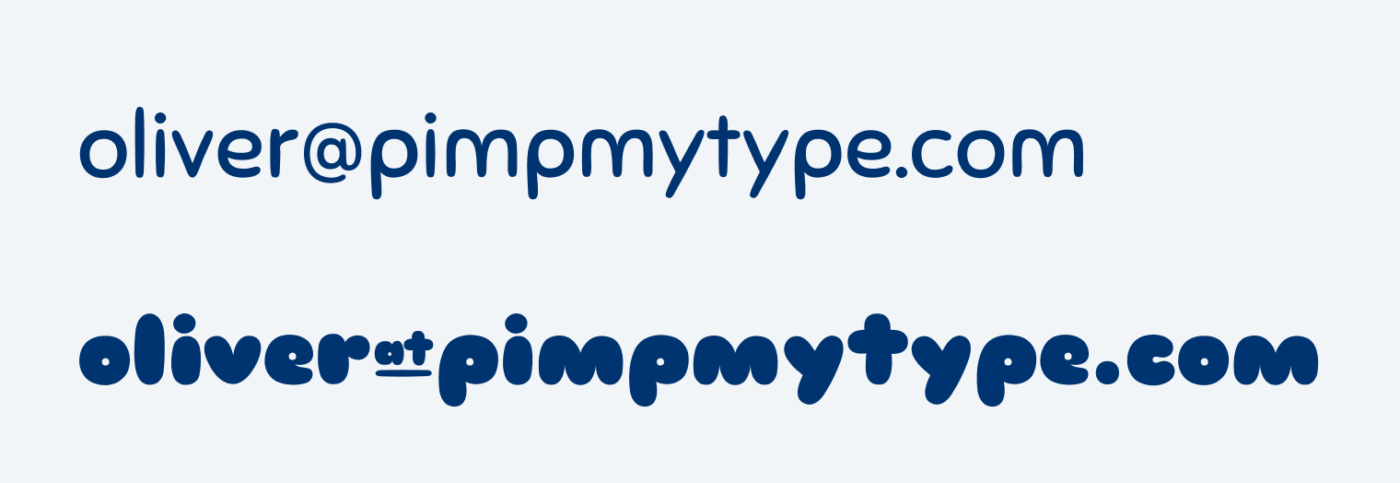
The bold weight is very attention grabbing, the regular is very approachable. And I just love this blobby bold weight! The regular style might appear a bit cheap, but maybe that’s exactly that fits your project?

Recommended Font Pairing

Sniglet is so different, that you could pair it with anything that’s simpler. But if you want to keep that soft feeling, use rounded Onest. But also rounded, geometric Mont Blanc would work.

Learn more about pairing typefaces using the Font Matrix.

Typographic power to your inbox!

  • Font Friday: I personally recommend one typeface per week and for what use case it’s best. Every second week I recommend a free font.
  • Pimp my Type: Articles or videos from the YouTube channel that will help you to pimp up the type of your next design project.
  • No Comic Sans, Open Sans 😅 or any other BS, like annoying ads. Your email will only be used for the newsletters, unsubscribe anytime.

Leave a Reply

Your email address will not be published. Required fields are marked *