Display typeface

from NM Type
designed by Noel Pretorius, MarĂ­a Ramos

Variable Font

2 axes: Space, Weight

6 Styles

3 Weights: Thin to Black
2 Styles: Direct and Indirect

Reduced Script only

Latin Basic

Best for

  • Headings (display text)
  • Long reading text (body text)
  • User Interfaces (functional text)

License

Free

Specialty

A free, eccentric caps only typeface inspired by dance movements. Use it for stunning posters, logotypes or buoyant headlines.

My thoughts on Movement

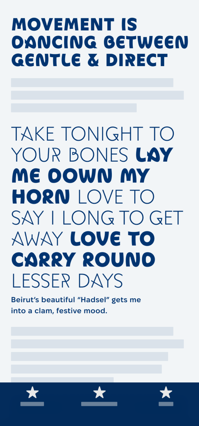
Movement is a wonderful free font, based on a strong concept that is inspired by dance movements. The typeface can be very fluid and organic, represented in the Indirect styles, or snappy and determined, represented in the Direct styles. With the variable font, you could even use it for cool animations, morphing seamlessly from one extreme to the other.

Movement Indirect Thin, Direct Thin, Indirect Black, and Direct Black.
The four extreme styles of Movement.

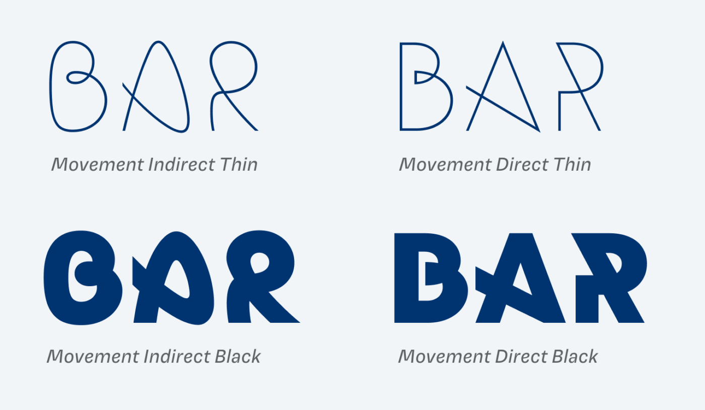
To me the indirect style works best. Even though Movement Direct has some cool shapes, like the pointy A and the long diagonal of the R, some numerals like 1 and 3, and the B look too strange. Also, round letters like O and C do not really connect that well with the direct extremes, while the top-heavy S stand out even more than it should.

Most beautiful to me is the light indirect Style, that shows the construction best. The Direct Black style seems quite cool at first, but also clumsy, looking at 123 or B.
The organic appearance of Movement Indirect (top) comes across best in the light styles. Direct Black (bottom) can be quite clumsy at times.

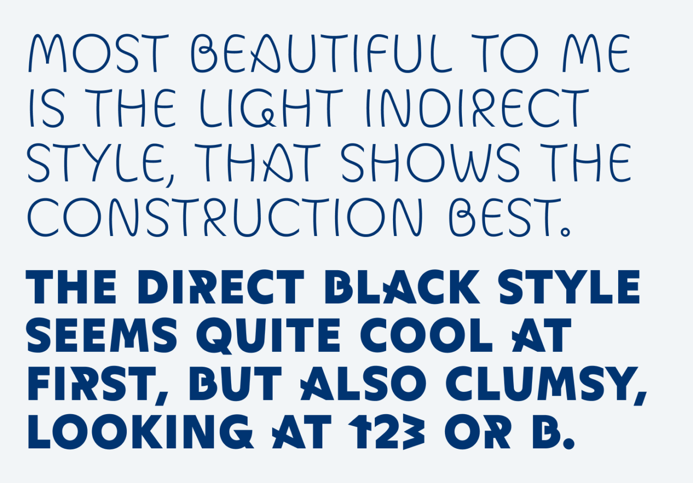
Besides some weaknesses in certain characters, overall this uppercase only typeface will most likely be used for very little text. So Movement could be a great starting point for a logotype, while performing best in large headings or on a poster.

See how letter shapes shift, from Direct Black to Indirect Thin to Indirect Black.

Font Pairings for Movement

If you’re looking for a good dance partner for this eccentric display typeface, choose rounded Onest, but also quirky Paysage would work.

Movement (free)
Movement (free)
  • Headings

Learn more about pairing typefaces using the Font Matrix.


Would your design dance with Movement? Tell me in the comments below! Also, if you spot an interesting typeface I should review!

Typographic power to your inbox

  • Font Friday: I recommend one typeface per week, free fonts included.
  • Type Tuesdays: articles & videos that up your design game.
  • Join 2500+ typography enthusiasts, unsubscribe anytime.
Edition #142, published

Leave a Reply

Your email address will not be published. Required fields are marked *