

My thoughts on Olympe Mono
Monospace typefaces often have a very cold and technical feeling to it. Because of the cursive design, Olympe Mono by Émilie Rigaud is different. It is based on the typeface of an Olympia typewriter, it has a certain innocence to it, feelings friendly, almost childish or naive.
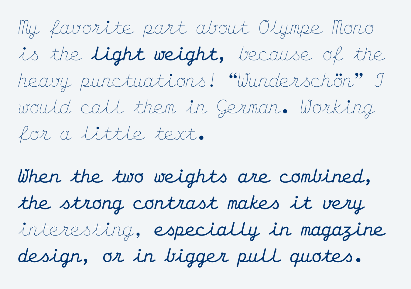
Olympe Mono mixes the wonderful contrast between fluent handwriting with the mechanics behind typewriting. The letters don’t always connect, which makes it a bit clumsy, but not less charming. The two weights are very contrasting. Regular is sturdy, while Light is almost hairline, with the punctuation marks remaining dark. When combined, these striking dots bind the two weights together in an extraordinary way.
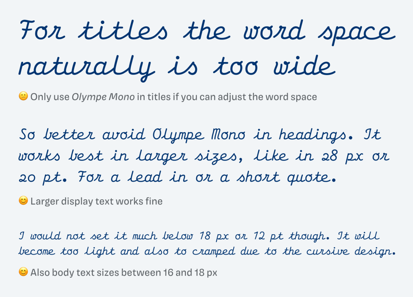
In my opinion, Olympe Mono works best in larger display sizes, anything between 20 and 30 pixels. As it is with monospaced fonts, in large titles they need too much space, with the word space seeming overemphasized.
I imagine Olympe Mono in editorial design, an intro text, maybe also a poster design, but also in larger marginalia or captions. In places where strict mechanics mingle with the warmth of handwriting, it will definitely be an eye-catcher.
What do you think of this week’s typeface? Write it in the comments! Also, if you have a suggestion for an upcoming Font Friday 😉.
Happy woman’s day to your lovely wife, Oliver🌺
And thank you for acknowledging the date. Formal yet you’re a gentleman all year round.
There is nothing cold about Monospace. Olympe Mono is affordable, adorable, and ORGANIC. The only thing that is mono here is its name 😀
Style-wise and in the application, it’s an edge case because it has so much personality in it. It’s a handwritten type, hello! So so cute. My dream always was to design a handwritten typeface. But Olympe Mono is too wide for how I write. Still, it can be used for personal brands who relate.
Light is way too light, to the point I think it’s unusable. 🤔
8/10
Thank you!
I knew you would like that one, Jana! It definitely inspires to think about applications … I would love to use this in print design … if I still did print design 😉.
In my Typography courses at FH Potsdam I was mostly one of two men, while there were 15—20 women. There are that many great female type designers today, I’m absolutely sure in future this field will be quite equal.
Thanks for pointing that out! I also know so many … I just was not aware of this imbalance in my selections. Of the 108 Font Friday’s roughly 15 to 20 were by female designers, 10 by mixed teams. So I’ll just feature the other way round, and I’m equal someday 😉.