
My thoughts on Humane
Humane is a striking compressed, sans-serif display typeface by Rajesh Rajput, who you might already know from Thunder. It is super tall, super narrow and has almost no contrast. Making it seem very confident, rational and loud. The variable font provides you with a fluid set of weights, which means you can visually adjust the thickness of the stroke across various sizes, to make is seem monolinear, like I did with 100% example below.
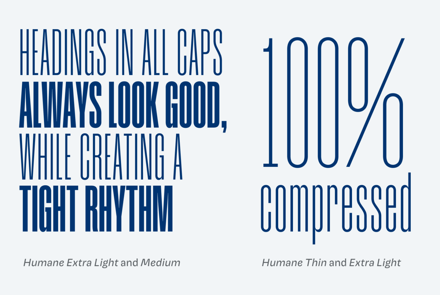
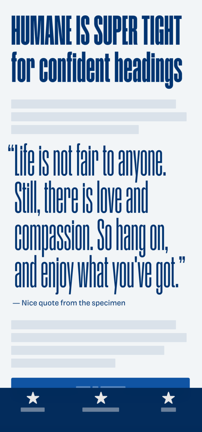
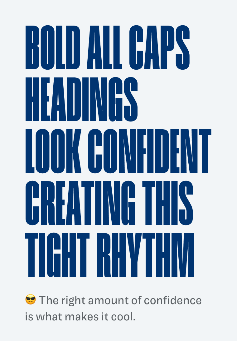
Set in capital letters only, Humane looks even stronger, but use this very consciously. Because it only works for very little and very large text. Confidence has to come at a certain dose, or it’s just bragging and noise.

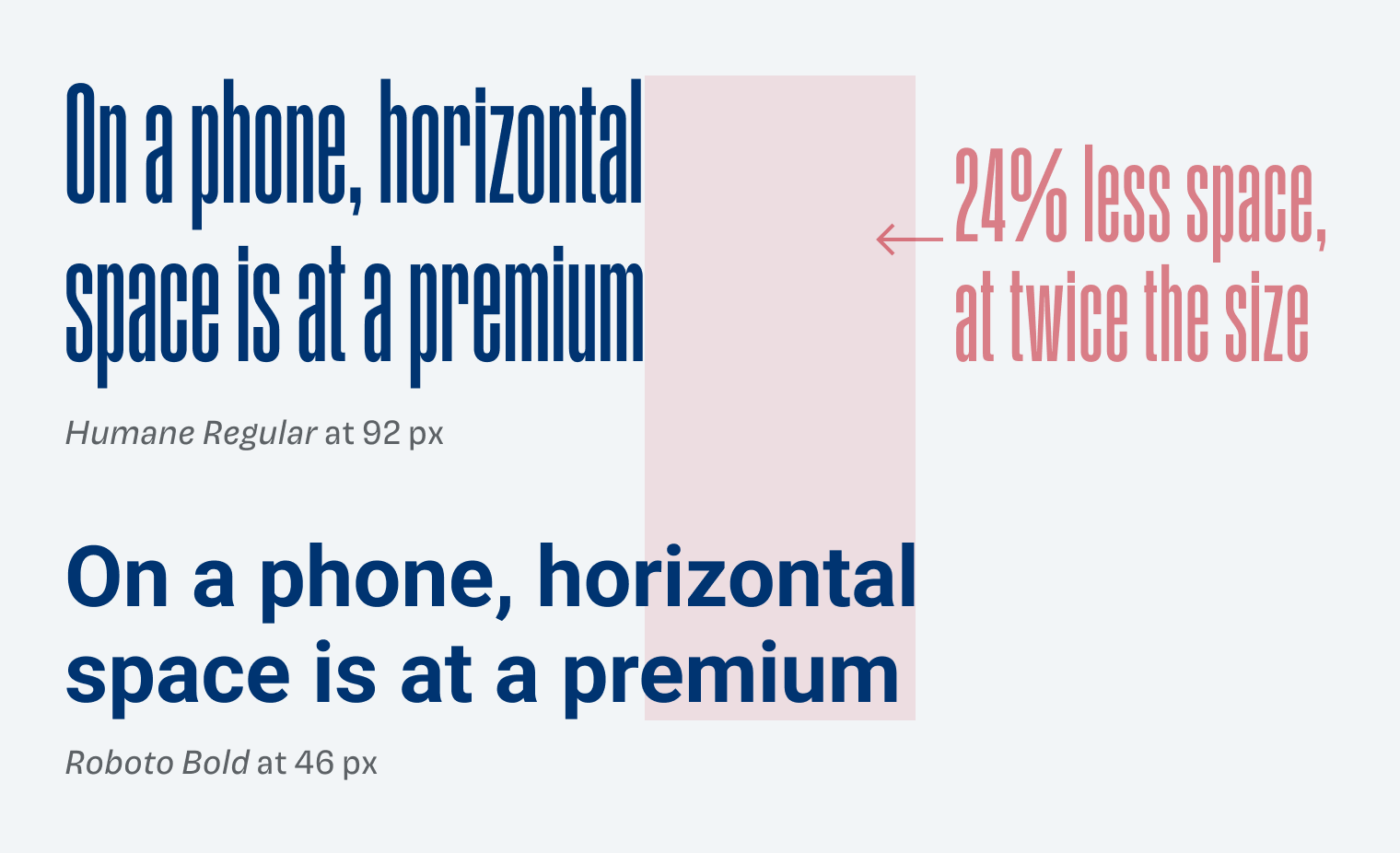
The benefits of this compressed typefaces is, that is saves horizontal space, which always is at a premium in mobile or app design. But you’ll have to set it larger, to keep it legible. Also a bit of letter-spacing can be beneficial, especially in all caps. This makes Humane a good choice, if you want something big in a narrow environment.
I recommend you try this typeface for titles or headings in a striking app design, editorial design or anything else, where you can go big. Play around with it and also be inspired by the beautiful use cases Rajesh shows on Behance.
Font Pairings for Humane
Humane is a rational, linear sans-serif typeface. Of course, you need something calmer for smaller text, like the rational, serif typeface Every or something else from my suggestions.

- Headings


Learn more about pairing typefaces using the Font Matrix.
What do you think? Is Humane something for an upcoming project, or do you have a font recommendation? Tell me in the comments below!
Oliver, I like this typeface.Humane. It’s strong indeed. Powerful and it fits well in the present time. The right amount of confidence is the right word. One word more can make a difference. So typography knowledge is needed.
Absolutely, Philipp. Knowledge is King … or Queen, R.I.P. 😉
Could work well on some book covers and can’t argue with the price! Thanks for sharing and good luck with the family band! : D
I’m a bit in love with a typeface I just got called Larken: https://www.behance.net/gallery/103060421/Larken-Typeface-(Free-Trial). It was part of a Design Cuts bundle so amazing value for money.
Thanks, Matt 🎺! Larken is gorgeous! I’m in love as well. I reached out to the designers and asked if I could feature it on an upcoming FontFriday. So let’s see 😉.
A ha, I get it, I recognize the author’s style in both fonts. It has a similar note. But I enjoy Humane more! ‘S’ is like a wardrobe hanger, slanty ‘a’ is okay, while ‘f’ and ‘t’ are twins.
I’m thinking which contrasting font would pair well, hm… one that is short like Nunito and Karla but they’re too soft for this striking guy. It’s a hard task, Oliver!
Naming… how many times do I need to say… People, I will volunteer if needed just that these fonts get the name they deserve! Grrr.
📯Artistic family, look forward to your concerts. Share some sneak-peakS! It’s gonna be festive I believe.
Wardrobe hanger … 😂 right! I think Karla fits better, since the shapes are also rational, and rather closed, if you want to stay in the same style.
I’ll share some music once, there is more than a garden hose with an attached mouthpiece and funnel 😅.