When untreated, all caps text creates problematic spaces between letters. Almost nobody seems to know this, and how much better and harmonious it looks when the letter spaces are evenly. This article and video shows you one simple adjustment that does most of the trick, and some fine-tuning.
TL;DR: All caps text creates problematic spaces because upper case letters are designed to be set next to lower case letters. Most of it will be evened out by adding some tracking (or letter-spacing in CSS). In design tools you can micro-adjust individual character pairs with kerning. This will create a more even typographic color, but in the end it depends on the text, typeface, and your typographic eye.
This topic is super emotional to me. It was my first typographic epiphany when I was starting out as a student at design school back in 2005. One evening in the shower I realized that the all caps letters on the label of my shampoo bottle were not spaced properly. It was a major brand and clearly done by an agency – how could I see that this was bad, and the professional designers did not? My world view collapsed. From this day forward I wanted to tell as many people as possible how to ideally set all caps text and why it is so much better with more space. I even wrote my bachelor’s thesis about this subject. And it’s a special occasion to come up with this topic celebrating 1,000 Pimp my Type subscribers.
Use all caps text intentionally and rarely
TEXT SET IN CAPITAL LETTERS ONLY IS VERY EYE-CATCHING. IT FEELS LIKE SOMEBODY IS CONSTANTLY SHOUTING AT YOU, SINCE WE ARE USED TO SEEING IT AS AN EMPHASIS. CAPITAL LETTERS NEED MORE SPACE THAN LOWER CASE LETTERS, AND LONGER TEXT IS HARDER TO READ, AS YOU CAN EXPERIENCE WITH THIS PARAGRAPH.

There are two reasons for that. The first one is, that we are used to mixed case text. The second one is that we don’t read individual letters, we read in groups of letters or words. The more distinct a word shape, the easier it is to recognize. When you set a text in mixed case, ascenders and descsenders create a more diverse outline than when it is set in capital letters. So before continuing our journey to spacing, keep in mind that you should not use all caps for body text. Save it for a something special, a word, a title or a short headline.
The problem with all caps text
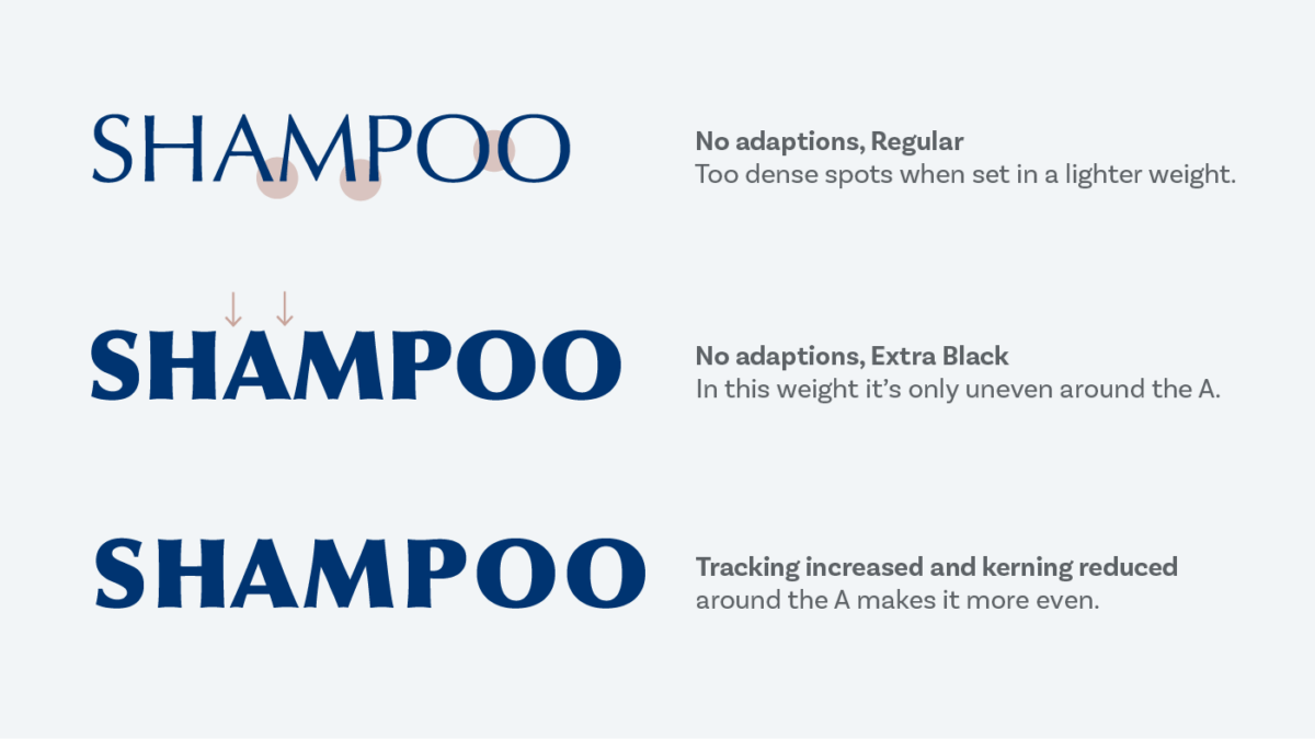
In typography, you aim for an even typographic color. This means you don’t want to have very light or very dark spots in your text. The default spacing for capital letters in most fonts is made to fit next to lower case letters. This is the reason why – when untreated – all caps words mostly create uneven spaces that appear too light or too dark.

Take a look at the example above and close your eyes slightly to make your vision go a bit blurry. You might see very dense or light areas within the word. Where the A and the M, the M and P meets it seems pretty dense, the Os also appear very close together, and the triangular shaped A creates two gaps in the upper part of the word. The goal is to evenly distribute the spaces between the individual characters. To do so we make use of the two methods for spacing words that typography offers us: tracking and kerning.
Step 1: Increase the tracking
Tracking (or letter-spacing in CSS terms) is used to changes the spaces uniformly of a whole word or a larger range of text. It works in both directions, so all characters can be pushed closer together or further apart. When you apply it in CSS you might start with something like letter-spacing: 0.1em; then take a look at the result and adjust it. I recommend using the em unit since it should be relative to the type size.
Lines of uppercase text seem more even and harmonious, just by increasing the letter spaces, as you can see in the example above. This will do most of the trick to improve it. Quite the opposite happens when you decrease it, the text looks cluttered, and gets harder to read.
But when it is too little, and when is it too much? It’s too little, when there still are dark and dense spots in your word. As a rule of thumb it’s too much, when there almost could fit another letter between the spaced characters. To find that point where it’s just right, it’s helpful to go a bit overboard with it and then reduce the tracking again.
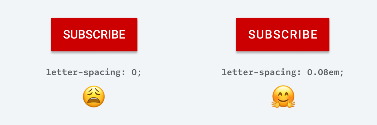
If you’re designing for an app, UI or website your journey ends here. Thank you for taking the ride with me, you already improved your text by a lot. Please apply this it to your designs form now on. For example, if you take the terribly spaced subscribe button on YouTube (or any button with an all caps label), it instantly looks smoother with more letter-space. Tiny adjustment, gigantic win.
If you use a design tool like InDesign, Illustrator or Photoshop to create an asset for your design of for creating some assets, kerning is the next step to micro-adjust the spacing.
Step 2: Adjust the kerning
With kerning you can influence the space between individual characters. Font designers already adjust the sidebearings between two specific characters to make them look better together. So it’s common that fonts store kerning pairs (in comparison to tracking which is set to 0 by default and not stored in the font file). When a typeface is well kerned, you won’t realize it. But it definitely gets obvious once kerning is turned off.
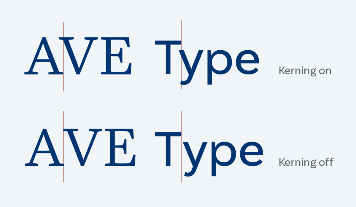
You should not have to adjust the spacing of individual characters in mixed case text, if the typeface is made well. For upper case text it’s a bit different. In most fonts capital letters are made to be set next to lower case letters. And over all the spacing is very tight around a character, since many type designers want their typefaces to be as versatile as possible. They assume that you, the typographer, will adjust the spacing accordingly. So the default kerning pairs for upper case letters aim to reduce the spaces in combinations like AV o WA, so that they don’t look apart. This is what creates the dense spots for a whole word or a title in all caps letters.
This was a long detour into the weeds of kerning, now let’s take a look at the shampoo example above. In the first step we did nothing, the default kerning is turned on, but that does not affect the set word. Then we added some letter space to get rid of the dense spots, and it already improved for the most part. But still, around the triangular A optically the space is too large. Here negative kerning comes into play that reduces the spaces again to create the best result.
As I already said, this last micro-adjustment only works in design software. You can not change the kerning of individual character pairs with CSS, you can only turn off kerning as a whole (but please, don’t). And it doesn’t really make sense when you are mostly creating a design system and not setting an individual title.
It depends on the text and the typeface
Alright, now you might think – great, just add some letter space and let’s call it a day. Well, almost. In the end it depends on your text and on your typeface, if you need to adjust anything at all and what. Some all caps typefaces are already spaced very loosely and don’t require treatment. In other situations the word just works with the default settings.

And if it’s a very bold typeface, the spaces inside the letters get smaller, so the overall typographic color of the word is more even as well. As a rule of thumb light typefaces need more spacing, bold need less. And sans-serif typefaces also need more space than serif ones. Eventually you and your typographic eye will decide if it’s necessary to change anything.
This was a deep dive into the word of spacing all caps text. If you take away one thing from this video or article, then it should be that adding some letter space will get you more than halfway and makes most all caps text look better immediately. If you want to go deeper into this subject and understand German, here is my bachelor’s thesis on this subject with the sexy super academic title “Ausgleich und Spationierung als Maßnahmen zur Harmonisierung von Versalzeilen” from 2008.
I’m curious about your thoughts, leave them in the comments below!
Herrlich!!! Danke für diesen Artikel, der mich mental zurück in meine Anfangszeit als Typograf zurückwarf. Wunderbar!
Haha! Freut mich, ja, das Gefühl muss man sich wieder holen 😉
I agree with most of this article. Yet, I think the YouTube subscribe button looks harder to scan with the increased letter-spacing, and doesn’t suffer too much in density in the original.
It also depends on the size you look at it. I scaled it up, to make it more obvious, and yes – in that size it becomes harder to scan. Zoom in your browser to about 50%, it gets more compact then.
Thank you! Excellent examples and theory. A big help!
Happy to hear that, Richard!
Thank you for the insights. I’ll be passing this article onto our design team as a reminder of the principles of tracking and kerning.
Glad you found it useful, Steve!
How many units Are there between the spaces? For example, does a capital letter require two spaces? Vice versa for a lower case? emoji, etc? is one space considered a unit at all.
Thanks for the question, Beindigo! Well, it’s not actually a letter space, it should be spaced by changing the tracking or kerning of the typeface. I can answer this more exact if you tell me what design software you’re using? Or is it for web or app design?
Thanks for the article as well as the link to your bachelor’s thesis.
As the general approach, would you recommend changing tracking in all caps one liners set in Impact or other similar fonts (League Gothic, Anton, etc.) as are often used for internet memes?
I’m asking because I was actually tempted to decrease tracking a bit last time I did something like that with one of these fonts. Though it was pretty big point size (ca. 180 pt), if that’s relevant.
I’m not a typographer and just want to know if my “naive” sense of what looks good in type is that far off.
Thanks for your question! Could you send me a picture? Then I can give you feedback. It’s easier than a general approach. However, Impact for instance is quite bold and narrow. If it’s a bold and narrow typeface, it can be tighter (see the Bungee example above).