
My thoughts on Thunder
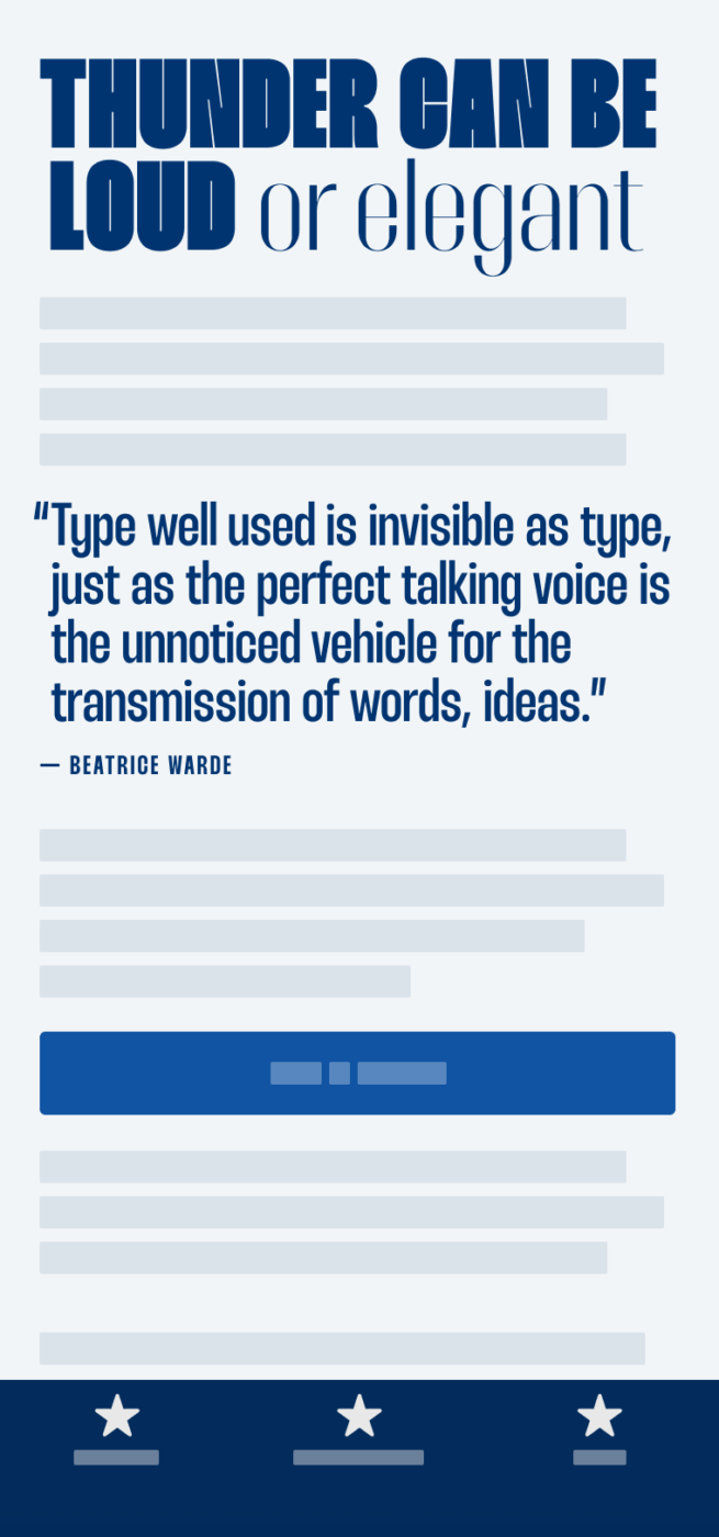
I immediately fell in love with the beautiful contrast Thunder brings. Designed by Rajesh Rajput, who already has quite an amount of interesting display typefaces in his portfolio, it is available for free, and beautifully presented on Behance. I appreciate how the variable font comes with the ability to seamlessly adjust weight, contrast, and slant, giving you plenty of design space to find the right visual voice.
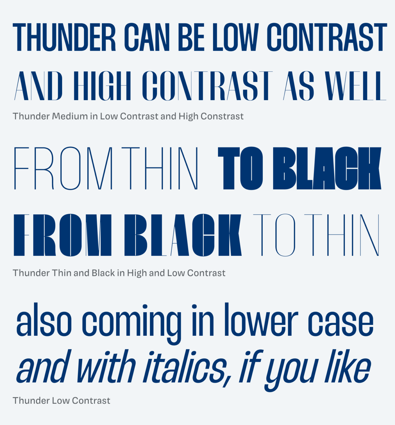
I don’t think that Thunder is perfect in every detail, though. The vertical and horizontal metrics are a bit off, the italics feel slightly distorted, and the word space is too wide for the narrow proportions of the typeface. But if you use it in all caps, you might be good to go in most cases. For anything else, the typeface needs manual adjustments. So definitely not something that works out of the box.
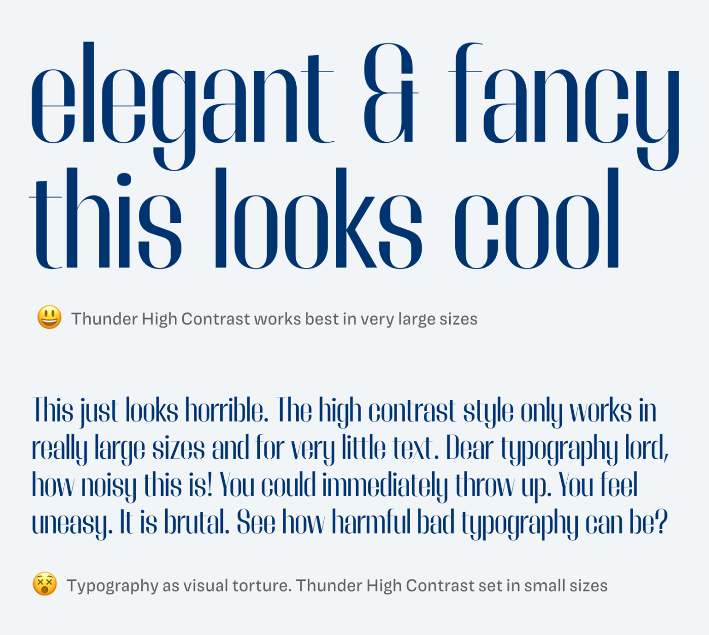
Also, bear in mind, that you should only use the high contrast style for very short and large text – as you can see in the torturing example above. Overall, Thunder is ideal for little text, like striking headings, and cool animations, which makes it definitely worth trying out.
What do you think? Is Thunder something for an upcoming project? Tell me in the comments below!
Ummm, not so sure about this one Oliver🤔 Thunder Medium High Contrast is the only one I would use. The HIGH contrast is very HIGH 😄 The characteristic that diversifies it. But we must appreciate the efforts to make font that stands out, aren’t we?
I see it on packaging and/or cartoon for the children of 3-7 age. They don’t have to read, it’s enough to look funny and animate them.
Yeah, I’m not so sure about it either. I think the extremes work well. Low Contrast Black or Thin. Packaging for kids seems appropriate 😉.
I couldn’t find how to download the font. It was a myriad of Tech complexity that seemed to be designed to trap someone into a data harvesting trap.
I gave up.
You can download it from the following page
https://rajputrajesh-448.gumroad.com/l/thundertypeface9
enter a number on the right side (for example 0) and then click on „kaufen“
on the next page you enter your e-mail address
Thanks for figuring it out, Lena 😃!
641 / 5.000
Vertaalresultaten
Well Oliver, I’m a kid of the seventies. And even then I didn’t want anything to do with letters like the ‘Stadio Now Novarese’, ‘Stadio Now Poster Italic’ and ‘Stadio Now Weirdo’. In fact, the ‘Eurostyle’ was banned in the studio. I am therefore a traditional typographer where readability and legibility are the most important conditions. The expression of this font in these styles, such as the unusual curves and the reverse contrast, go over the edge in my opinion. Just like the old ‘Saloon/cowboy’ typefaces’ or the ‘Bosozoku’ (from 2015). the ‘Monolnea’ and the ‘Text’, on the other hand, are good to use.
Hey Philipp, thanks for sharing your thoughts on that! I heard a theory once, that if we are socialized as a designer in a certain period of time, we try to avoid that kind of aesthetics. Since I’m a kid of the late 80ies, I encountered a lot of system fonts in my early design days, which makes me despise them 😂.
LOL these commenters sound like traditionalists. They will live and die by it, wondering why all the album covers and moving posters are illegible, which they aren’t. I love this font, it’s not even pushing too hard, animated type is really pushing new boundaries, if only they had a clue how difficult and time consuming it was and how minimal the results are, not to mention inline with their beliefs that they no longer are capable of recognizing. Whenever someone says no, I get excited to dig deeper. The way the dropouts push up against the edges is beautiful. There are 4 typefaces in one to animate through, and they are all elegant. These are dope AF
Thanks for sharing your thoughts, Erik! It always depends on the context and project, of course. I’m excited about these possibilities as well.