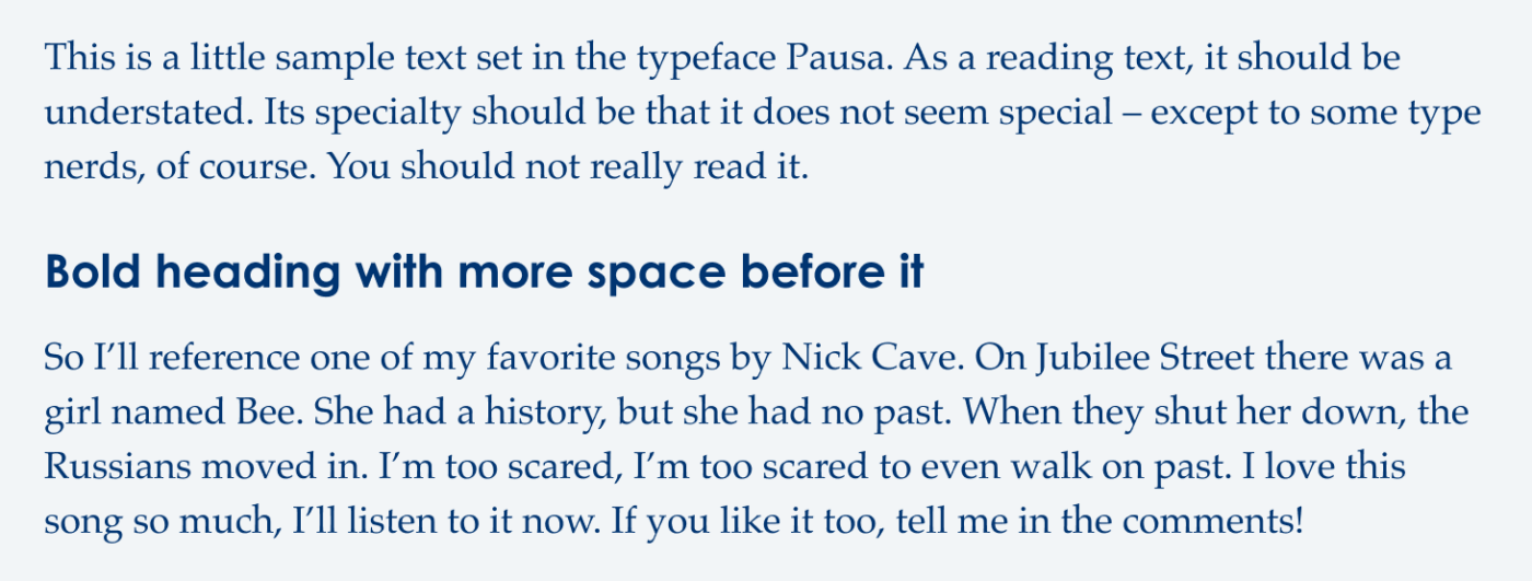
Visual hierarchy enables viewers to get the things they need quicker. This is why it’s key to let your print, web, or app design perform at its best. In this practical article you will learn how to leverage the two main principles of visual hierarchy in typography. So you can create convincing document layouts, outstanding buttons in web design, and clear components in your next app or UI design.
TL;DR: It all comes down to guiding the view and attention of readers purposefully. Contrast and spacing have the most influence. Contrast in typography can be achieved in several ways, with weight being the most striking one. When it comes to spacing, set elements that belong together closer. Eventually, these techniques will only be as useful as your design has clear goals, relevant content and a reasonable structure.
I will focus on the visual representation of information, not the content itself. And to keep it practical, you will find various examples from document, web, and app design. Know that these principles apply to all disciplines that have similar use cases. Ready? Then let’s go!
Visual Hierarchy is about guiding the eye
And guiding the eye means guiding the viewer’s attention. Let’s start with an example. This privacy policy document by Scott, a CPA, is by far not a bad design. It comes with a decent type choice, and is overall well set. But still it lacks something important – visual focal points. The letterhead and title stand out, but the subheadings that should structure the whole thing, mostly blend in with the over all text.
By adding more contrast to the subheadings, adjusting the spacing and fine-tuning some other details, the document becomes easier to digest. This creates an even more professional impression (see what I did exactly in the video, and I’ll illustrate the most important measures further down). For now just compare the two documents, and observe how the different designs make you feel. Visual hierarchy in typography makes all the difference.
Typography can’t rescue unclear intent or poor structure
First, let’s take a moment to think about the content. I once had to lay-out a proposal of several hundred pages that came with ten levels of headings. I tried various font sizes, styles, type and colors combinations to make it work, but it always resulted in a confusing text layout. I felt horrible 😫, why couldn’t I solve that? This was when I realized that the problem was not the design, it was the structure. So I asked the client to streamline the content, ending up with five levels of headings 😊. Still a lot, but it was workable.
If the given structure, and goals of your document, website or app are unclear, typography won’t solve it. Its flaws will only become more obvious. So before you start designing:
- Know what the primary goal of a design is,
- Make sure the content is relevant, and
- Be clear about the levels of information.
Okay, so once you know that, how can you apply visual hierarchy to your text design? There are two main principles that I follow when doing it: Firstly contrast, followed by spacing. Let’s take a look at them individually and then combine them later on.
1. Contrast establishes visual hierarchy
Set your base first, because without a clear reference you will not know what it should be contrasting with. So pick your primary typeface, size and style. For a text document this might be the body text at 11 pt, regular, for an app design, functional text at 14 px, in font-weight: 500.
Contrast can be achieved in various ways, by utilizing different:
- Sizes (small, medium, large)
- Styles (upright, italic, backslanted, all caps, or small caps)
- Typefaces (see pairing fonts)
- Weights (Light and Regular, or Medium and Black) or
- Colors,
- or a combination of several.
Use as much variation as necessary and as little as possible. These choices are also influenced by what kind of text it is. A heading, body copy, lead-in, label, caption, or pull quote probably will all have a different style or place in your design. But for now let’s look at a classic scenario, combining a heading and copy.
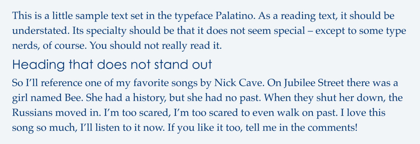
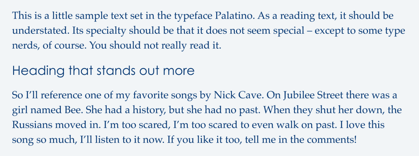
Contrasting headings in text documents
The underlying problem with the privacy policy document from before is, that the headings do not stand out enough. Even though they are set larger and in a different typeface than the body text, the headings seem too similar. Now there are several ways how we can apply more contrast.
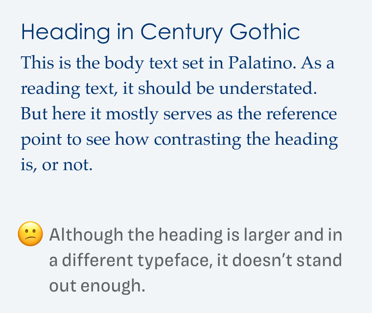
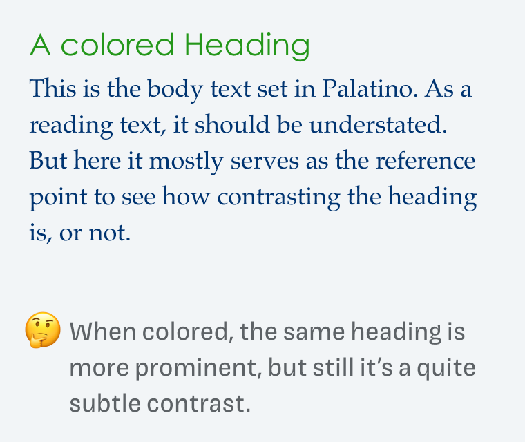
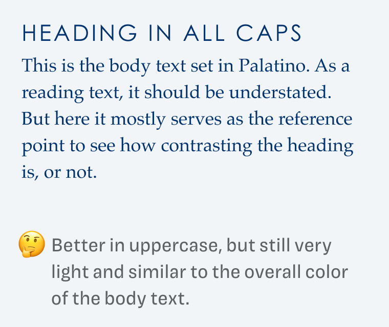
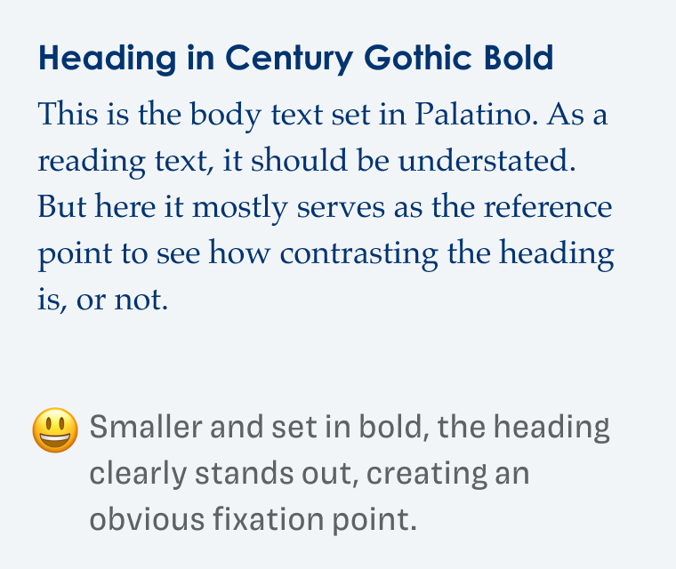
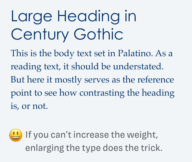
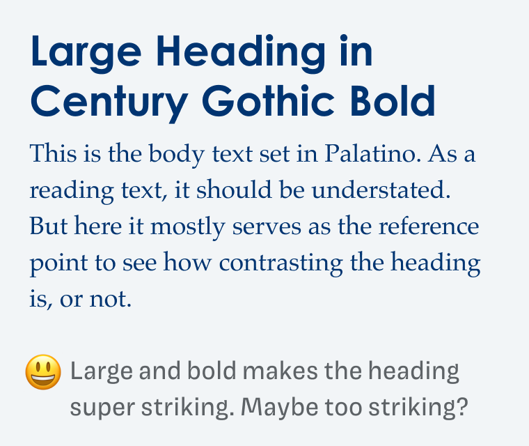
When it comes to contrast, everything works better than leaving it the way it is. Depending on how much the heading should stand out, you can choose an option. The most obvious version is to introduce contrast by weight. This also works best, if you do not want to change the flow of the document significantly, or if larger type would end up with an inappropriate size for this level of hierarchy.
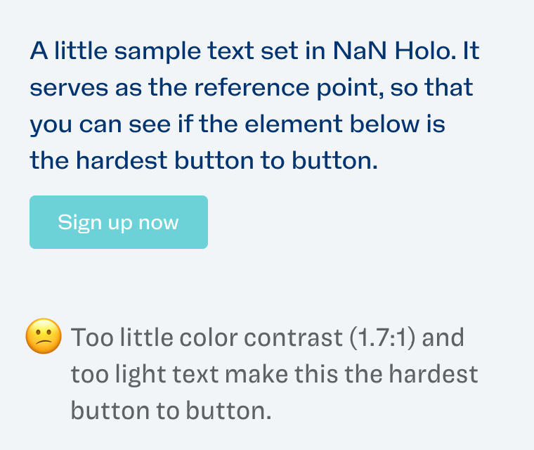
Type and color contrast in web design
Now on with something else – on many websites or apps you can find buttons, where the text hast too little contrast to the mostly colored background. This insufficient color contrast is a huge problem regarding accessibility, but the visual hierarchy suffers as well. Yes, you might look at the button because it has color compared to its surroundings, but it won’t perform that well, since the text is hard to read (see below).
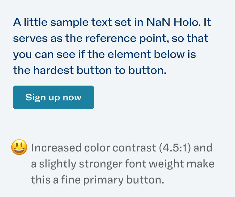
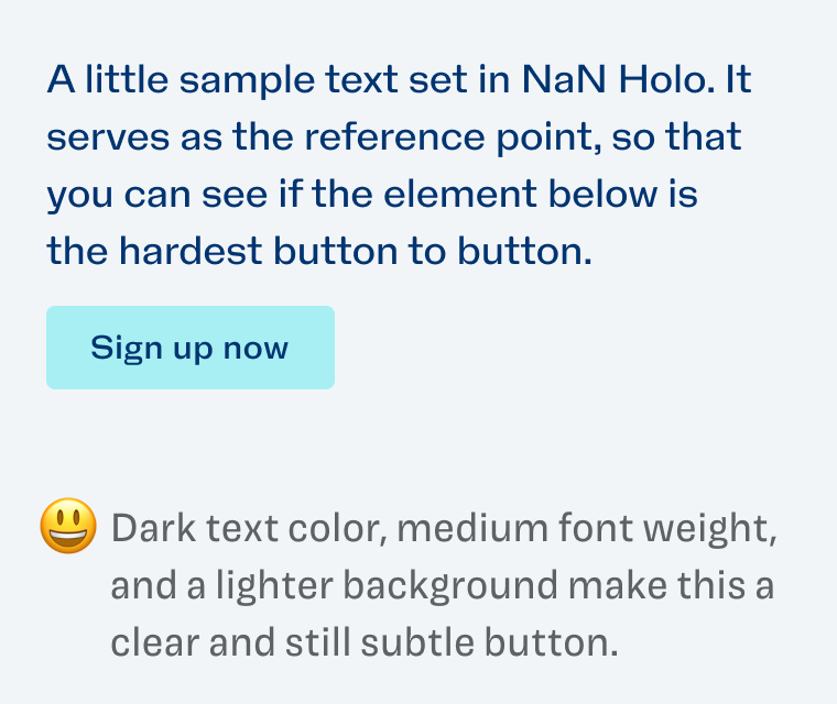
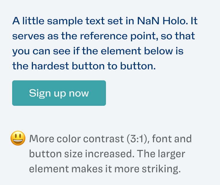
To solve this, we have several approaches, that you can also see in this short video. In example two and three, the font size stays the same while the weight and the color contrast change. Depending on how eye-catching or subtle the button should be, you can pick one of these styles. In the last example, the font size is increased, which then will also work with a lighter background color to achieve sufficient contrast.
The right contrast in UI design
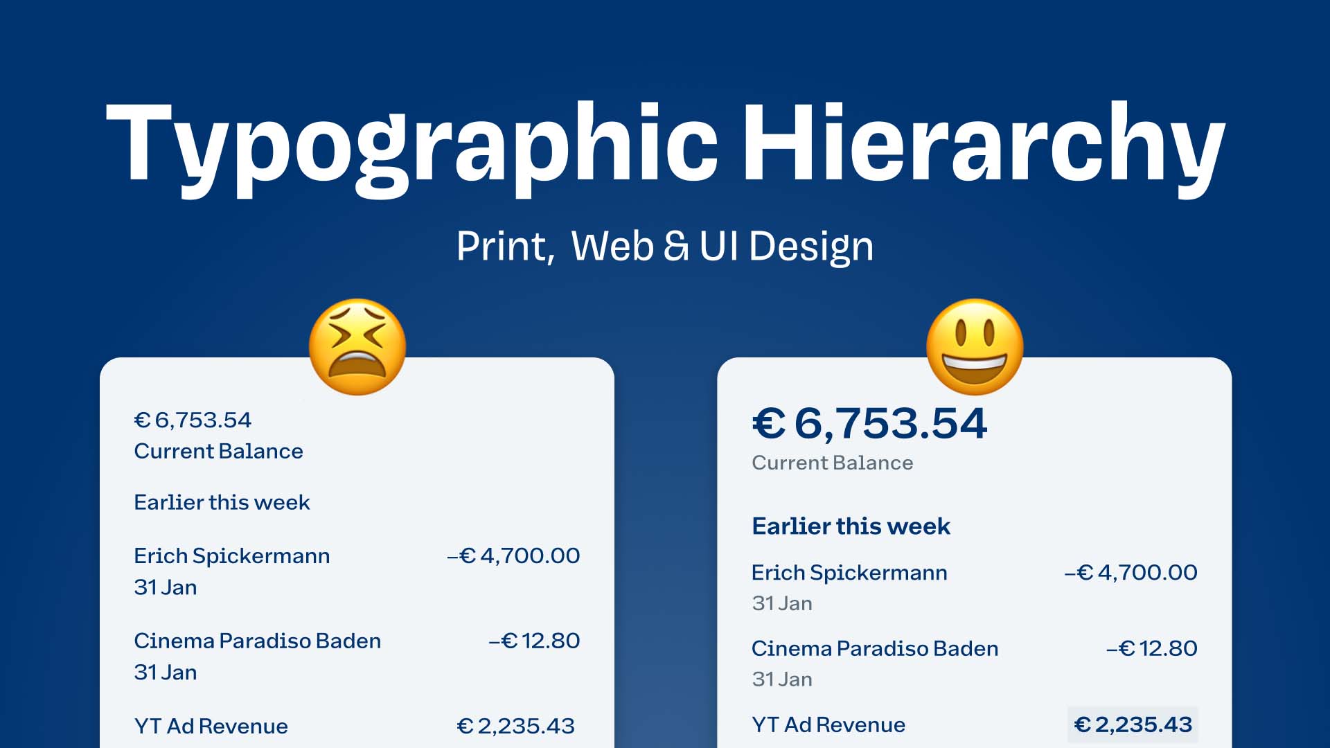
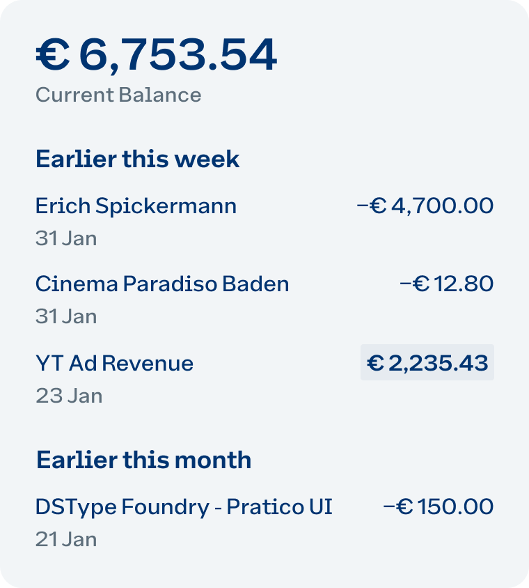
Now, let’s see in a more complex example how to apply visual hierarchy in a user interface design. This approach is not something unique to apps or UIs, it is a way of how to visually organize any list or table. In this fictitious banking app it is hard to focus, because every information seems equal. Even though the position and rudimentary spacing gives you a hint of what belongs together, it still creates an unpleasant impression.
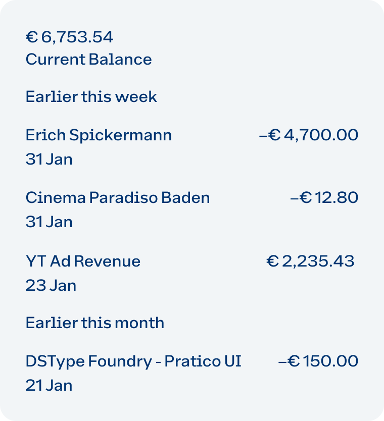
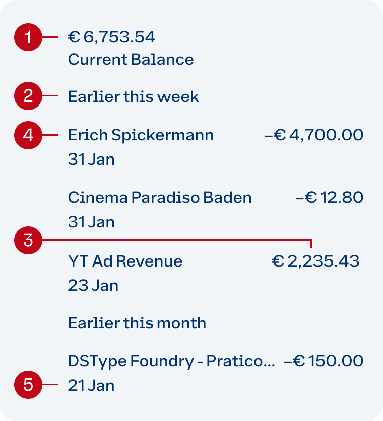
So let’s start by thinking about the various levels of importance in that view. I’d assume most important is the current balance. Followed by the subheadings like “Earlier this week”, transactional details and amounts, and last the date. I also think that the incomes are more important than the expenses.
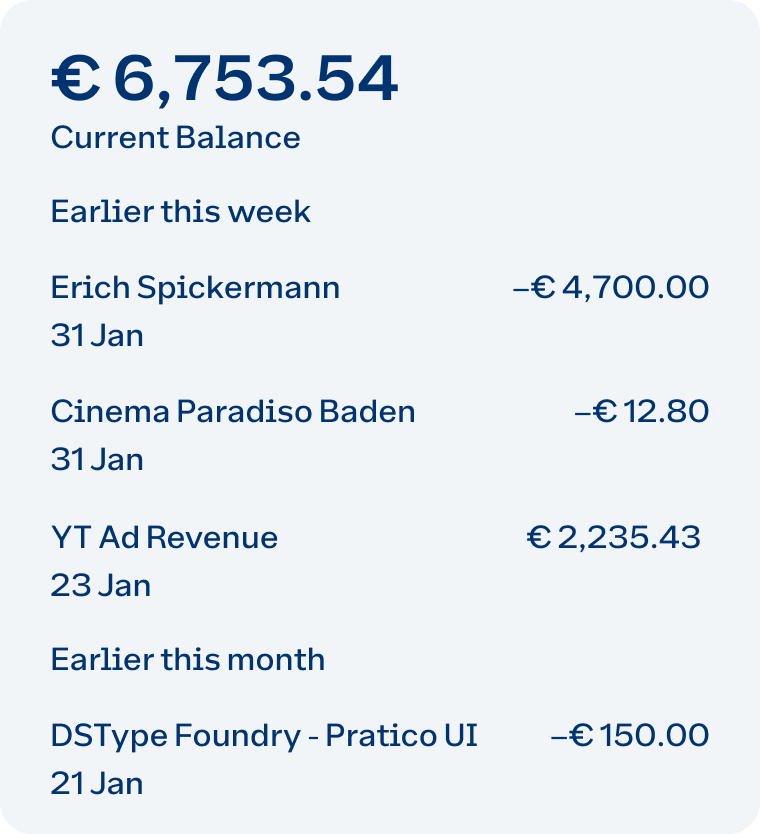
Knowing this, let’s highlight our most important information, the current balance. By increasing the size and weight, it becomes more contrasting, resulting in our primary focal point. In the second step, let’s give some love to the subheadings too, and increase their size and weight from 15 px and Medium, to 18 px and SemiBold. Also, let’s highlight my – yet to come – massive YouTube ad revenue 😜, by making it bolder.
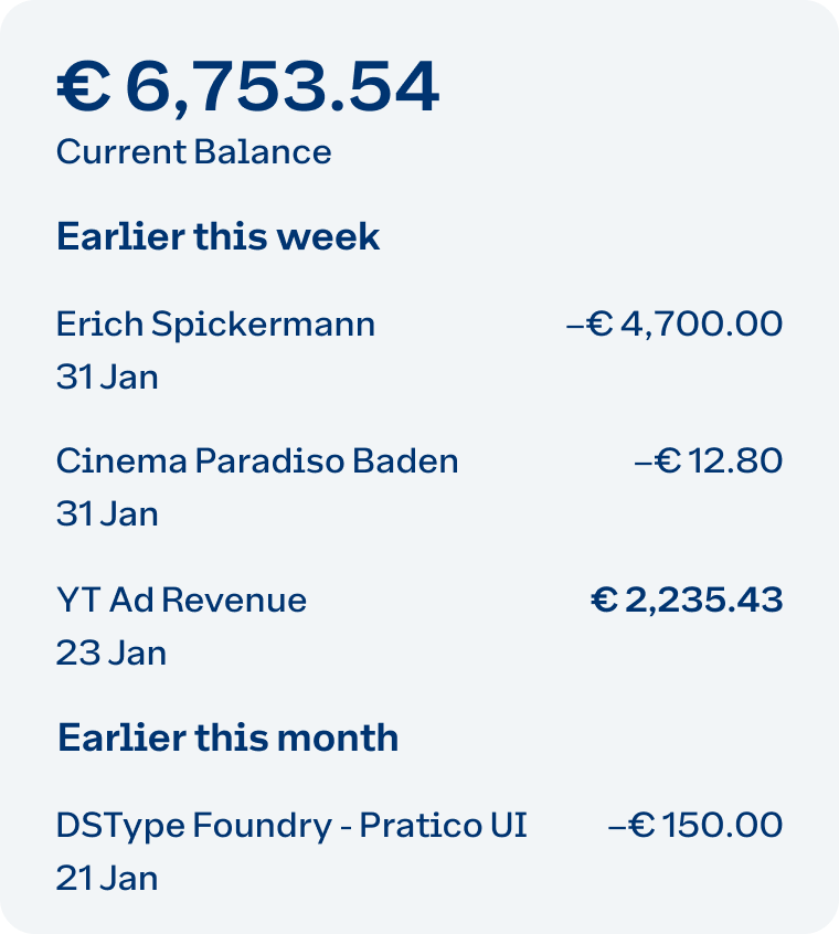
In the third step, we decrease the contrast for our least important elements, the label and date. The font size is reduced from 16 to 15 px, and the text color turns into a mid-gray.
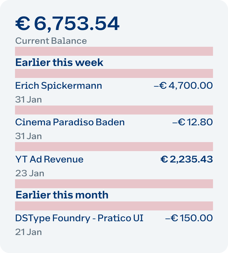
By increasing and decreasing the typographic contrast, we could establish a clear visual hierarchy, and guide the eye of our viewer to what’s most important. But we are not done yet. In this last example, it gets obvious that the distance between elements is a bit off. Let’s revisit it later, and now move on to the next chapter: space.
2. Space amplifies visual hierarchy
Space is the second crucial ingredient to make visual hierarchy work for you. After you fixed the contrast, space will amplify your decisions. Because the order of something can show its importance, while the space around and between elements make it easier to group and understand their relationship to each other. As a simple rule of thumb: when elements belong together, reduce space. When not, increase space.
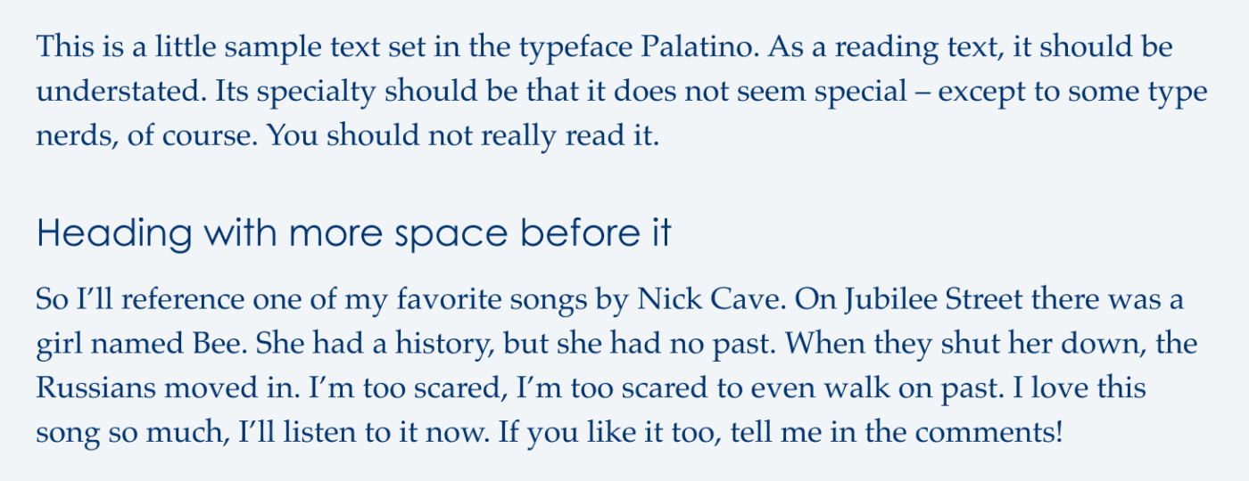
The right space around headings in documents
Coming back to our first example, the privacy policy document, where the subheading was not standing out enough.
Could we make this work only by adjusting the spacing, without touching the text style? Yes! By adding space before and after the subheading, it immediately draws more attention. In the example below, it is the same amount of space. At least we have something to focus on now, but it also could be more determined.
So let’s make this clearer by increasing the amount of space before the subheading and reducing it after. This groups the heading with the subsequent paragraph, emphasizing the natural flow of the document (see below). Compared to the one before, it clearly solves the problem. If you want the subheading to be more subtle, you can stop here. It does not always have to be so attention grabbing.
But if you really want the headings to be a fixation point, adding contrast is the way to go. So let’s set it in Bold again. With the increased space before it, and the stronger text it combines contrast and spacing in an ideal manner.
Adjusting space in UI design
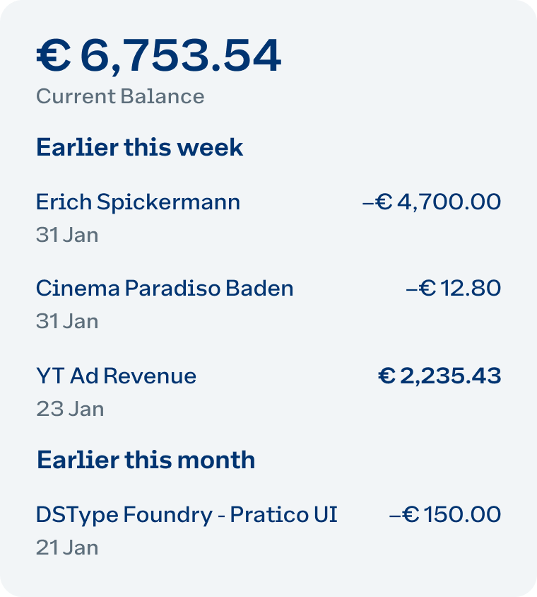
Knowing that, let’s revisit the app design from earlier and add more space before the subheadings to connect them to the subsequent entries, while reducing the space between the individual transactions. Compare it to step 3 from before to see the difference.
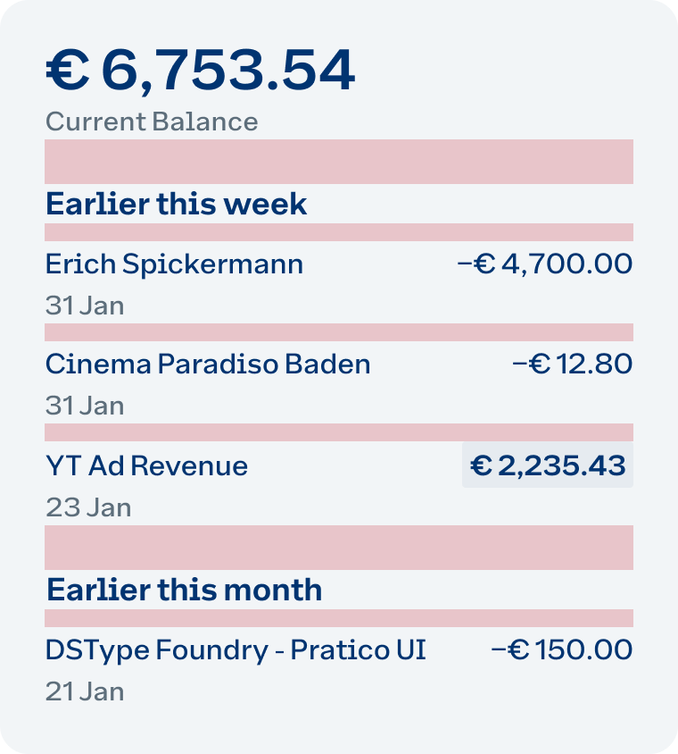
Two tiny details: I also slightly emphasized the income by adding a background color, so it stands out more among the expenses. And I changed the minus before the expenses to the case-sensitive, higher version that aligns better to numbers.
So in both examples you can see, that adjusting the space really gives it the final polish. The contrast is guiding the eye while the space is grouping the information clearly.
Final thoughts
Let me close with these five steps as a guideline for your next project:
- Think about the design’s goals and structure first.
- Simplify hierarchies and repeat the same styles as often as possible.
- Strive to create clear distinctions between different elements.
- Use contrast to establish the visual hierarchy.
- Amplify it by using space to group connected elements together.
Please note, that this focused on isolated parts of a design. So you’ll have to bring it together on a higher level for your project. In a text document and generally for headings, this means thinking about how the different levels will look, and how contrasting they should be. Additionally, in web design, how other buttons and navigational elements on a page compare. And in an app, how these patterns perform across various flows and views is crucial.
But whatever situation you have, using contrast and space are the two corner stones that help you to consciously guide your viewer’s attention. So they get what then need more easily, so your project has the success it wants.
Do you have any other tips when it comes to visual hierarchy in typography? Tell me in the comments below!
Really helpful article – thanks for providing great content (sir!). Especially since I’m often tempted to “overdose” on each of the means to structire content. Your example on proper spacing shows that subtle changes really help guiding the eye without tearing the content apart. Things you haven’t touched on:
… left indents to make subheadings stand out. In your example the listed items could be pushed in by 5 px, for example
… horizontal lines to separate content blocks (subtlety is king, so the line should be thin or have a light shade – and, if I had to chose I’ll pick proper spacing over divider lines)
… and color backgrounds to group elements (again, subtle!). In your example the general page background could be light grey while the item groups have a 5-10% brighter background.
Again, thanks!
Thank you, Daniel, for you kind words! 🤩 And great additions! I’ll collect some for a follow up. This topic is so big … 😉.
Oliver,
Thank you for this! This is extremely helpful!
One thing you have not touched on (perhaps intentionally) is whether small-caps have any value in headings. I would be curious to know your opinion.
Thank you again, my friend!
Of course, Scott! I’m glad it was helpful. About the small caps – I would not really use those in a heading as a rule of thumb. If the heading is set in small caps only, this could be something, but more working in book design, rather than a document layout.
Excellent resource. Thanks for the effort. I know it takes time to work out all the examples.
Thank you, Kel! It is so great to distill these things, which again makes it easier for me. And when you find it helpful too, I have won 😉.
First thing came to my mind is accessibility. As long as contrasts satisfy WCAG 2.0 requirements, it’s good. Would need the proper tools to inform the developer/designer.
So true, David! That’s why I added the color contrast thing. I’ll also do an Instagram reel soon with this. I’ll be quite fun 😅.
Such a gem of an article, and unfortunately such an underrated concept, that a lot of people (and some designers) don’t leverage.
I’d add a single thing here: using ”tabular lining” figures in situations where there you have especially sums of money, right aligned, can be very helpful and make the overall design (of that entire component/layout) best in class.
Wonderful addition, Catalin! Surprisingly, I made my first video ever about tabular lining figures (hard to watch for me now after two and a half years 😂). In the example I decided to stick to the proportional figures, because the entries are not close together, so the numbers have quite some space around. With the tabular lining figures they seemed a bit too loose.
Great article, looking forward to your next share.
Happy to read that, Jimmy! Hope it helped you at a project.
Great read. Very well presented and clearly communicated!
Yay! If it was helpful in a particular design situation, I’d love to hear how it helped you, Kevin. 😉 Thanks for reading.
Great article, im actually planning on going over it with some of the juniory designers at my work in a little workshop. A lot of UX designers are missing this type of design fundamentals and struggle with solving these typographic problems.
Would love to see more in depth articles like this, theyre great for educating folks!
Super happy to hear that, Kelly! 🤗 There will be more about UI Typography coming up. You won’t miss it if you’re subscribed to the newsletter 😉.
Hier auch ein paar Empfehlungen
https://developer.chrome.com/blog/font-fallbacks/
Was sagst du dazu, Oliver?
Sehr cool, Lena! Technische kann ich es nicht beurteilen, aber gestalterisch macht es durchaus Sinn sich darüber Gedanken zu machen. Das aber auch erst ab einem gewissen Punkt, bzw. ab einem gewissen Besucher:innenvolumen. Der Aufwand ist dann doch recht hoch, dafür, dass der Übergang vom Fallback zum eigentlichen Font ohne die Layout-Shifts passiert.
Danke Oliver für dein Feedback.
Stimme dir voll und ganz zu.
Ich werde das ganze jedenfalls aktuell nicht anwenden.
Really useful.
Thank you, sir.
Of course, Michael! Glad you found it helpful!