
My thoughts on Foreday
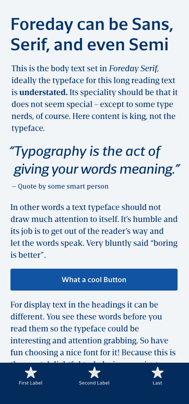
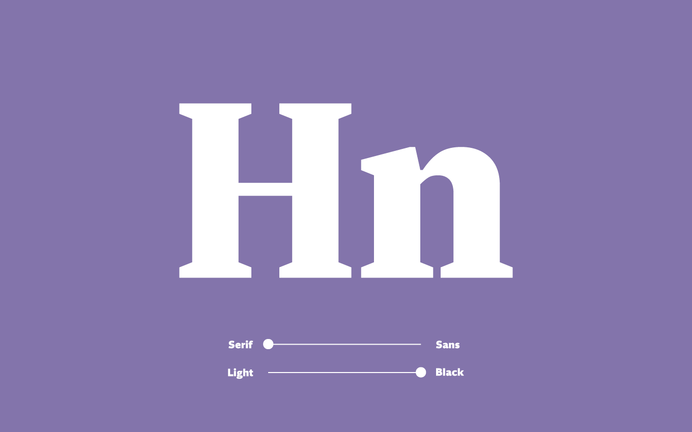
The concept of having a typeface that goes from Sans-Serif to Serif with steps in between first came to my awareness with the typeface Rotis which was vastly popular in the 90ies. The idea is to have a type family that also shows some unusual styles in between. 30 years later, DSType Foundry did this with Foreday. It has classical humanist shapes, which make it elegant and friendly in Sans and in Serif, since the construction is the same. It’s a great pick if you want something open, and pleasant to read, working for long reading applications but also some UI components in sans-serif.
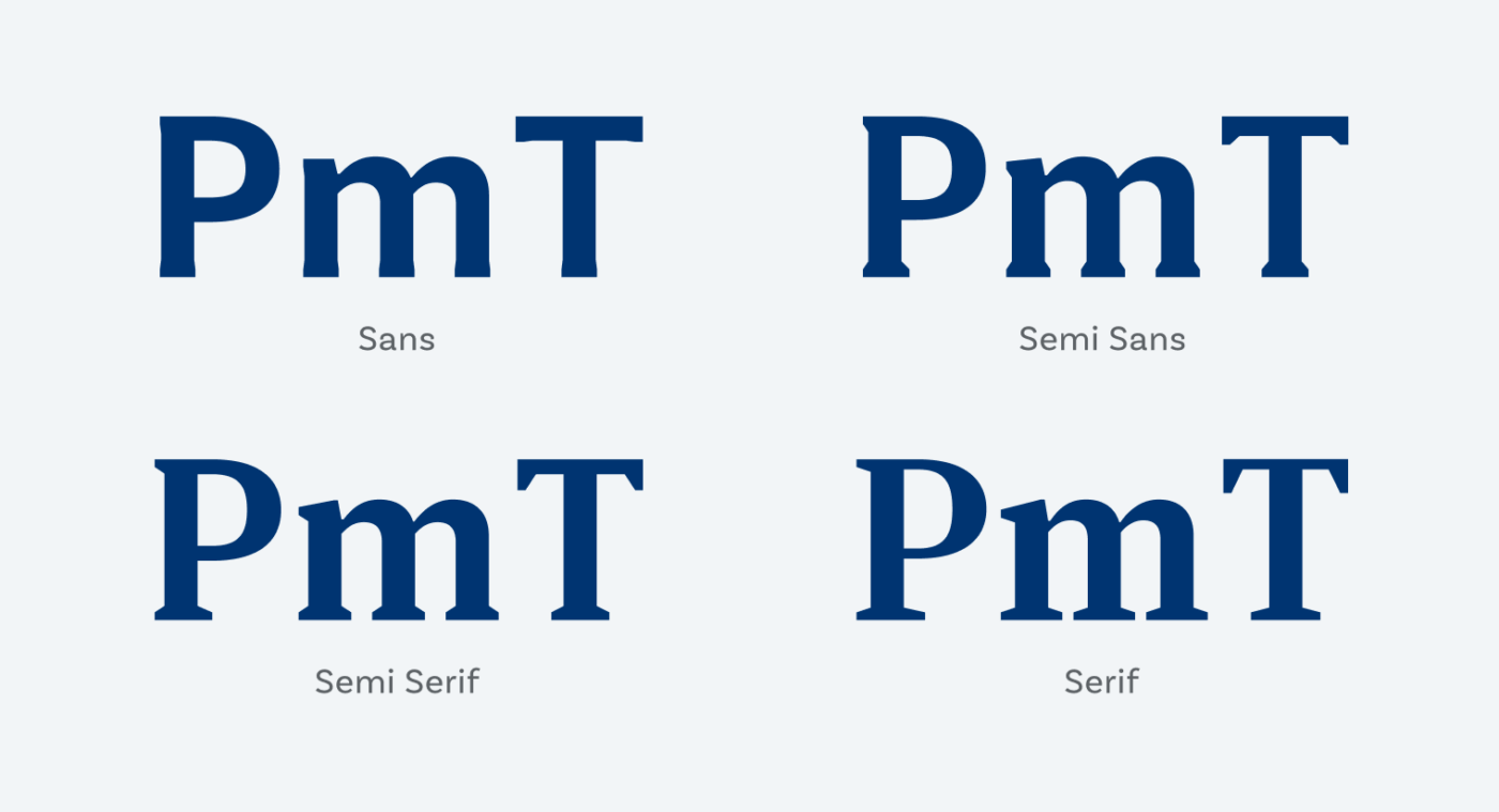
Back in 2018 it blew my mind, when I saw the variable font can seamlessly go from Sans to Serif, creating interesting states in between. As with Rotis, the Semi styles can look a bit odd. Semi Sans seems a bit clunky, Semi Serif interesting again, but as always it depends on what you want to use the typeface for. I would not recommend those for body text, but for a heading or something more striking it might be just right.
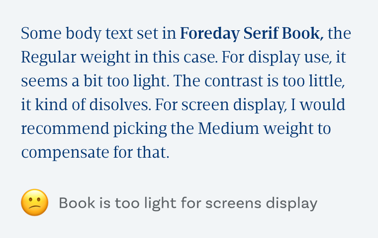
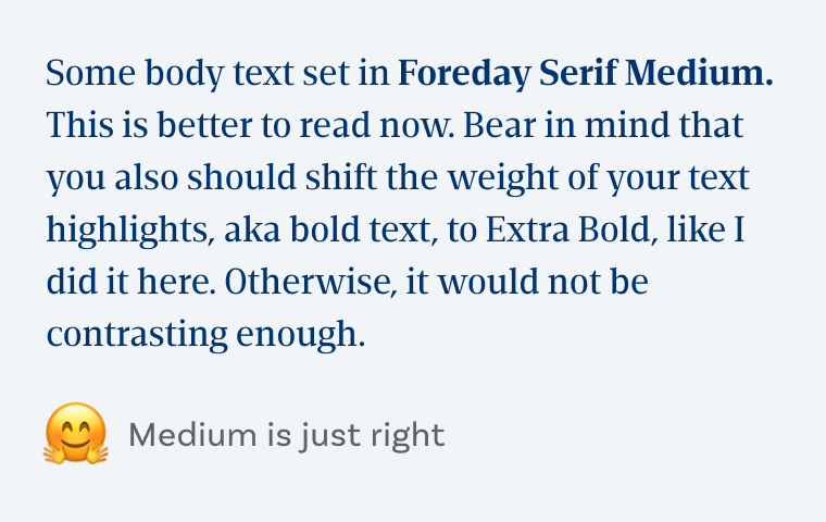
Foreday was designed for editorial use, which means print to me. So for screen, I recommend setting it one weight stronger than you would with other fonts, since the contrast is a bit too little otherwise. Instead of the Regular weight (which is Book in Foreday’s case) use Medium.
Recommended Font Pairing
Forday is a dynamic typeface. For eccentric headings, choose Faune or Reforma, which are also based on a dynamic form model. Otherwise, choose something very different, like Style Script.

- Headings
- Copy
- UI Text


Learn more about pairing typefaces using the Font Matrix.
What do you think? Is Foreday something for an upcoming project? Tell me in the comments below!
I’m a hunter for personality and uniqueness. My choice is Semi Serif.👌🏻 I always learn something new from you. Semi – oh, totally different dimension in typography. Thanks for bringing this to awareness.💡
Serif for text and Semi Sans for headings is my recommendation for editorial. It’s so convenient!
Welcome to the Semi-Club, Jana! Glad you learned something from it 😄!
Semi Sans options is… absolutely beautiful!
It’s very cool, Caco! I also like it more than Semi Serif, since it’s subtle but not too much. That’s the reason why I used the Semi Sans Italic it in the pull quote in the example above. 😁