Display typeface

from Floodfonts
designed by Felix Braden

18 Styles

9 Weights: Light to Black
with matching italics

Best for

  • Headings (display text)
  • Long reading text (body text)
  • User Interfaces (functional text)

License starting

below $30 (one style)
below $500 (bundle)

Specialty

A blackletter inspired typeface for bold headlines and even body text, remaining readable with a traditional, historic touch.

My thoughts on Ferryman

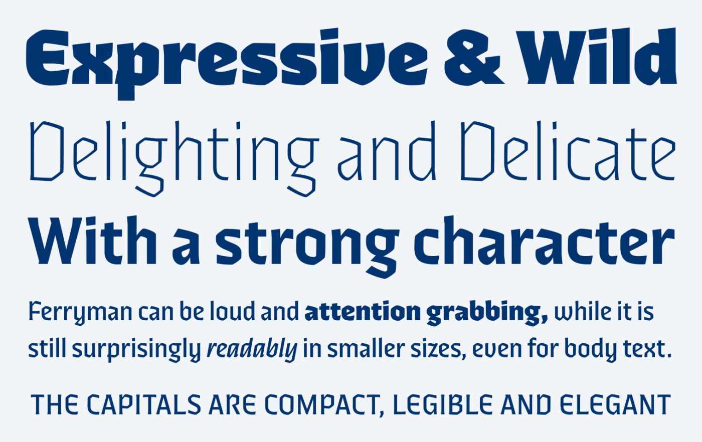
The blackletter inspired typeface Ferryman sets a traditional, historic, and expressive vibe, while being made for everyday use. The typeface is wild in the stronger weights, giving you a more obvious blackletter connection. The light weights are de-light-ful – I know, I’m the best writer 🤪 – with an unusual monolinear elegance, something you don’t know from traditional broken fonts.

Expressive & Wild Delighting and Delicate With a strong character Ferryman can be loud and attention grabbing, while it is still surprisingly readably in smaller sizes, even for body text. The Capitals are compact, legible and elegant
Extra Bold is extra wild, is Light so elegant – Ferryman’s mood dramatically shifts, depending on the weight.

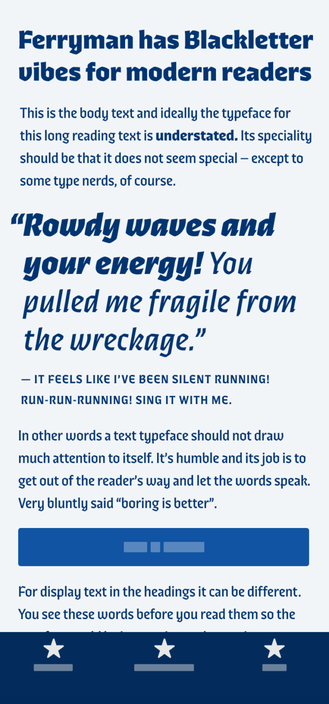
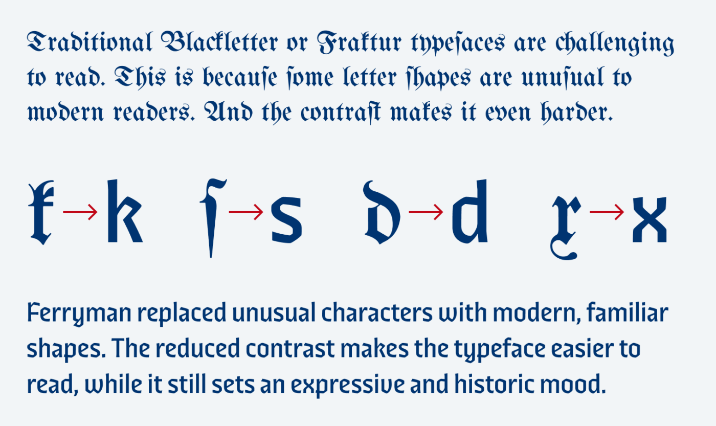
But Ferryman also works surprisingly well when used for a fair amount of copy, retaining its readability. The secret behind this, is that Ferryman replaces unfamiliar characters from traditional blackletter typefaces, with letter shapes that are common to modern readers. Also the reduced contrast and large x-height contribute to better readability.

Traditional Blackletter or Fraktur typefaces are challenging to read. This is because some letter shapes are unusual to modern readers. And the contrast makes it even harder. Ferryman replaced unusual characters with modern, familiar shapes. The reduced contrast makes the typeface easier to read, while it still sets an expressive and historic mood.
When comparing UnifrakturMaguntia with Ferryman, you see how much more legible it is for nowadays readers.

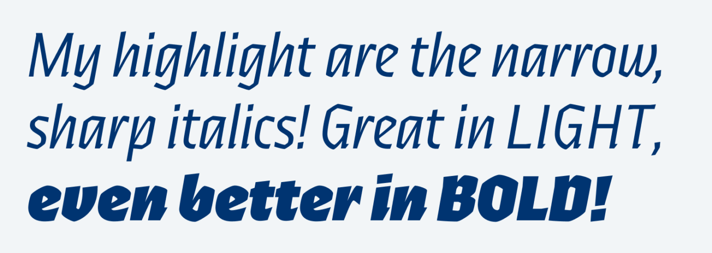
The goal of Ferryman was never to accurately reproduce a historic style, so it surprises with italics, something you would not find in traditional in blackletter fonts. These are my highlight – energetic, snappy and contrasting!

My highlight are the narrow, sharp italics! Great in light, even better in bold!
I’d follow these italics everywhere!

Ferryman is a wonderful mix of traditional and modern, unusual and familiar. Making it ideal for larger display text, strong headlines, logotypes or poster design. A counterpoint to blunt and slick geometric sans-serif typefaces.

Recommended Font Pairing

Ferryman pairs well with snappy Piazzolla or contrasting Comma Base, but also would be great companion to smooth Foreday Sans.

Ferryman
Ferryman
  • Headings
  • Copy

Learn more about pairing typefaces using the Font Matrix.


What do you think? Is Ferryman that would work for a project celebrating retro aesthetics? Tell me in the comments!

Typographic power to your inbox

  • Font Friday: I recommend one typeface per week, free fonts included.
  • Type Tuesdays: articles & videos that up your design game.
  • Join 2500+ typography enthusiasts, unsubscribe anytime.
Edition #139, published

Leave a Reply

Your email address will not be published. Required fields are marked *