
My thoughts on Fauna One
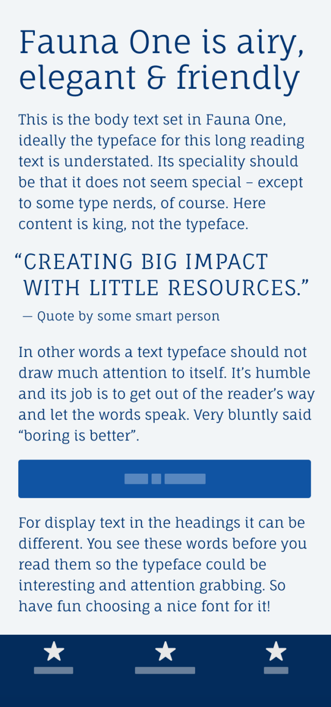
Fauna One by Argentinian type designer Eduardo Tunni is a hidden gem I discovered on Google Fonts. This dynamic, linear, semi slab serif, conveys an organic, airy and friendly vibe for your project. The narrow proportions make it space-saving and ideal for crisp headings, the large x-height, and open apertures makes it easy to read in copy.
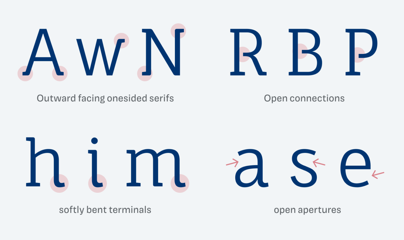
Taking a closer look at the details, you will soon discover what creates this clean impression. The serifs were taken away completely or just in parts at some places. Also, some connections were opened, while some terminals are softly bent.
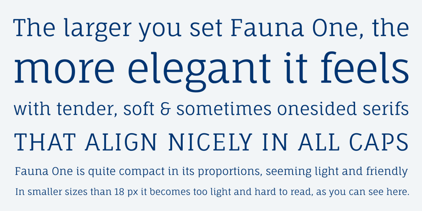
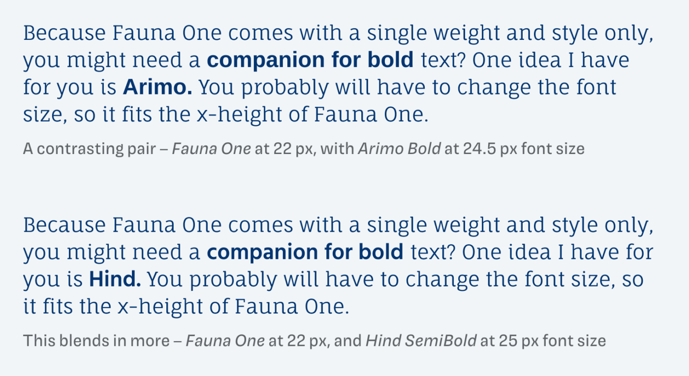
The catch with Fauna One is, that it only comes in one style. Don’t set it below 18 px or 12 pt font size, or it will become too delicate and harder to read. And, if you want to highlight parts of your text in bold, you might want to pair it with another typeface. One way to go is choosing a sans-serif, see my pairing with rational Arimo and dynamic Hind, both free fonts as well. Depending on your choice, it can result in something very contrasting or more harmonious (learn more about pairing fonts).
So even though, Fauna One only comes in a single style, has no additional OpenType features or other bells and whistles, I find it refreshing and challenging to as much as possible with this typeface. So embrace limitations to spark creativity.
Font Pairings with Fauna One
Fauna One is a dynamic, linear semi-slab serif typeface, performing best in headings and a little body text. Combine it with one of my suggestions for your specific use cases, like UI design.

- Headings
- Copy

Learn more about pairing typefaces using the Font Matrix.
What do you think of this week’s typeface? Let me know in the comments, and share it with me when you used it in a project!
Eine wirklich schöne Schrift. Danke für den Tipp!
Das freut mich sehr, Lena!