My Bajazzo Font Review
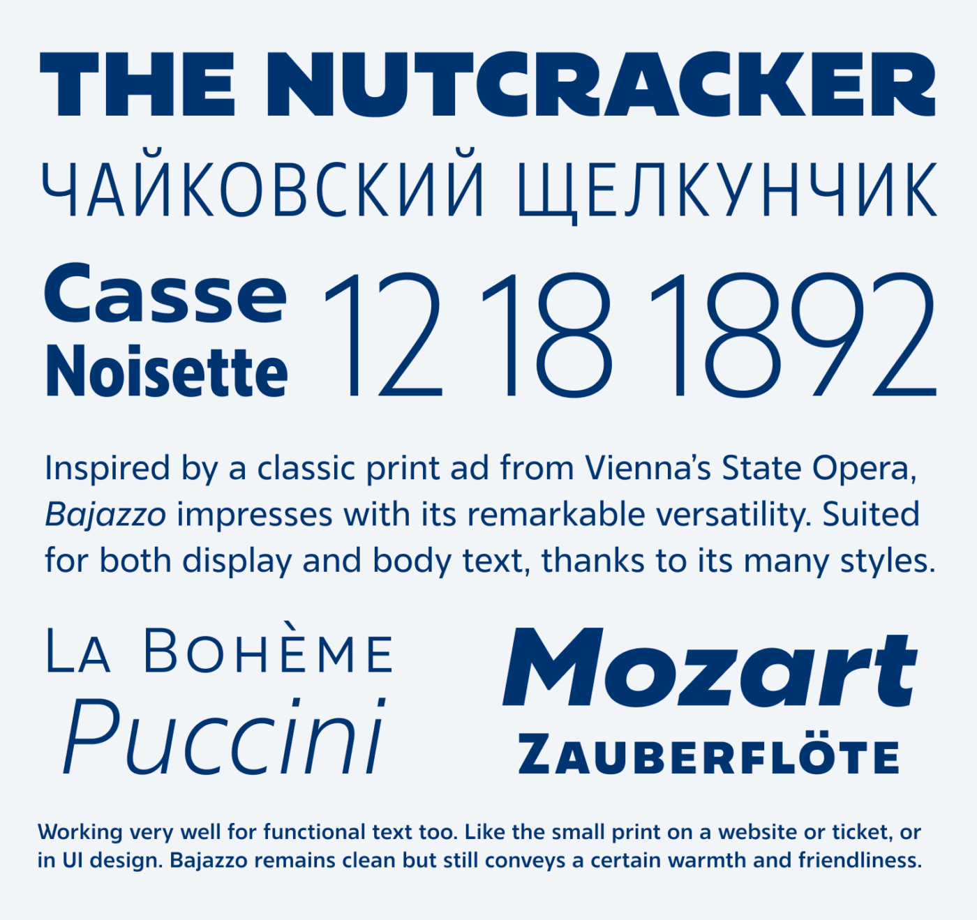
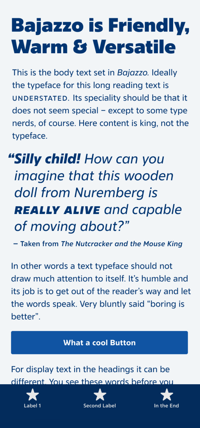
Let’s go to the Ballet! To the Nutcracker, of course, Christmas is coming. And what better typeface to take with us than Bajazzo! This versatile superfamily, coming in 9 weights and three widths, will cover most of your design needs, from expressive headings down to dry, functional captions.

Its designer Lisa Schultz told me the typeface was inspired by an old ad from Vienna’s State Opera. Comparing it with Bajazzo Rounded, you can observe how well the essence of the typeface was captured, cleaned up and made accessible for a broad range of applications.

Speaking of alternative characters – Bajazzo offers a wide range of adjustments: Make it warmer with rounded dots or this wonderful flared capital “R”. Or a bit cleaner, with a simpler “t” and a single-storey “a”. Especially when creating logotypes, having these options is great.

This superfamily cover a wider range of typographic expressions, going from Narrow to Expanded, Thin to Black, in both Latin and Cyrillic script. Bajazzo’s versatility bridges elegance and functionality, making it a dynamic toolkit. With its alternative characters and adaptable styles, I can recommend it for everything from branding to UI design.
Font Pairings with Bajazzo
Bajazzo is a dynamic, linear sans-serif typeface. To take your titles and headings up a notch, pair it with one of my suggestions below.
- Headings
- Copy
- UI Text
Learn more about pairing typefaces using the Font Matrix.
Wanna dance with Bajazzo? Tell me in the comments! Also, if you came across another cool font that I should feature!

