
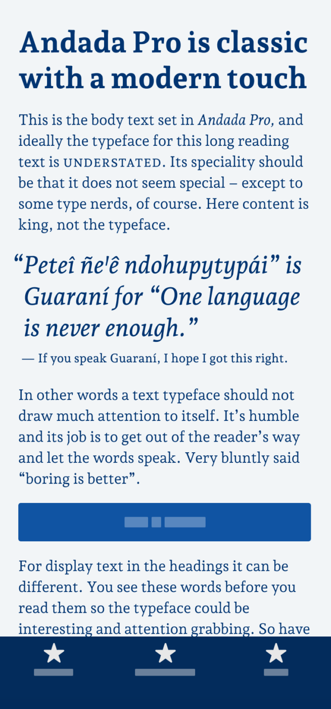
My thoughts on Andada Pro
After so many sans-serif typefaces, It’s time for a little variety, and the free font Andada Pro is perfect for that. This typeface is made for body text, with a medium stroke contrast that is just right to give you that classy book serif vibes. For a slab serif typeface, Andada Pro is very fluid and organic – more on this in the upcoming Font Friday Digest on Patreon.
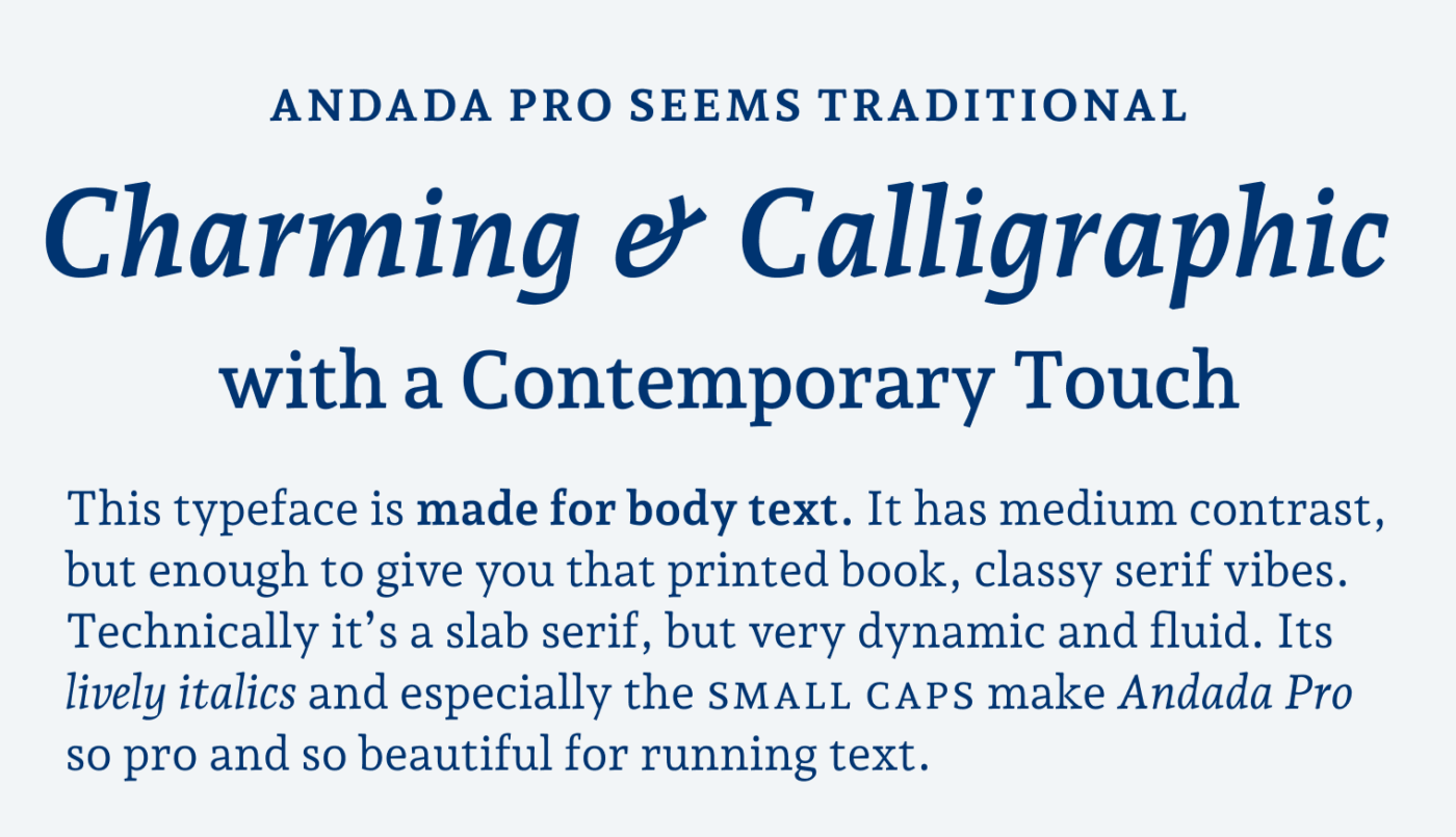
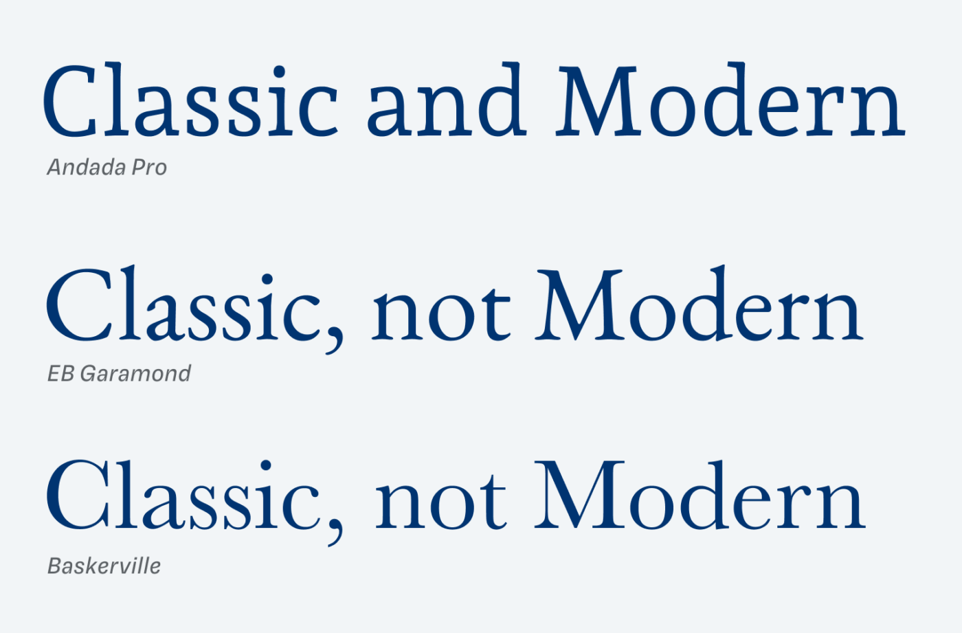
But it also seems quite modern. You might say: “But this is a serif, how can it be modern?”. It always depends on what you set it next to. Traditional serif typefaces like Garamond or Baskerville have much more stroke contrast, which makes them seem more noble, but also a bit dusty.
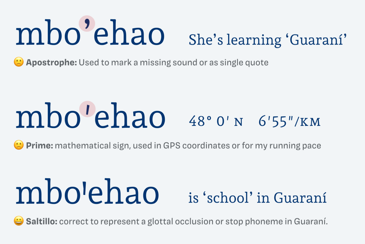
Andada Pro was designed to be used in a specific bilingual context, Spanish and Guaraní, which is spoken by indigenous people in South America. Guaraní language uses the Latin system and a special character, named puso. The correct sign to represent it, is the saltillo, not an apostrophe, nor a prime. Learn more about Guaraní language at the Andada Pro minisite.
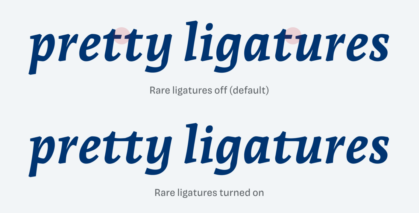
The typeface is also packed with a ton of OpenType Features, like stylistic alternates, fractions, and gorgeous rare ligatures, even more beautiful set in Black Italic, as you can see below. I can imagine the italics being used for package design or in other display text. The Romans work best for long reading text.
Overall, Andada Pro is a gem, supporting immersive reading experiences with a certain finesse, waiting for you to let your content shine in 219 different languages.
Recommended Font Pairing
Andada is a dynamic, contrasting serif typeface. It pairs well with clean and warm Gelogica and Asap, but also with geometric SFT Schrifted Sans for interesting headings.

- Headings
- Copy


Learn more about pairing typefaces using the Font Matrix.
Do you speak Guaraní? Tell me in the comments! Also, if you have a suggestion for an upcoming Font Friday 😉.
Love this one, thanks Oliver! It doesn’t only look and feel good, I’m really amazed by all the detail the designers went into, covering so many use cases and language requirements. A really versatile font!
Right? Discovering all these OpenType features is like opening a treasure chest! Le me know if you use it on a project!
Thanks for the discovery, I really like this slab serif font and the integrated ligatures.
Yay 😀! Hope you will use it in a cool project, Nicolas!
Hey Oliver! What a classic article. I also have an idea about the font and your article is very classic. I like the display fonts. Keep up the great work.
Thanks a lot.
Thank you, David! I’m glad you enjoy this one. It’s too gorgeous. Just recorded a the June Font Friday video digest for Patreon and looking at it again made me very happy 🤩.