
My thoughts on Amaranth
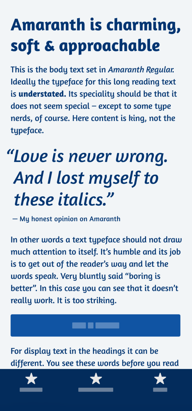
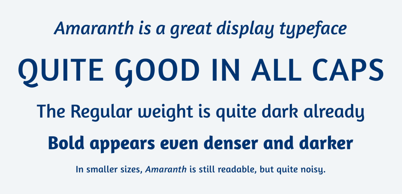
Amaranth is a free, sans-serif typeface that combines simplicity with charm. It works best for larger text and titles. Especially the snappy, lively italics with their playful curves and slight contrast deserve to be adored. For a little bit of copy, Amaranth might still work, but since the Regular weight seems quite heavy, I would avoid it for more than one paragraph, as you can see in the phone image at the top.
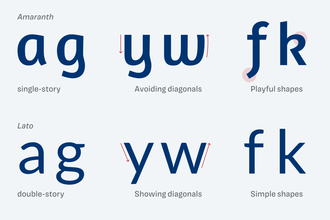
Amaranth is an upright italic, but what does this actually mean? An upright italic shows the fluent letter shapes of an italic, but without being angled. This creates the typeface’s joyful and organic appearance. When comparing it to Lato, another sans-serif typeface, you see what I mean.
Recommended Font Pairing
The interesting, dynamic letter shapes of Amaranth are ideal for headings. For copy, or UI text, I recommend picking something lighter, with little contrast, like Palanquin or Lato.

- Headings

Learn more about pairing typefaces using the Font Matrix.
What do you think of Amaranth? Tell me in the comments below! Also, if you have a suggestion for a future Font Friday.
This is my reaction 🤔looking at g, y, and even k.
Before this, I was considering Amaranth many times in my projects. But it always felt off and I couldn’t explain why. Now, when you put it under your expert’s loupe, I see… It’s like The Hunchback of Notre Dame. There is some ‘old story’ in it. I dunno Oliver. And thank you for helping me realize why I actually don’t want to use it. Except for headlines, on occasion!
Happy family gathering and your runer win🏆