
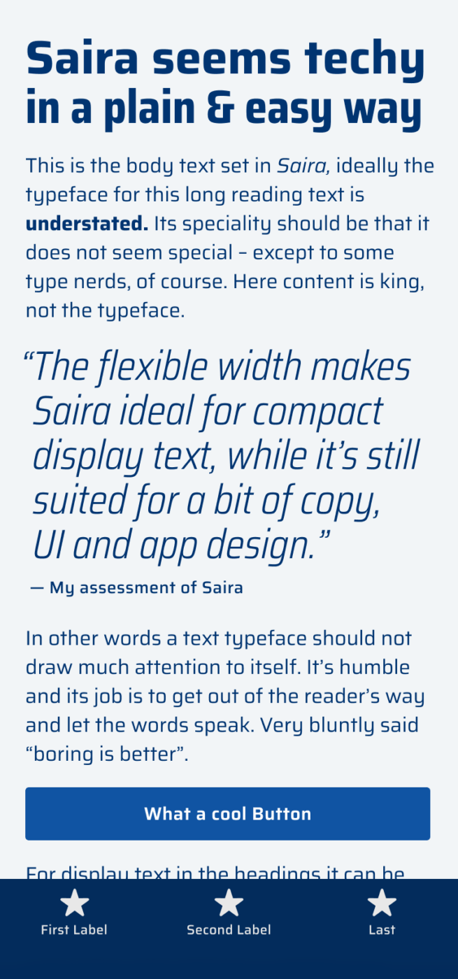
My thoughts on Saria
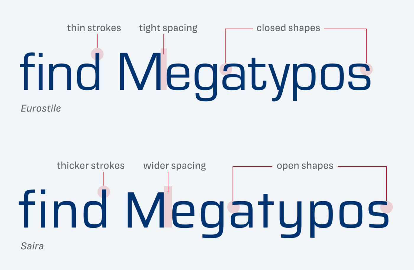
Jordan emailed me: “One of my favorite typefaces is Saira from Omnibus-Type. I’d love to hear what you think about it, especially in regard to what it’s well suited for.” All right, then let’s take a closer look at it! At first, this free sans-serif super family reminds me of the popular classic Eurostile by Aldo Novarese from 1962. Both have a squarish design, appear constructed and mechanical. However, Eurostile is clearly more restrained, and spaced tighter, while Saira leaves a plainer and more open impression.
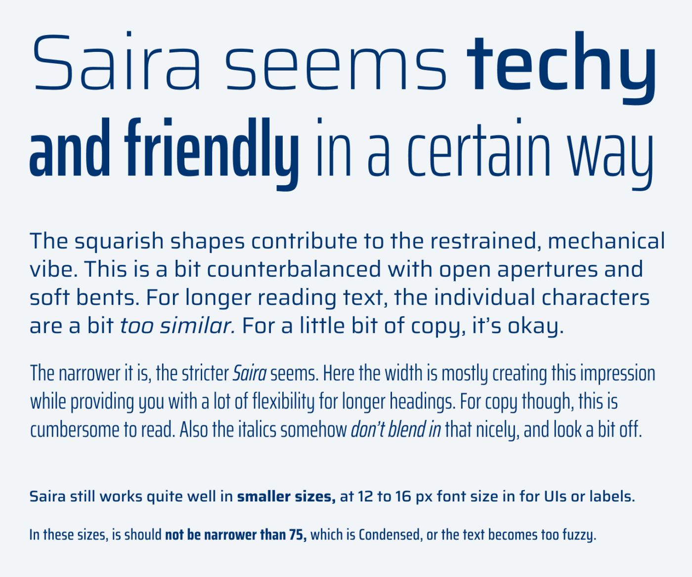
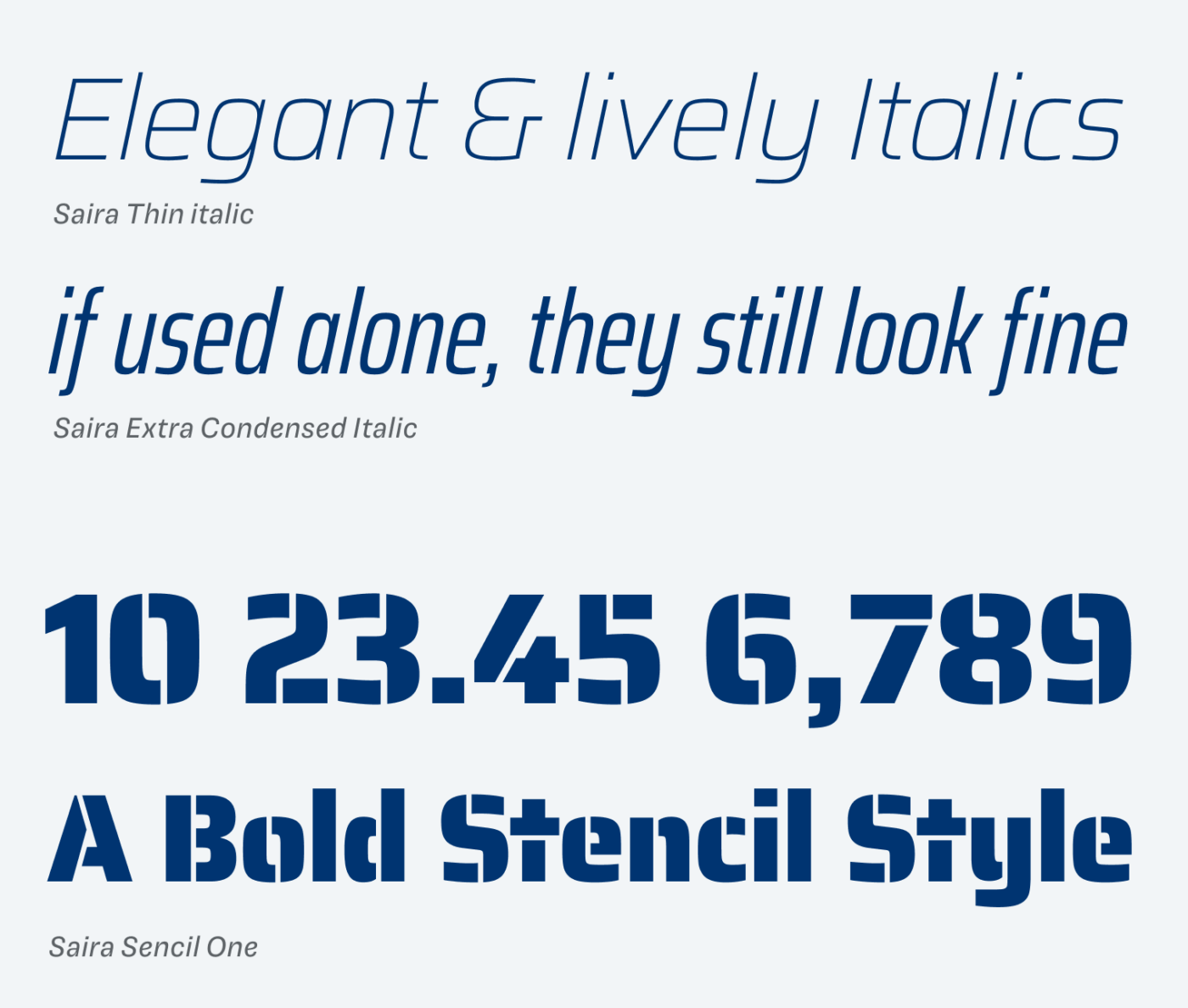
This also teaches us, what to keep in mind when using Saira. In headings, the typeface works smoothly, letting you adjust the width to the space available. I recommend reducing the tracking for larger text in normal with, because Saira seems to be more spaced for body text. For a bit of copy, it works well, but after some time the quite similar letter shapes (g y, d b, or q p) will make it exhausting to read, see below. In combination with the upright text, the condensed italics look a bit off – too steep and uneven. If clear character recognition is not a top priority, the typeface is also working for UI design.
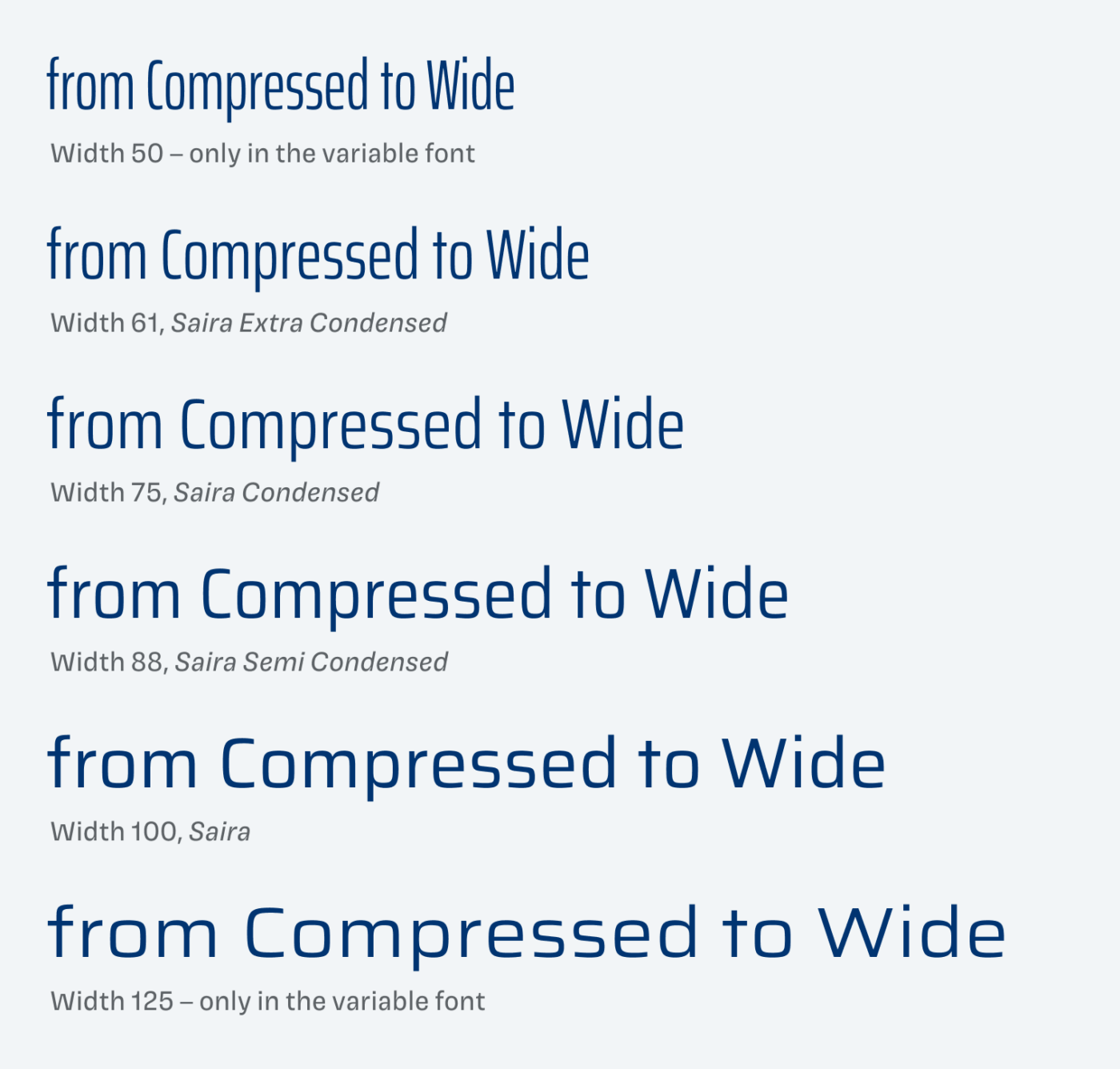
The variable font covers a vast design space, going from compressed (50) to wide (125), which are additional width that are not available in the static fonts. On Google Fonts, you can find these other styles as the individual families Saira Semi Condensed, Condensed and Extra Condensed.
Two more things I like a lot about Saira are the lovely italics. They seem playful, since they are not only a slanted version of the upright style. Also, there is an additional stencil version, which has, beautiful numerals. The cut-outs are also very well-placed, less intrusive as you would see it with other stencil typefaces, which makes it feel more natural and elegant.
Overall, Saira is a decent choice for a fair amount of body and UI text, with display text being the place it can truly shine.
Recommended Font Pairing
Looking for an interesting companion for Saira? Choose Kyoshi for Retro Gaming vibes!

- Headings
- Copy
- UI Text


Learn more about pairing typefaces using the Font Matrix.
Thanks to Jordan for this suggestion! Tell me your thoughts in the comments, also if you have an idea for an upcoming Font Friday 😉.
Very cool—thanks, Oliver!
I really like the techy yet friendly look. That really sums it up. I love Eurostile, which Saira also reminded me of. Something about that rounded off square shape. 😍 Saira’s line spacing surprised me in that it seems uncommonly large. I think that might contribute to it being not so handy for longer texts—at least where space is tighter. But I do wonder if the line spacing was expanded to make body copy easier to read, since the glyphs are quite similar as you mention. 🤔
I’ve yet to see Saira used much. But I saw it in the logo of a quiz show in Germany (the name now escapes me). Just the other day, I saw it used in a rebranding that was done by an Austrian design company for an Austrian e-learning provider: https://www.hcg-corporate-designs.com/en/spedifort. I think the overall design looks great.
I’m a translator, not a designer, but my career has turned me into a font lover. I also love rebrandings. 😁
Thanks for your comment, and sharing this use case, Jordan. About the large line-height, which is defined by the Saira’s vertical metrics, I’m not sure. Personally, I feel it is way too much, and I don’t think it is because of fitting better for body text.