Display typeface

designed by Alanna Munro

16 Styles

8 Styles
all as solid and color fonts

Best for

  • Headings (display text)
  • Long reading text (body text)
  • User Interfaces (functional text)

License starting

below $20 (one style)
below $100 (bundle)

Specialty

A pixel style typeface that celebrates 8-bit retro aesthetics with a contemporary twist. Coming as a color font and in eight fun styles, Kyoshi will even impress in witty headings.

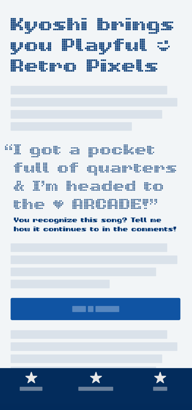
My thoughts on Kyoshi

I’m so drawn to the typefaces Alanna Munro releases, because it delights me to see how playfully she manages to combine two of her passions: gaming and type. With the pixel inspired typeface Kyoshi, Alanna is giving one up to 8-bit nostalgia. It is very confident for a pixel font, with wide proportions, and coming in eight cheerful styles.

Fun Retro Game Font set in Kyoshi Heart, Knit, SmDot, Dot, TwoLine, ThreeLine, SmQuare, and Square
The various styles of Kyoshi, from very detailed to simpler

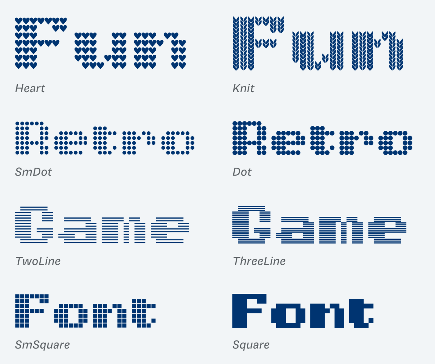
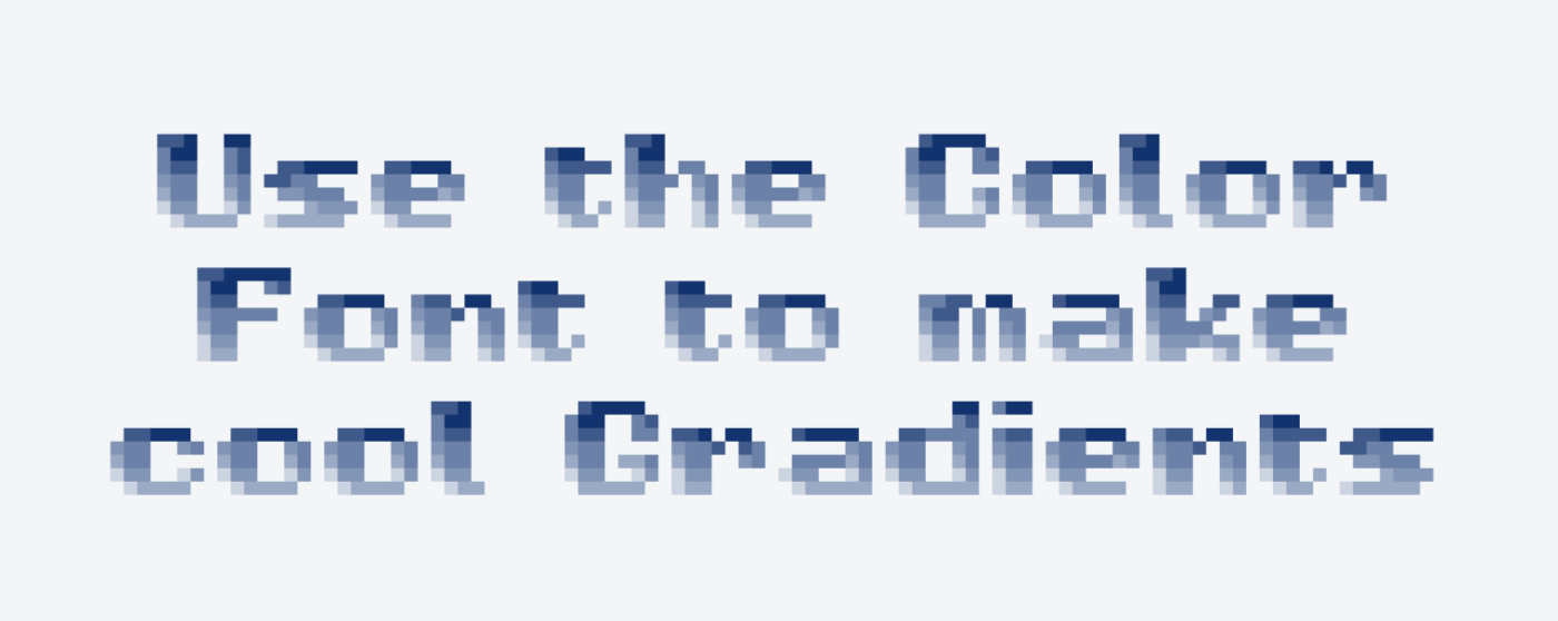
You can see that these styles are not only pleasing low resolution scenarios. Especially the expressive Heart and Knit style keep it interesting for larger sizes. Besides some lovely symbols, like emoji, Kyoshi’s superpower is, that it’s a color font. You can use the nice default style, or make it fit to your palette with the color font customizer by DJR.

Use the color font to make cool gradients.
Giving you even more 8-bit-nostalgia-vibes: the gradients in Kyoshi Square Color

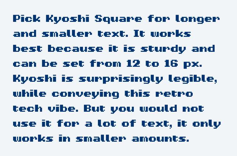
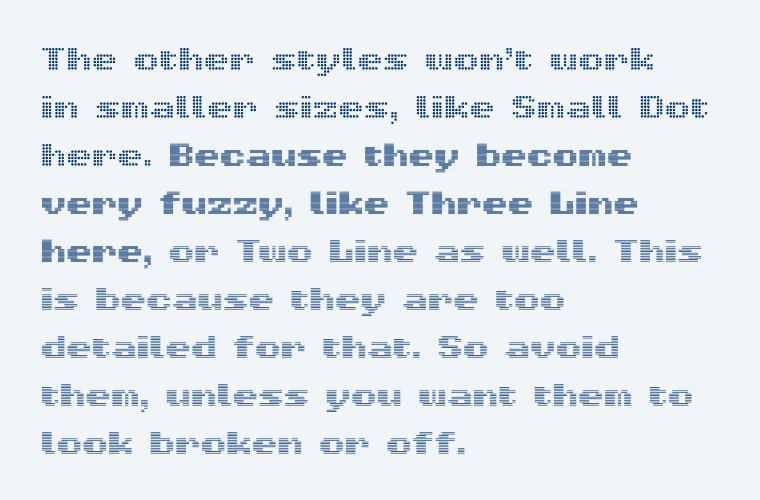
For smaller text, Kyoshi Square is the best and most robust option. It will work for a little running text even. The other styles are too detailed and become blurry in sizes below 30 px, so better avoid them in these use cases.

Pick Kyoshi Square for longer and smaller text. It works best because it is sturdy and can be set from 12 to 16 px. Kyoshi is surprisingly legible, while conveying this retro tech vibe. But you would not use it for a lot of text, it only works in smaller amounts.
🙂 Kyoshi Square works best in small sizes. It remains clear and legible.
The other styles won’t work  in smaller sizes, like Small Dot here. Because they become very fuzzy, like Three Line here, or Two Line as well. This is because they are too detailed for that. So avoid them, unless you want them to look broken or off.
â˜č Kyoshi’s other styles become fuzzy in small sizes. Better set them larger.

Overall Kyoshi brings a lot of joy and room for visual expression with it. May it be for the interface of a retro themed app, or bold headings with sober stripes or funny hearts in it. Use this opportunity to 
 play!

Recommended Font Pairing

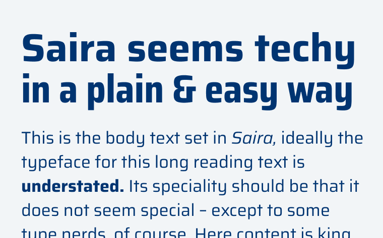
Since Kyoshi is so different from other fonts, you can pair it with anything that you feel fits to it. Pick a typeface that is rather square and maybe a bit wider, like Saira, which will also work for a fair amount of copy.

Kyoshi
Kyoshi
  • Headings
  • UI Text
Saira (free)
Saira (free)
  • Headings
  • Copy
  • UI Text

Learn more about pairing typefaces using the Font Matrix.


What do you think? Is Kyoshi a typeface that would work for a project celebrating retro aesthetics? Tell me in the comments!

Typographic power to your inbox

  • Font Friday: I recommend one typeface per week, free fonts included.
  • Type Tuesdays: articles & videos that up your design game.
  • Join 2500+ typography enthusiasts, unsubscribe anytime.
Edition #135, published

Leave a Reply

Your email address will not be published. Required fields are marked *