My Ruda Font Review
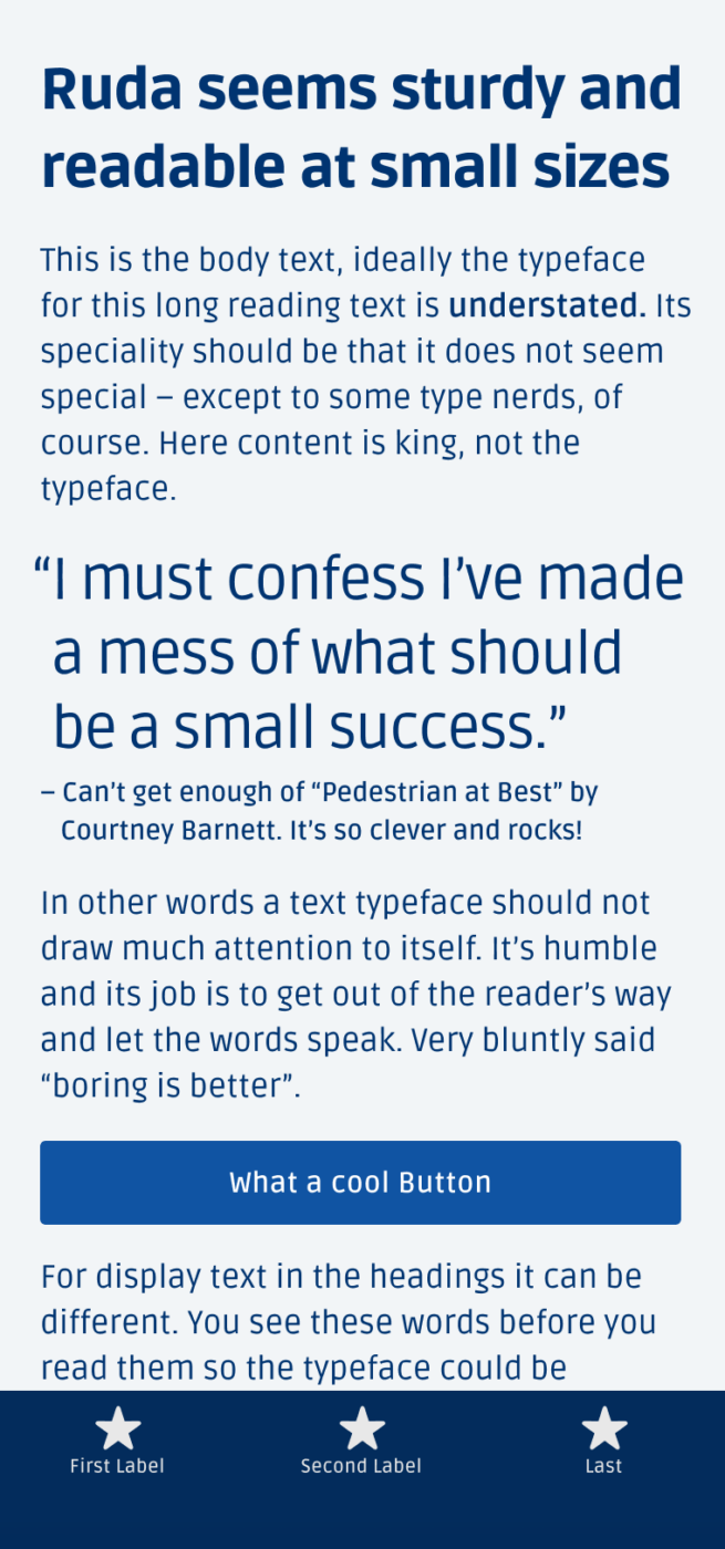
As a UI designer, I constantly look for a typeface that is compact, rocking at small size, and also comes with a certain energy. And Ruda is that free sans-serif typeface. It makes a clean first impression, but when looking closer, you see that it has a lot of energy in its details. Besides the snappy open loop of that cheeky g, I adore the subtle stroke contrast. Combined with its compact squarish design, it is creating Ruda’s certain dynamic.
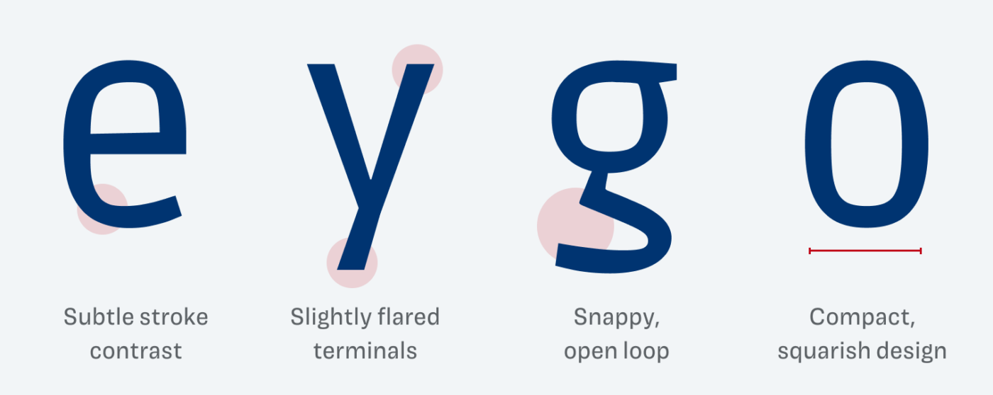
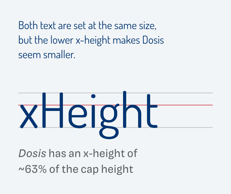
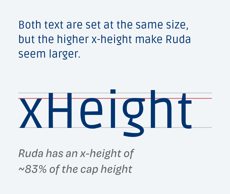
Ruda was made for product labels, so it performs best at small sizes. Everything is tailored towards that, the spacing and also the x-height, which is the height of the lower case characters. When comparing it to Dosis – a quite inappropriate typeface for anything but headings – you see how well Ruda performs.
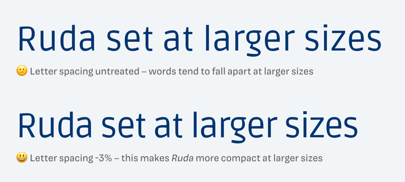
But what also becomes obvious here is, that Ruda kinda falls apart when used for larger text due to its spacing. This is why I recommend decreasing the spacing. Start with −1% to −2% between 30 and 50 px, which translates to letter-spacing: -0.02em. Increase it up to −3% the larger it gets. This will make work for headings.
Also, there is another thing you should pay attention to when using Ruda, which I’ll explain exclusively on Patreon in the monthly Font Friday Video digest. Overall, Ruda is the typeface your captions, body text, and user interface designs have waited for to be rocked by!

Font Pairings with Ruda
Ruda is a dynamic, linear sans-serif typeface. But the narrow proportions and slight contrast almost reminds me of a simple blackletter typeface, which is why Grenze would be a wonderful companion for headings. Alternatively it would also pair well with something less themed and more classy like Larken.
- Headings
- Copy
- UI Text
Learn more about pairing typefaces using the Font Matrix.
What do you think of Ruda, is it something for your next project? Tell me in the comments below!

Finally a quirky, well-deserved name for the font, and one very special with all interesting characteristics in its letters. I’m not a fan of squarish and sturdy style but I love it in Ruda. Everything is compact.
Thank you for reminding me of Dosis. I always loved that font but didn’t know what to do with it.
Song: https://www.youtube.com/watch?v=0VU9p1p9fXE Because we think of our users, always showing them love 😍
Sure, Jana! You will see Dosis again in the upcoming webinar about Website Redesign 😉.
Not a big fan of that song, because I heard it just too, too many times on the radio throughout the 90ies as a kid 😂 … but the live version is truly great! Thanks for sharing! I’m in a good mood now.
I am a fan of Ruda. It works very well as a title font for Faustina.
Interesting combination! I’d go the other way and use Ruda for copy and Faustina for headings, since large size are a bit of a weak spot of this typeface, but pairing them definitely works.