Let’s discover how to get most out of the design of a conference website, so that it can convey its message even better. Read the article or watch the video and let’s redesign this website together in a free, fun and practical session.
You will learn:
- How to analyze a web design,
- What makes a good font choices and font pairing,
- About layout, composition and how to purposefully guide attention,
- How to set text right and care about micro typography.
Why doing this redesign?
I met lovely Dave Letorey, one of the organizers of the wonderful State of the Browser conference. He asked me if I wanted to share this event for the web community with you. I suggested why not doing a live session redesigning the website, so that everyone can learn from it?
Some of my comments might sound harsh or rude. I don’t want to downgrade the people behind the web design. I really appreciate their effort for the community, how they bring people together by creating such a wonderful event. So everything I say is from a perspective of enthusiasm and improvement. How to leverage unused potential of the design.
I do not expect that anything from my suggestions will be implemented, I just want this to be a real life example from which we can all learn.

The process
Before we get going, let’s set a few guidelines. We will not start from scratch. I want to use what is already there, redesign in a way that the site does not lose its visual identity. The goal is, that people should still recognize it as the same conference.
When doing a redesign, I generally follow these four steps:
- Analysis
- Structure
- Basic Redesign
- Design Refinement
Let’s address them step by step. I’ll only do this very briefly in the post. If you want to go deeper, watch the whole session, where I also added chapter marks. Or access the Figma file and study the individual steps and notes there.
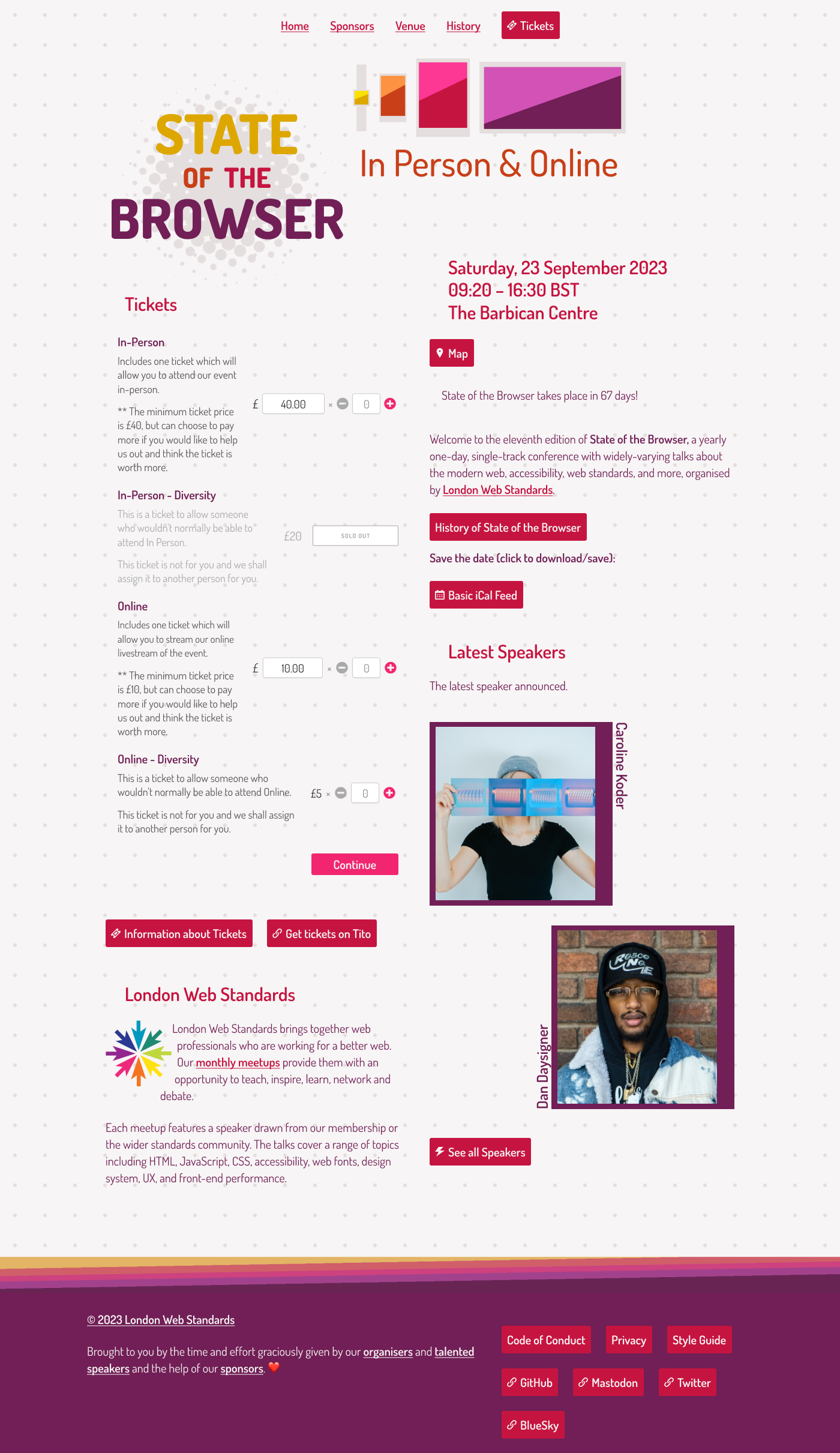
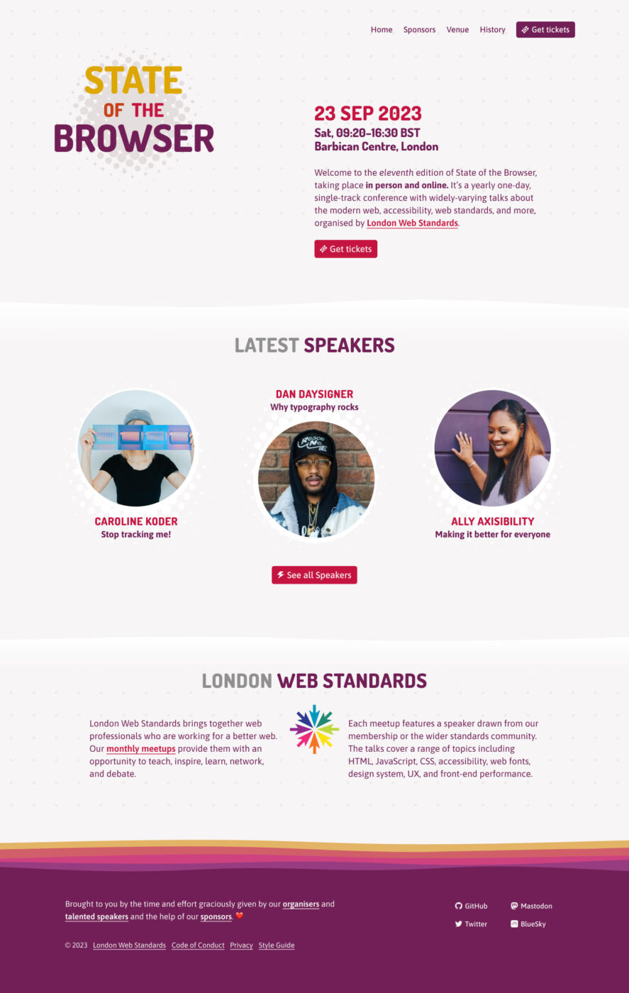
1. Analysis of the current web design
Let’s structure the analysis of the current design under several aspects.
Overall impression
- Too many, equally important elements
- Unclear primary call to action
- Unclear alignment of elements
Structure
- Little defined sections
- A lot of focus on the tickets form
- Little focus on the speakers
Visual Design
- Mood: Fun, playful, approachable
- Joyful colors
- Inconsistent use of rounded/squared shapes (everything rounded except speakers, footers)
- Noisy background
- Footer Links too prominent
Typography
- Unclear hierarchies
- Unclear alignment
- Small perceived type size (18px)
- Too little contrast in some parts
- Different style for visited Links are irritating
Font choice
The currently used typeface, Dosis, has a few advantages:
- Friendly, soft
- Unique/unusual
Unfortunately, the cons outweigh these:
- Striking characters
- Mechanical
- Very narrow
- No italics
- Quite light
- Low x-height
2. Structure
Ask yourself what are the most important sections? What is most relevant to the visitors of the page? What’s too much? Or is there something missing? I got rid of a lot of content, and rearranged things, ending up with:
- Navigation
- Header: where I removed the illustration
- Tickets: Where I removed the form, because it was too overwhelming on the entry page
- History: About the conference
- Speakers: More prominent now. Maybe I’ll rearrange it later.
- London Web Standards: About the organizers, sorry, organiser 🇬🇧😉
- Footer
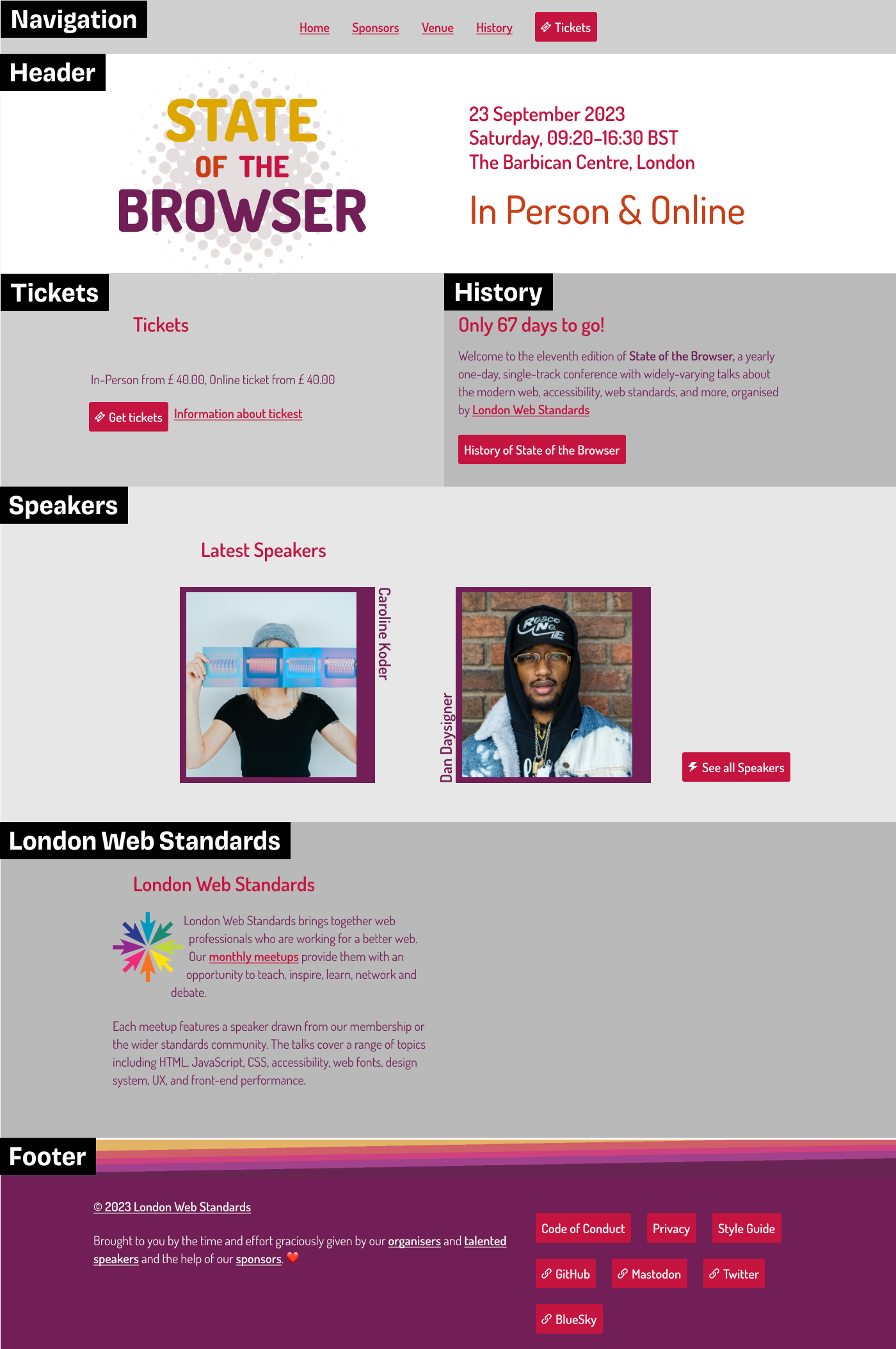
This is only a starting point, things can and should change throughout the design process, because you will see that elements might not be positioned right.
3. Redesign
My general approach in doing a web design is establishing a visual vocabulary and reusing it again and again. This goes for typefaces, colors, shapes, spacing, everything. Let elements relate to each other. This way they reinforce themselves.
Get detailed notes to the individual steps in the Figma file or in the video.
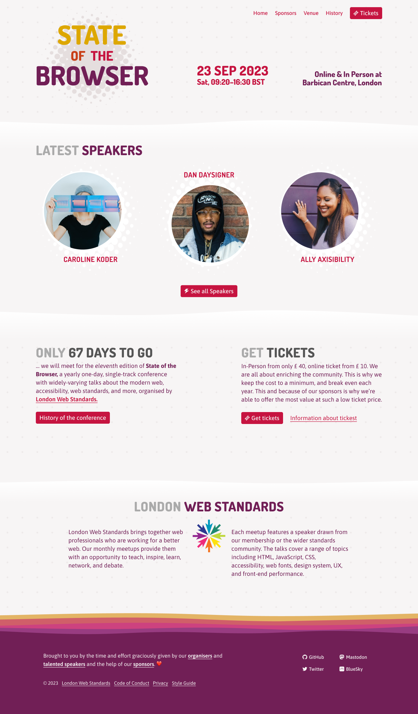
The most important design decision were:
- Body text: I switched to Asap, which is also soft like Dosis, but less annoying, and easier to read due to the higher x-height.
- Headings: I kept Dosis, but in all caps and in Extra Bold. This way it relates to the logotype.
- Page background: Making the dots more transparent and less irritating.
- Section separation: By adding wave shapes, it reflects the organic design of the logo. Especially love ❤️ the waves in the footer.
- Header: I removed the Illustration, since it conflicts with the soft aesthetic.
- Speakers: new design based on the halftone dots from the logo, also no dots in the background.
- London Web Standards: Redesign focusing around the logo. On the web the text could also wrap around the logo, like it does now, which I found neat at the current design.
- Footer: New arrangement, adding a link bar at the bottom, social media links with icons much smaller and less obtrusive.
4. Design Refinement
I still was not happy with the header. There was too much going on. It still lacked focus, while the ticket section felt a bit redundant. So I rearranged it again, coming to this result.
These things gave it the final polish:
- Header: Including information from the “Only 67 days …” section, more aligned with one primary focus.
- Navigation: In purple so that it does not stand out that much.
- Speakers: Adding the titles of their talks here so that you get a feeling for their topics.
- Ticket section: could be skipped, because it got integrated into the header.
- Headings: Making the gray darker, so that it is contrasting enough for accessibility reasons.
Before and After
Comparing the before and after, the redesign is more focused and reduced to the essential:
- There is more white space around the individual elements, which are positioned more purposefully.
- The typefaces are more balanced, with the body text being easier to read.
- The speakers and their talks stand out more, while being in alignment with the overall aesthetics of the page.
Note that his all went hand in hand with reshaping the content. Because design is never about making things pretty, it is about making sense so that things can become pretty.
Now, after having spent so much time with State of the Browser, check out the upcoming event and get a ticket. The past ten editions have shown a great track record of excellent speakers and topics! Prices are very affordable, which proves the point that this event is made for the community. Plus, diversity tickets are available as well. I won’t be able to attend live this year, but I’ll dial in for the web stream.
Now I’m curious, what did you think of this format? What was the best thing you learned or what did you miss? Tell me in the comments below!
Fantastic guide! Thank you Oliver.
Happy you enjoyed it, Alexey!
I love Before and Afters! Besides, in this format, you’ve brought all of yourself. The typographer AND the designer. All of your skills in one place (maybe, I must say, one video) ;). I loved it! The words “event” and “before and after” gave me an idea I want to share with you!
Mile grazie, Veronica! Thanks for your kind words ☺️!