
My thoughts on Asul
The free semi-serif typeface Asul by Mariela Monsalve mixes a classy first impression with a noble touch, and a certain simplicity. The lean, narrow capitals contribute to the overall elegant look. It is best in larger sizes, 24 px and upwards. This lets the subtle details of Asul shine, while coming across confident and clear.
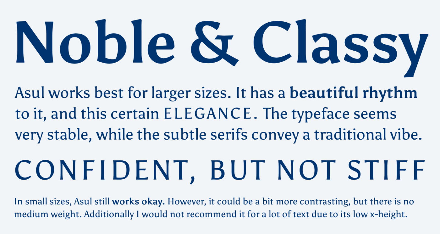
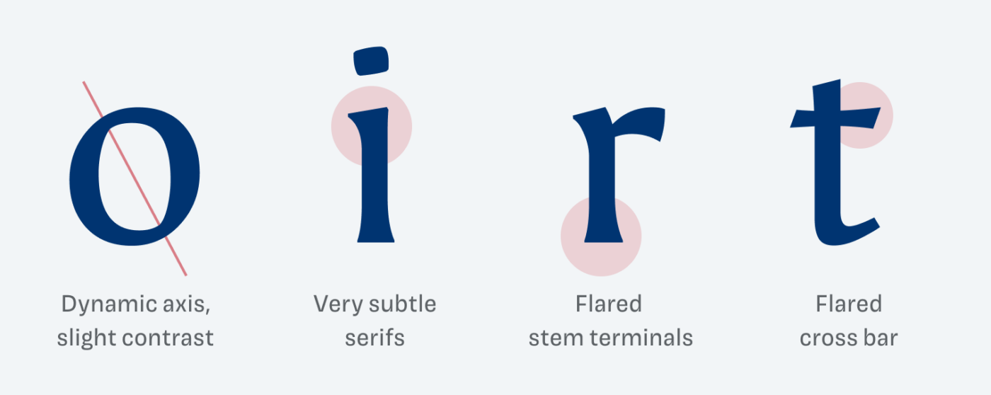
You can see how it originated from calligraphy, as the broad nib pen is still present in the dynamic axis (look at the o) or the slightly angled beginnings of the i and r. The serifs are only slightly flared, almost disappearing, so the traditional vibe mostly shows due to the subtle stroke contrast.
But not everything is perfect with Asul. There are only two weights, and the kerning is a bit off at times. You could even see that in the name of the typeface at the beginning of the article, where the “A” and “s” appear too close together. I’ll go into more details in the upcoming Font Friday video digest für supportes on Patreon.
I can imagine Asul for big text on an arty, confident landing page, a little intro text in a noble blog or in poster design.
Recommended Font Pairing
Asul is a dynamic, contrasting semi-serif typeface. If you look for a nice combination for small text or UI text, pick Ruda, which is also dynamic and by Mariela Monsalve as well.


Learn more about pairing typefaces using the Font Matrix.
Will you give Asul a chance in an upcoming project? Or have you already used it? Tell me in the comments!
Looks fantastic in the ‘CONFIDENT, BUT NOT STIFF’ example. All-caps seems the way to use this one, to me. Is that just kerning off, or did you alter the spacing?
Also, ‘works best for *lager* sizes’. Long week, Oliver?
Good luck, Birgit!
I increased the tracking with the all caps text. Thanks for typo, wish it was only the long week, but it’s just the usual typos 😅. Fixed it while drinking a … lager 🍺 😜.
I’m with Jeremy for all caps.
But, there is always one BUT Oliver, and it’s that these angles in r and i make Asul feel angry. 😡
Look at the word Classy and don’t tell me that that guy isn’t mad? But when you apply tracking, especially in all caps, the temper comes down. 😌
Anyway, Birgit, I’m sending you 🌸🏵️🌹💐🌺🌻🌼🌷You rock!
Jana! So great to read from you, I stared to miss you comments ☺️. I see temper in that angles not anger, but we might have a different perspective 😉.
Totally, in this case! Once confirmed: beauty is in the eye of the beholder 😊