
My thoughts on Fraunces
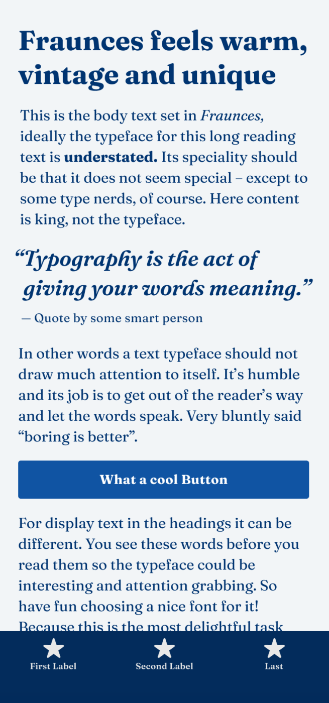
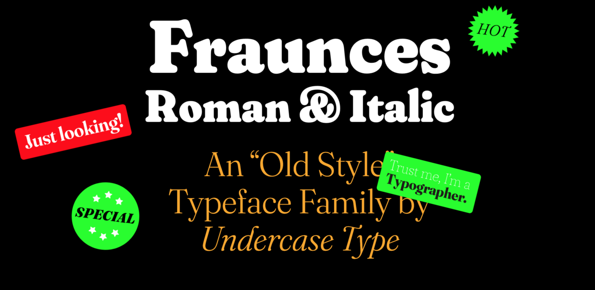
Fraunces is a display, soft-serif typeface inspired by early 20th century typefaces such as Windsor, Souvenir, and most famously the Cooper Series (watch this great video about it). It is available on Google Fonts and its range is just incredible! It’s a perfect, calm to expressive typeface for body text and headings, depending on the style you choose. For smaller sizes below 14 px it’s a bit critical and almost too delicate.
These kinds of fonts have a comeback. The designers Phaedra and Flavia call them wonky fonts, and on this delighting microsite they show so many beautiful samples, that you should definitely check it out. The soft, imperfect and approachable touch of Fraunces continues a trend towards more humanity and warmth, away from the omnipresent geometrical sans-serifs of the last decade. Among others, Recoletta (pretty popular in the last years), and Mailchimp’s custom display typeface Means, prove that. What do you think of it? Leave it in the comments, blow!
Recommended Font Pairing
Fraunces it a quite rational, contrasting sans-serif typeface. Pair it with something more simple and rational for body text or headings, like Garino or Fig Grotesk. Or emphasize Fraunces softness with geometric Outfit.

- Headings
- Copy
- UI Text


Learn more about pairing typefaces using the Font Matrix.
I love the comeback of these soft, quirky and retro typefaces! I am not a big fan of the brutalist, grotesk trends as they feel less personal to me. Sure, a good and functional grotesk such as Helvetica is practical and sufficient but what story or feeling does it display? I am a sucker for storytelling through typography so I am really digging the Fraunces! And maybe I also love it because we used Cooper Black for our wedding invitation recently, haha!!
It’s beautiful, right? Yes, Cooper Black! Cooper is super ubiquitous as well once you realize it, but it has much more character for sure than Hellvetica. I think Fraunce takes a lovely contemporary approach to that 🙂
And ofcourse it’s great that such a quirky font is now able to be variable, so cool!
I really like it! Especially the ‘sharp’ variant that counterbalances the softness of ‘soft’ and ‘supersoft’. It’s definitely been a trend in tech and digital product companies nowadays as its friendliness and fun suit perfectly the ‘cute’ and ‘friendly’ user interfaces(soft colors, big-figure illustrations, you know what I mean, just open Dribbble haha) that dominate the industry. I am a bit worried about it’s starting to get overused by designers but I think we all deserve some fun after 2020!
Absolutely, Victor! I like the sharp style as well, which will be great for body text! And it definitely will be overused 😉
New Kansas would also work well. It’s available on Adobe Fonts for free, and we wrote an interesting blog about Cooper and also Windsor.
Thanks for that addition, Miles! New Kansas is beautiful, I love New Spirit as well.