
My thoughts on Mayenne Sans
Mayenne Sans is a special, tight, and rich in contrast treat for your eyes. I love how rhythmic, quirky, and lively it comes across. This free font by Studio Triple was designed for the department of the Mayenne (see it on their website applied in the headings). It’s a straight forward display typeface made for text in larger sizes or very short paragraphs. It is too striking for longer reading text, and too rich in contrast for smaller sizes (below 16 px).
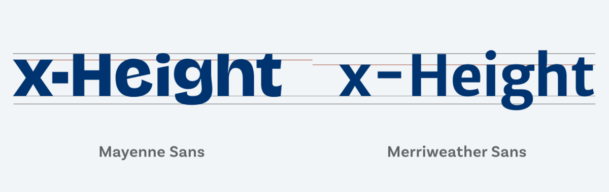
A main feature of Mayenne Sans is the tremendous x-height. The x-height is used to define how high lower-case letters are compared to the cap height of upper-case letters (more about this in this video). The large x-height and the very short ascenders and descenders make it ideal for compact headings and brief paragraphs. Set it with very tight leading (little line height) and create a nice, texture-like appearance. In that sense Mayenne Sans could almost be a contemporary Blackletter.
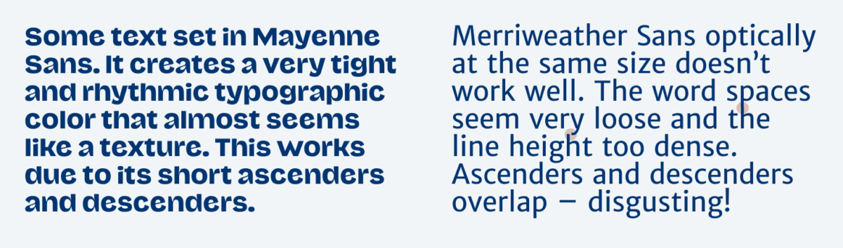
What I want you to take away from this font selection is that it not only depends on the typeface, it is almost more important how you use it. The most brilliant font looses all its power when applied wrong. Like in the example above, Merriweather is not a bad typeface it’s just used horribly. Mayenne Sans looks good but if you’d set a text heavy page in it, you would go blind. It’s up to you as a typographer to decide where to draw the line.
Recommended Font Pairing
Mayenne Sans is a quite rational, very constrasting sans-serif typeface. For long reading text, rational Neue Freigeist would be something very similar. If you want your body text to be more traditional, pick Charter or Pausa.

- Headings


Learn more about pairing typefaces using the Font Matrix.
This is no longer available from the designer’s website. Directs you to (for $$) NaN Jaune.
Thanks for the hint, Lorcan! I updated the a link to a Github repo where it is still available.