
My thoughts on Moucha
Since Futura’s debut in 1927 a geometric sans-serif is not all the hype anymore. Also, variable fonts with varying widths are common by now. And even though Moucha is both – a geometric sans-serif and a variable font – it is different, mucho different 🤪. Because with the width not only the length of lines is changing, also the vibe of the typeface goes from Vintage to Modern. How can that be?
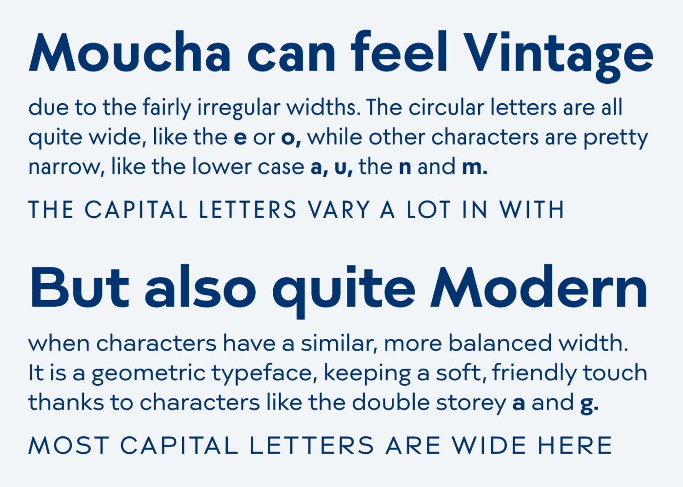
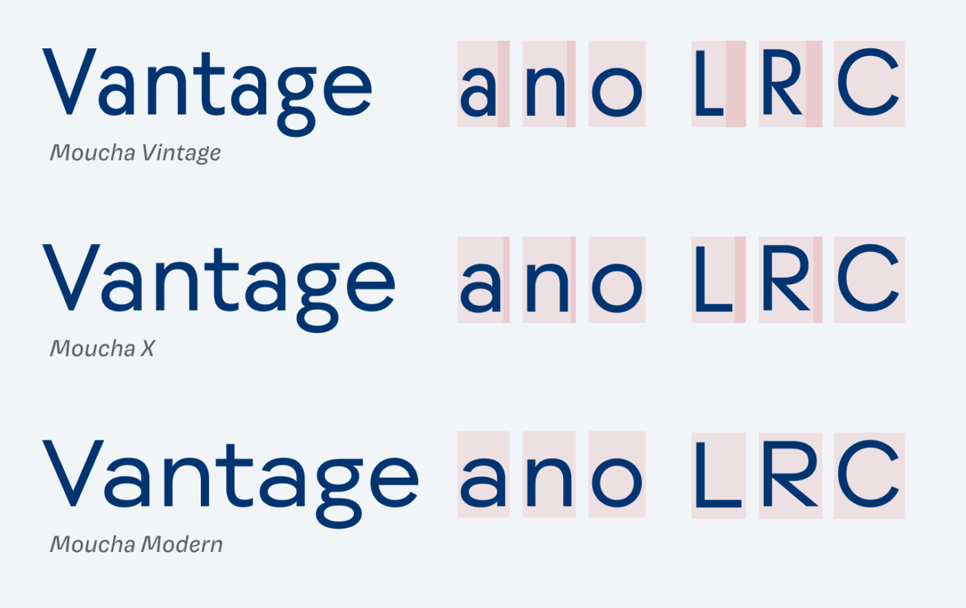
The secret is that not all the characters change their width, and this irregularity makes it so special. Circular shapes, like “o”, “e”, or “c” remain the same across styles, some characters like “t” or “w” change a bit, while others, like “a” or “n” change dramatically. Moucha Vintage shows the most variety in the width of the individual characters, making it quirky and a bit strange. Moucha Modern is quite wide and seems balanced, and there also is the interesting Moucha X in between.
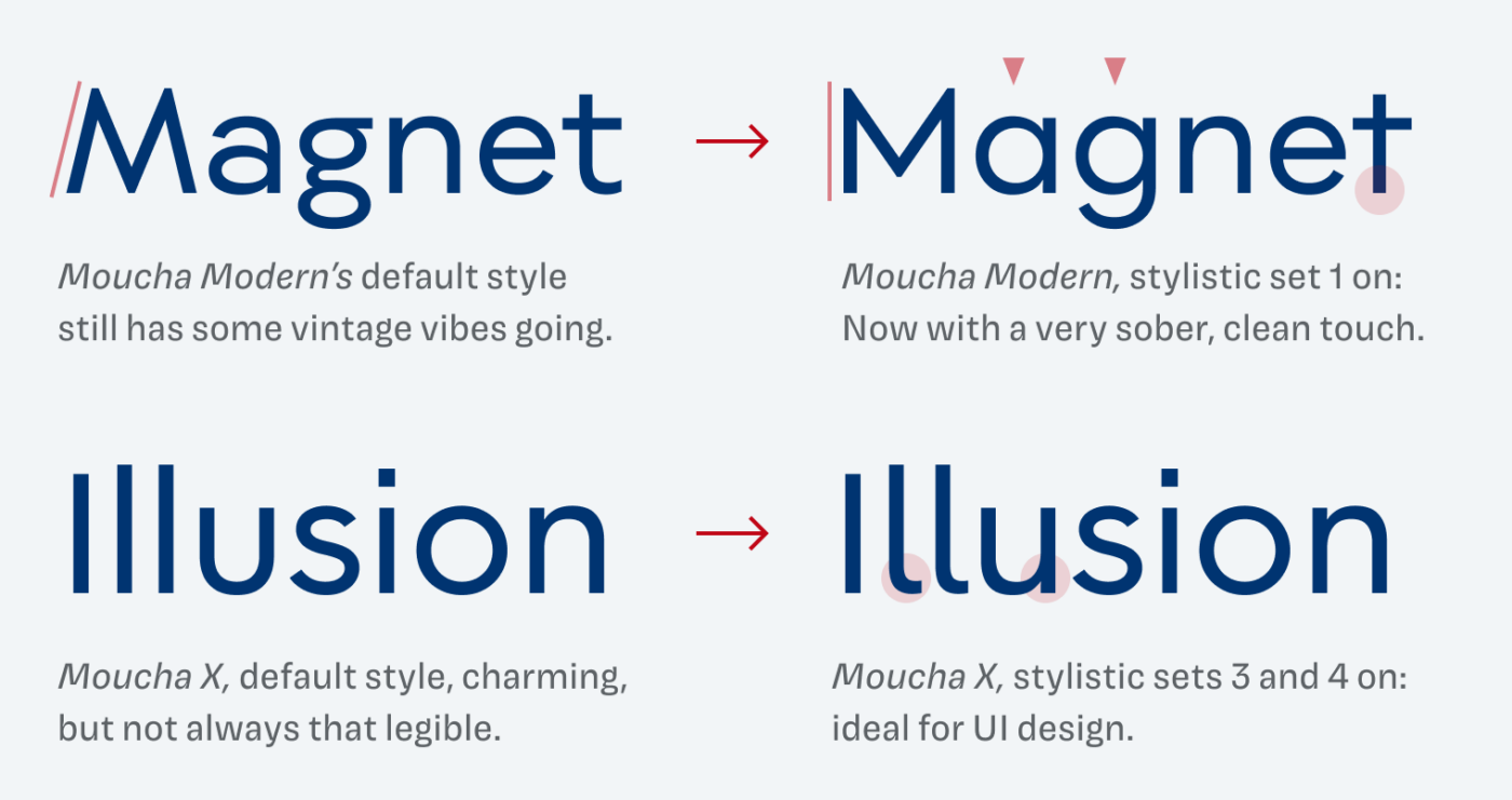
What I like a lot about Moucha Modern that is still has a certain warmth to it. This is due to the tailed terminal of the “t” and the double storey “a” and “g”. By utilizing the various stylistic sets, you can make Moucha more minimalist but also more legible. When it comes to usage of space and legibility, I recommend Moucha X for UI design with certain stylistic sets activated.
You can see the roots of the vintage style lie in typefaces like Futura. But Moucha has plenty of advantages, I go deeper into that in the Font Friday Video Digest. Moucha is a very versatile, but clam typeface. I only wish the weight axis would use the CSS defaults between 100 and 900, rather than 20 to 200. But still, the typeface performs well in many applications, ideally in body text and even in UI design, if the right stylistic sets are activated.
Font Pairings for Moucha
You look for something with fire for your headings? Choose Voyage, also geometric, but in a contrasting, lavish way, or one of the other suggestions.

- Headings
- Copy
- UI Text


Learn more about pairing typefaces using the Font Matrix.
What do you think of Moucha? Tell me in the comments below! Also, if you spot an interesting typeface I should review!
lc “l” and uc “I” barely differentiated
qp and db are mirror images
Except for lc “g”, italics seems like oblique regular
Irregular width is more a bug than a feature
Counters small in bold and too small in black weights
In Modern, circular letters should have been made narrower instead of other letters wider
Appreciate your opinion, it’s definitely not a font for everyone 😉.
First, a quote from one of my favorite high-school songs
“I’m flyin’ away running like the wind as I chase the Sun (font)”
Now, Moucha – don’t like the name for what I see. For years I was looking for Futura’s alternative and hope Moucha Vintage could be that.
While Modern Moucha is spacy and should look friendlier, and more approachable, if you look at the word Magnet, do you see how a and g look so bored? Like their eyelids are half-closed 😒 but I love pyramidy M 😍
You know Oliver that I’m all about sensing a wholistic and zooming out, but I wish I had picky eyes for nuances that you eloquently explain and Steve’s comment also made me think💭
Thanks for that quote, Jana! And love how you describe the M as pyramidy! It is not a perfect typeface, it has much more personality in the genre of geometric sans-serifs, so definitely not for everyone.