

My thoughts on Hepta Slab
I discovered Hepta Slab while looking for interesting typefaces on Google Fonts for the exercises in my Pairing Typefaces online course. Given its high drawing quality, unique look and the confident impression it makes, I was surprised how rarely it is used, based on the GF stats. Maybe a hidden gem?
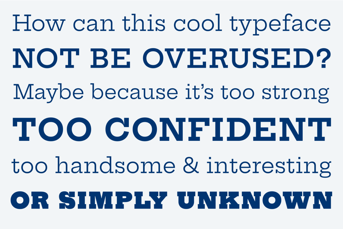
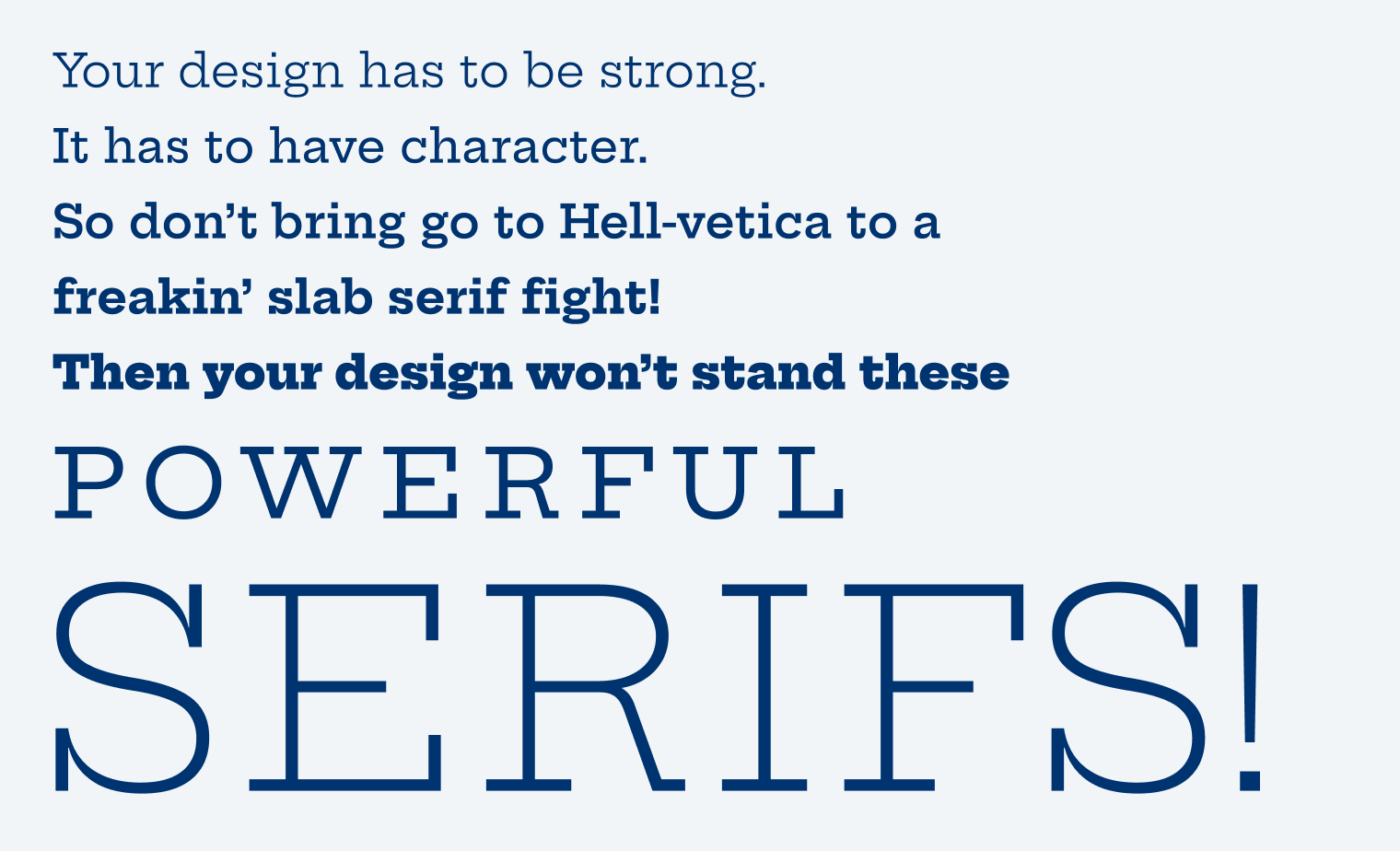
It definitely needs a project that either is super confident or a bit cheeky, and does not take itself too seriously. Slab serif typefaces tend to be a bit comical and over the top. Compared to FR Kraken Slab, it is rather calm and straight forward. It has a vintage vibe, but the geometric letter shapes make it a bit more contemporary. But not in a cold and sober way, it still has some warmth, shown in t, the double-storey g, the serifs of the S and the black weights.
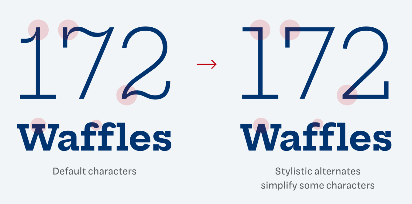
This is a typeface for headings, titles, anything large. Don’t go below 18 px with it, if you do only for a little text. It will become too noisy. I also appreciate the stylistic alternates, that make it a bit straighter even.
Suggested font pairing for Hepta Slab
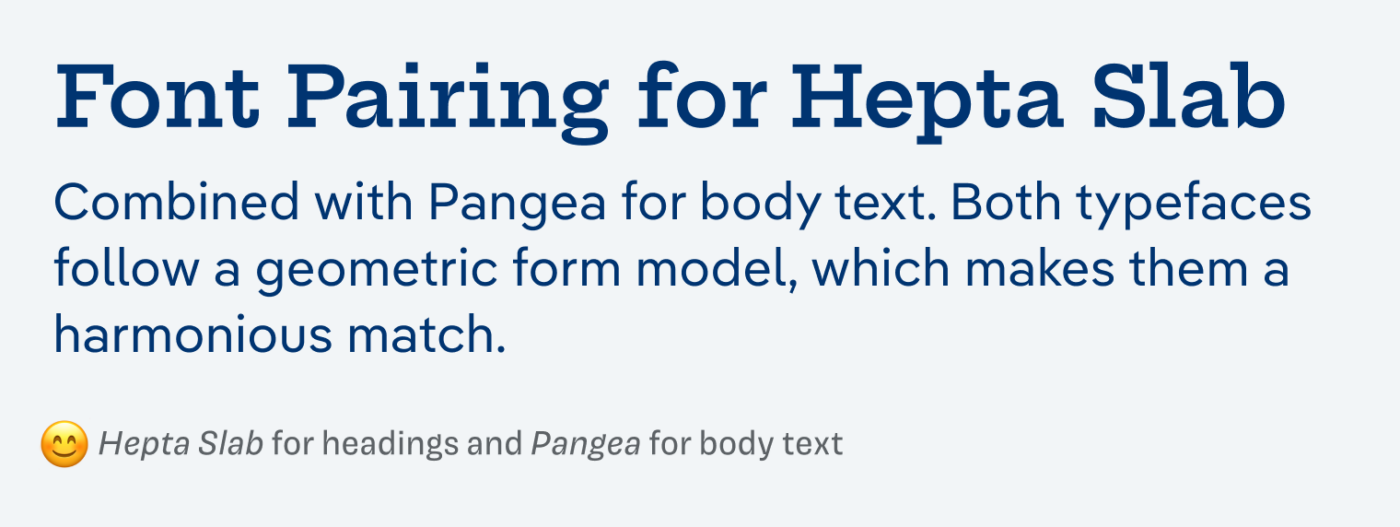
Since it’s geometric, it will perfectly pair with typeface like Montserrat or Raleway, or better Pangea, which is much more interesting. How do I know that? The Font Matrix told me 😉.
What do you think? Is this typeface something for an upcoming project, or do you have a font recommendation? Tell me in the comments below!
Hi Oliver,
vielleicht wäre die Überschrift (beim Wort Robotics) auf der folgenden Seite eine Schrift, die du mal vorstellen möchtest
https://tympanus.net/Development/TooltipTransition/
Oh, Lena! Die ist aber schön! Hab sie gleich in meine Liste aufgenommen, Danke!
Habe gerade folgendes entdeckt
https://fonts.google.com/knowledge/readability_and_accessibility
Wahrscheinlich kennst du das schon, aber vielleicht ja auch nicht
Danke! Ja, das kannte ich schon, aber es ist definitiv immer wert wieder gelesen zu werden 😉