My thoughts on Caladea
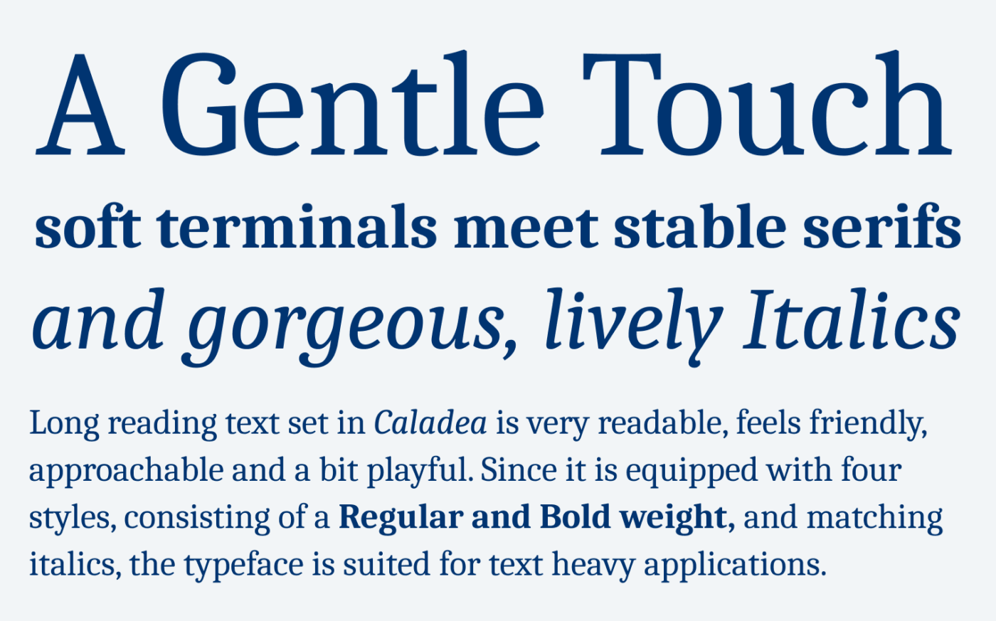
Caladea is a free, soft serif typeface, that is interesting enough for beautiful headlines and robust enough for running text. What struck me first is how gentle and classic it seems. But then again, it also creates a stable and modern impression. How can this be?

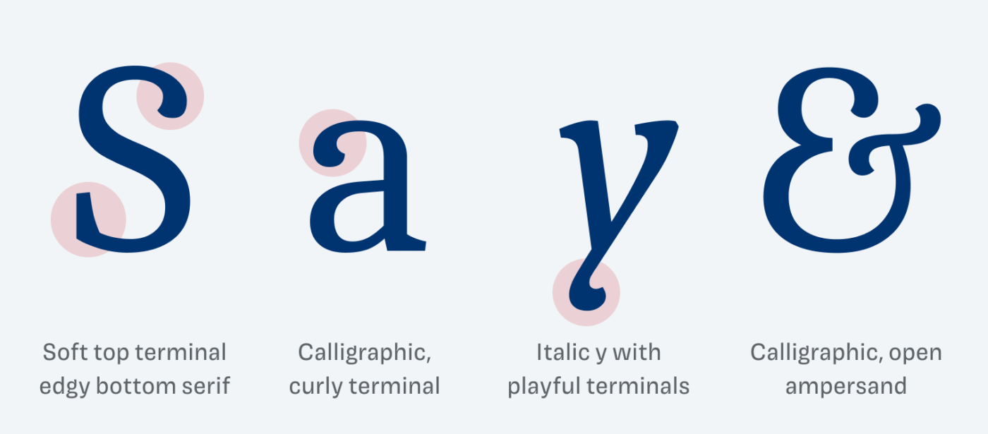
I think the essence of Caladea is shown in the letter “S”. It illustrates this combination of soft and stable with the calligraphic, curly top terminal and a stable bottom serif. You can find this at the “G” and “a” as well, if you look closely. Also, the Italics are so incredibly beautiful, especially the twisted terminal of the lower case “y” and the ampersand are my favorites.

The design of Caladea is based on the single style typeface Cambo. Besides the additional bold weight and italics, also other things got enhanced. I will show them to Patrons in the upcoming Font Friday video digest.

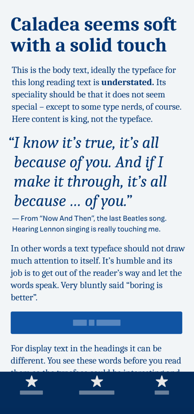
Because Caladea is tightly spaced, and the strokes are quite sturdy, it works for large and regular text sizes. But I would not set it smaller than 16 px, since it becomes too delicate. So for functional text like captions or UI components, I recommend pairing it with another typeface.
Font Pairings for Caladea
Caladea is a quite rational, contrasting serif typeface. This means it will work well in combination with other rational typefaces, like Roboto, Inter, or wonderful Magnet or Familjen Grotesk.
- Headings
- Copy
Learn more about pairing typefaces using the Font Matrix.


ich finde die Schrift sehr schön. Danke für den Tipp
Das freut mich sehr, Christian!