My thoughts on Chaumont Script
I rarely feature script or handwritten style fonts. You can only use them for display text, and for mobile design it’s tricky to show them in an appropriate size. But most of all, many of the free fonts in this category are poorly executed. Chaumont Script is a surprising exception. It is inspired by the work of Chantal Jacquet, a sign painter from the town of Chaumont, France in the 1980s. In cooperation with ANRT, Alexandre Bassi designed a simply gorgeous font based on it. Taking a look at Jacquet’s stunning sign paintings, Bassi managed to transcribe the rhythm, angle, and liveliness of her writing very well!

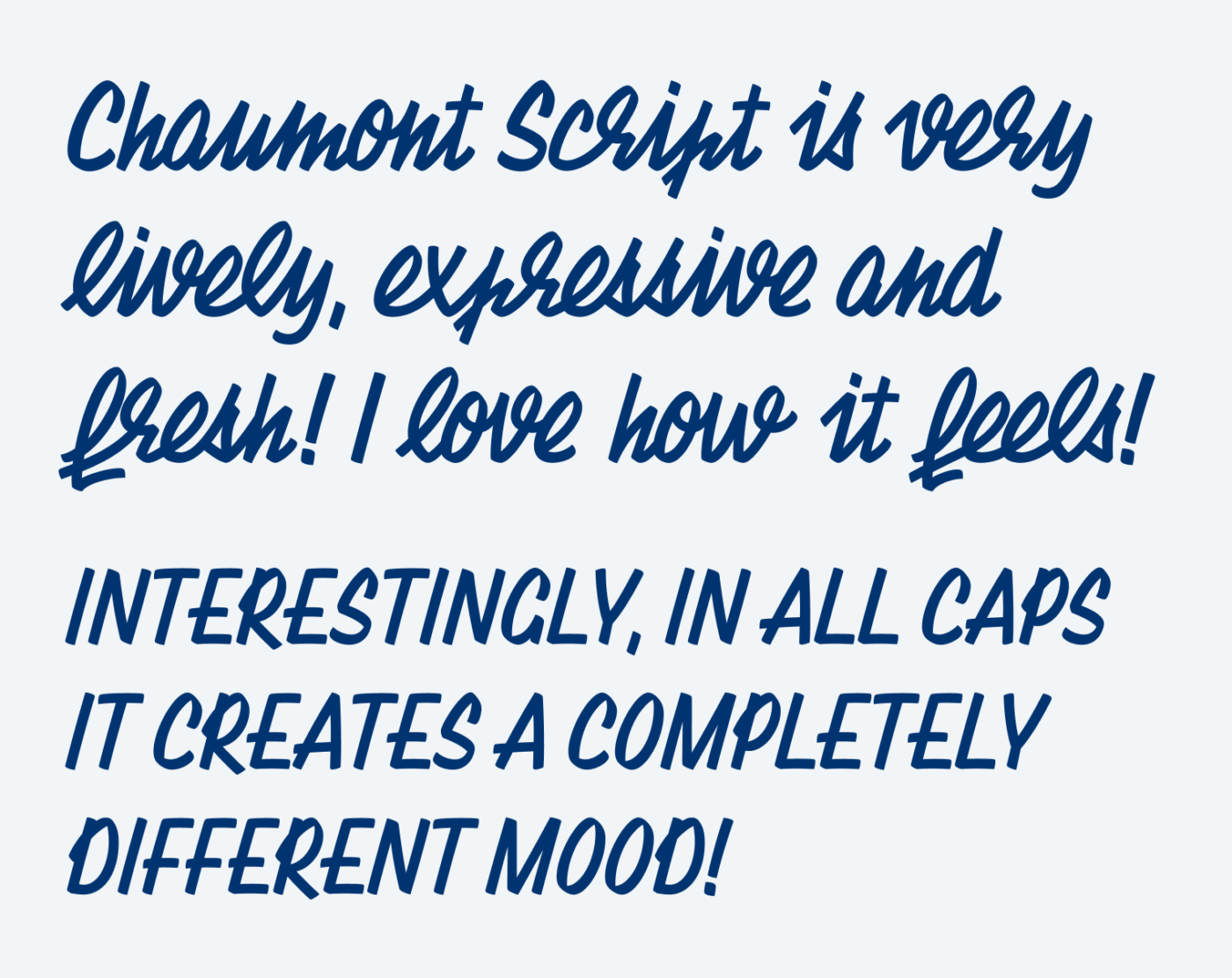
I particularly like the two different moods Chaumont Script can convey. The lower case alphabet is very expressive, spiky, a bit twitchy and harder to read. It only works for very short text set at larger font sizes. It has a great retro vibe that comes with it. The broad loops, the narrow characters and the thick broad stroke all contribute to that. The capital letters on the other hand are more open, much easier to read, a bit friendlier. So this gives you the possibility to mix them in certain points in your design.

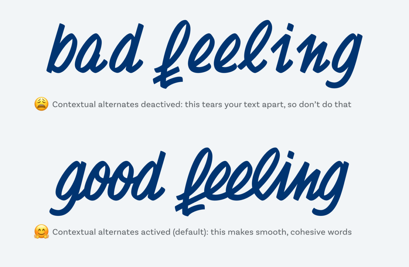
Creating a script typeface is very labor-intensive, because you have to think of the ton of possible connections there are. This is why Chaumont Script comes with over 2500 characters to cover all that. So when using it, don’t deactivate the contextual alternates and never, never ever change the tracking, or you’ll tear it apart.
Recommended Font Pairing
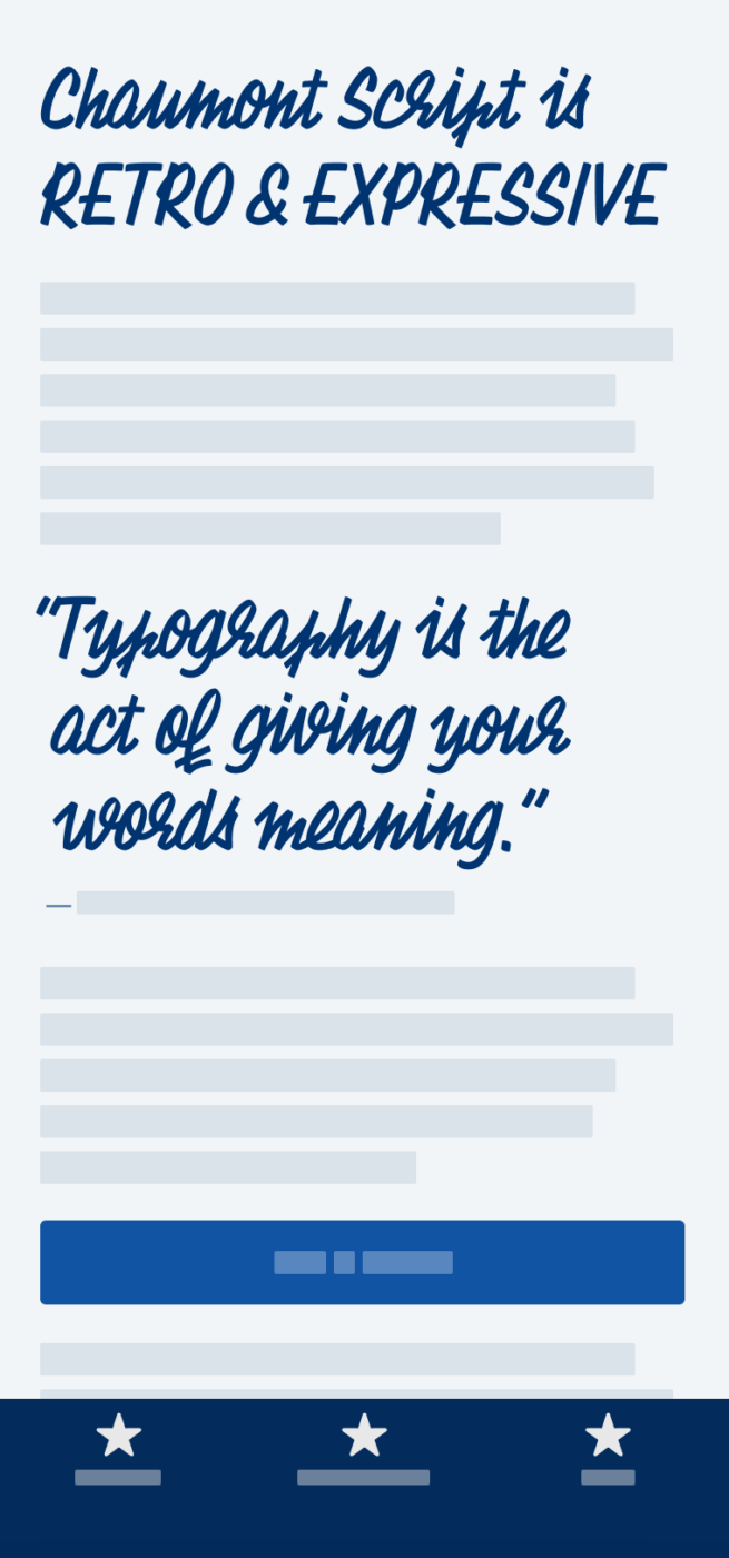
Since Chaumont Script is so playful and expressive, it will pair with something sober and clean for body text, like Generals Sans. But if you want to keep that quirky vintage vibe, Tarnac would be a great match!
- Headings
Learn more about pairing typefaces using the Font Matrix.
What do you think? Is Chaumont Script something for an upcoming project? Tell me in the comments below!


My first thought was “Yuk, hard to read,” then “meuh (ce n’est pas terrible),” but after visiting the link to the original signs, I must say ‘chapeau’ à Timothee.
Seeing this font at work gives me a certain ‘je ne sais quoi’… it would have to be for a very specific project, but it definitely gives me some inspiration on a Friday. Merci beaucoup for the font and a history lesson!
Anytime, Connie 😉! I love how this font and your comment illustrates, that it’s always about the application and what to do with it. My mobile phone sample isn’t always ideal for that, especially not for display typefaces. But the original designs show it quite well.
I appreciate the business of the lower case Chaumont Script. I see it in some South European, small old town restaurant, on the cardboard menu, scribbled. Just for the sake of attracting the tourist’s attention.
While the capital letter option is more of a serious player. Definitely takin’ it, Oliver!
btw. This happens a 2nd time in the past few Fridays. When I hit “write a comment” (after reading the blog post in a browser) it leads me to the previous blog post, not the Chaumont’s. So I’ve scrolled down to the end of Fragen’s page to choose “next” and open a new page (this one currently). The problem is in the direction between pages.
I’m definitely one of that tourist drawn in by such writing 😉.
Thanks for the info about the error, Jana! I obviously forgot to replace the link. Time to write a checklist when preparing the newsletter 😅.