Sometimes you just gotta follow your heart, follow the urge to express yourself through type! It was time to pimp the type of Pimp my Type. So I redesigned the headlines and homepage and shared the process on YouTube.
In the video, you will:
- Watch me struggle and suffer choosing fonts 😅
- See how I resolve it, while I’m delighted by typefaces 🤩
- Witness the revealing of an evolved design for this website
- And simply have blissful moments with typography.
I feel so embarrassed …
There are so many things I’m embarrassed about on this website, up to a point where I think you think: How can this guy even talk about typography? But what bothers me most, is the feeling of the articles, especially the headlines … and the homepage. I try to avoid spending too much time enhancing the design of this site, because I easily lose myself in it, and convince myself to rather create new content. But there are times when reflection and the evolution of this site is also needed.
Redesigning the headlines
There are several problems with the headlines. The titles of the articles do not draw you in. They even seem a bit like a thoughtless template, too generic, not powerful enough, not really matching my voice and eccentric style. Also, the category gets unnecessary attention.
What I like about my articles though is the typeface for the body text, Piazzolla, the subheadings and functional text set in Magnet, and the blobby dropcaps that are using Cheee. So I’ll stick with them.
Step 1: Writing a briefing
Before you start looking for something, make up your mind what it should be, or you will never know when you find it. In my case, I’m looking for a similar typeface, that can be used more prominently in for the titles. Ideally a variable font, maybe with optical sizing? Free or paid. If I replace the titles with it, it also should work for the functional text (navigation, captions, buttons) so that there are not too many different typefaces on my site.
Step 2: Creating a shortlist
Browsing through my own Font Friday archive, but also checking out my other sources for fonts, I came up with a shortlist of typefaces I liked, and I thought that could fit. I choose five candidates:
- Bricolage Grotesque by Jérémy Landes,
- Degular from Oh no Type,
- Obviously from Oh no Type,
- Gazzetta from from TipoType, and
- Lektorat from TypeTogether.
Step 3: Trying it in the design
Every font looks great on the foundry’s website, but the truth only shows when you apply it in your design with your content. So I downloaded the demo fonts and tried it out. I also created a list of pros and cons of the individual typeface. Including the format, price, what works and what does not. Watch this part of the video to get all the details.
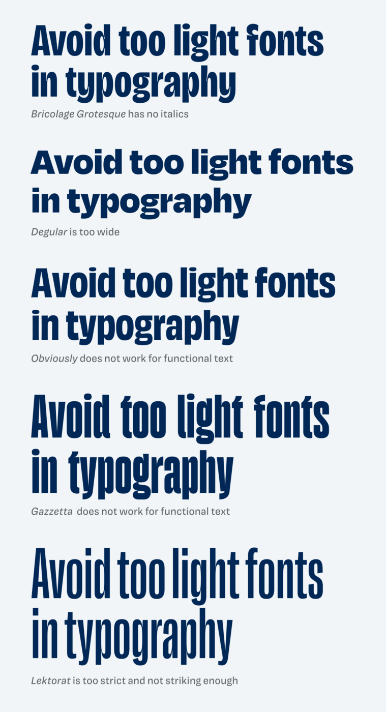
No typeface really worked …
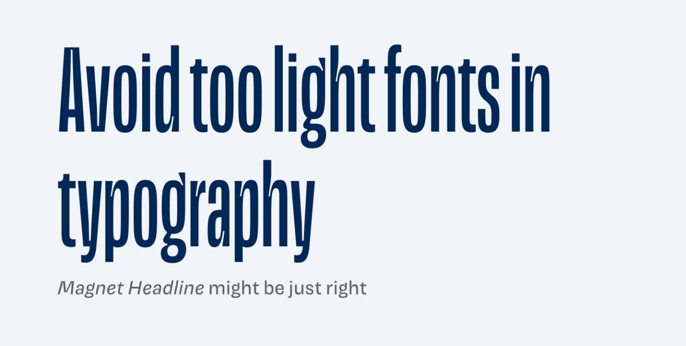
Seeing them in the design, I was not happy with any of the options, mostly because it could not really replace Magnet, the typeface I’m currently using. So I came back to my original love for Magnet. And there was a headline style. A very crazy headline style, even! Super tall and tight, and striking. Maybe what I was looking for was right in front of me all the time?
Step 4: Making it work
I looked for a way how the Magnet Headline would look best. It is a bit tricky to work with. You can only use it for a little text, a sentence would even be too much. And you have to set it big, really big! Anything smaller than 80 px would not work. So I tried several approaches, that you can see here in the video. But what I settled for was the combination of the wonderful, classic serif small caps for the category, representing the traditional part of typography, and the tight loud headline, showing the power of typography.
Step 5: Moving into the browser
After I knew that this was the way I wanted it to look, I moved into the browser to try it out in the actual web design in varying sizes, and with different content. I also sprinkled in some fluid font size CSS magic and text-wrap: balanced stuff. I was happy with the result.
Redesigning the homepage
The homepage is the first impression of Pimp my Type and creating it, is very hard. There are several issues that don’t work, most prominently these:
- Unclear message with too many styles on the top
- It looks stuffed with way too many elements, that are too diverse
- The offerings are too large
- The list of articles seems loveless
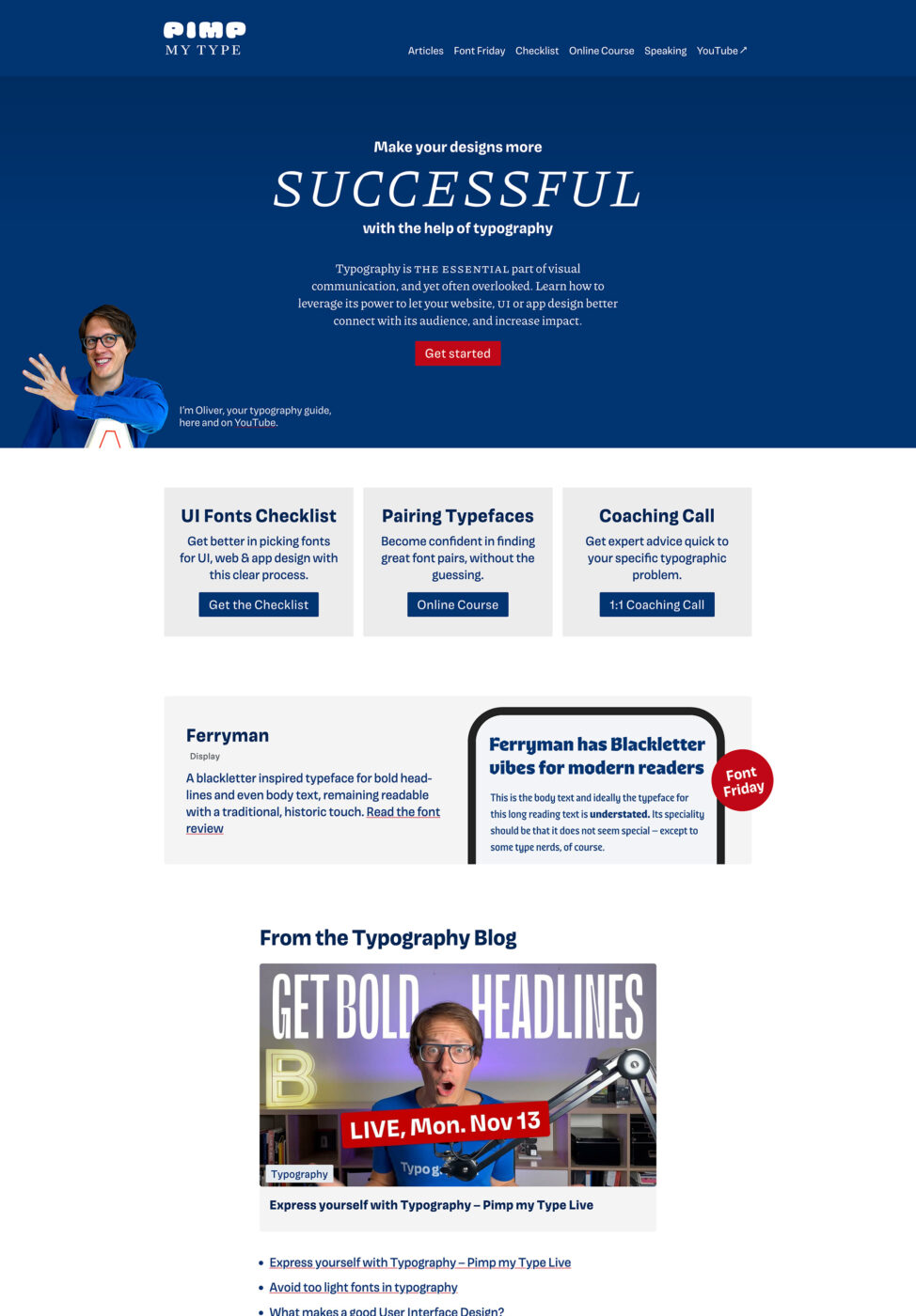
Reshaping the content
When redesigning something, it always goes hand in hand with changing the content:
- I created a new, bold, and simple intro using Magnet Headline. This way the typeface is already established on the front page, and not only on the articles.
- I made the offerings more compact, combining the serif small caps with the headings.
- I added expressive titles for the sections, using Magnet Headline in all caps, playing around with a dynamic left, right alignment.
- The articles are now more compact, everything has the same width, and I even add some cool featured logos.
What can you take away from this?
You can always change things. Embrace that. Because once you do, it does not paralyze you that much. Because there is no perfect. It is better than before, but I still have issues with the new design. Some text lengths don’t look ideal, also the fallback fonts are too large and I need to check that. But the overall feeling is much better and more aligned with the message and the personality of this project. And that’s what counts.
Now I’m curious about your impression! Tell me your thoughts about the redesign in the comments! Also, if this kind of content where I share my process is helpful to you.
BOLD. (900)
Congrats on the new design.
😂 Thank you, Kel! It was lovely seeing you in the chat during the live stream!