
My thoughts on Tarnac & Tarnac Sans
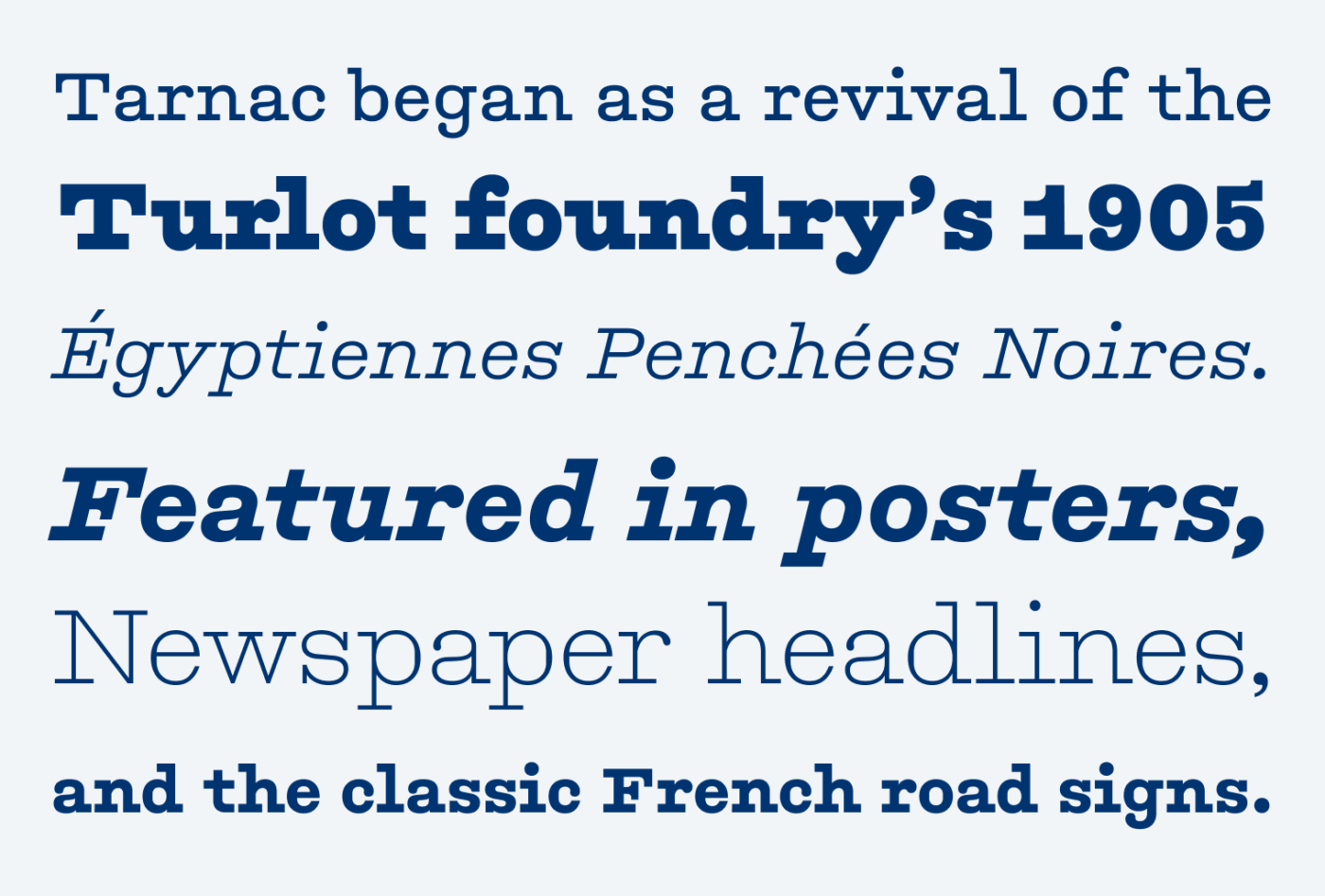
I have never been to France, but I can vividly imagine old road signs on the countryside looking like Tarnac. This typeface has such a beautiful feel of imperfection, and being hand made. Designed by Marc Rouault and released by Sharp Type, it goes back to the slab serifs of the early 1900s. They were obviously made for display text – headlines, posters, and the bespoke classic French road sings “plaques Michelin”.
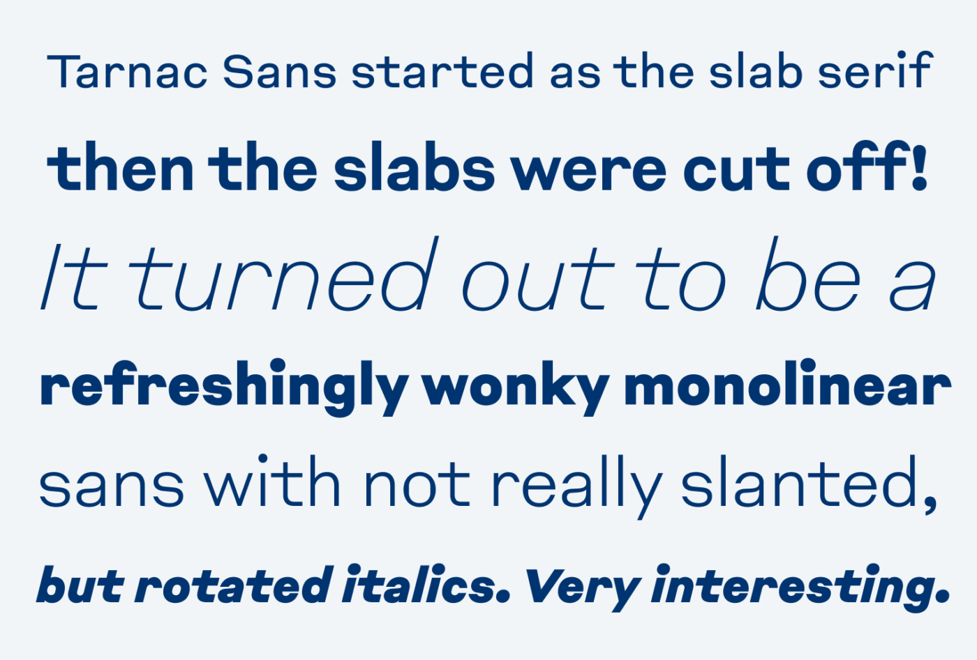
The approach, for the sans-serif, was cutting the slabs off. Which interestingly was the origin of the first sans-serifs in the early 1800s (I only learned this recently on a great episode of the Weekly Typographic Podcast). This way, refreshingly wonky Tarnac Sans was created. It still is rather loosely spaced. Also, the punctuation marks are very strong (see the dot of the i), like if the slabs were still there. The italics are special, too. They are not slanted, but actually rotated, which seemed to be common in sing painting at that time in France.
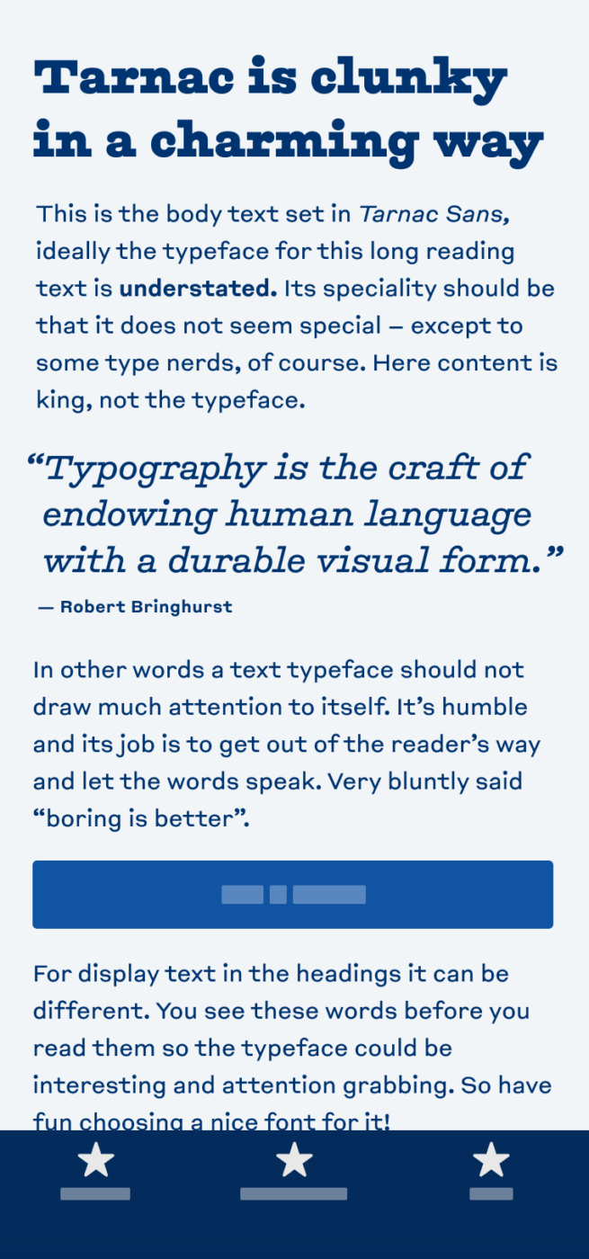
Tarnac and Tarnac Sans make a good choice, if you want to convey a rational, but still approachable, warm feeling with a vintage touch, in headings or other display text. It looks constructed, but in a handmade way. For a little reading text, it is okay, don’t use it for more than that. After all, these are display typefaces.
What do you think? Is Tarnac or Tarnac Sans something for an upcoming project? Tell me in the comments below!
Tarnac Slab Thin is my bet here. Only in that version would I use it! It has a vintage spirit, especially if we look at Black weight, from the Westerns, cowboys🤠
Tarnac Sans – not much distinction from what I see these days all around the design globe.
P.S.Seems like every other brand on the planet right now is redesigning with typography. Every agency invests in type-fused visual identity. My eyes are tired of so many letters, little to no uniqueness.
Thanks for sharing your thoughts, Jana. At least typography gets more attention now. However, I agree, that in most cases it is not vey unique. Most geometric or grotesque sans-serifs … Feels a bit like the trend of having stock photos back then 😉.