Skip to content
Primary Menu
Free Type Check
Articles
Font Friday
Speaking
YouTube
Category
Review
7
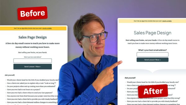
Better Sales Pages with better Typography
9
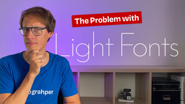
Avoid too light fonts in typography
Web Design Review – Better Impression with Better Type
10
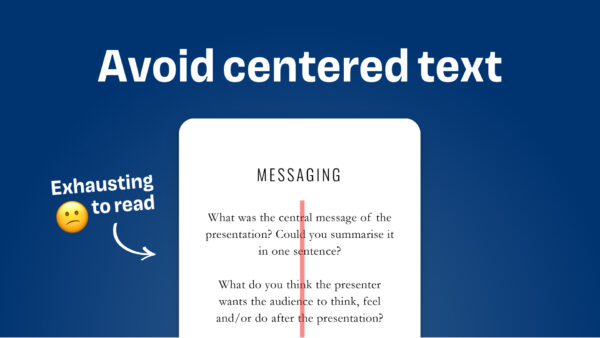
Avoid centered text
4
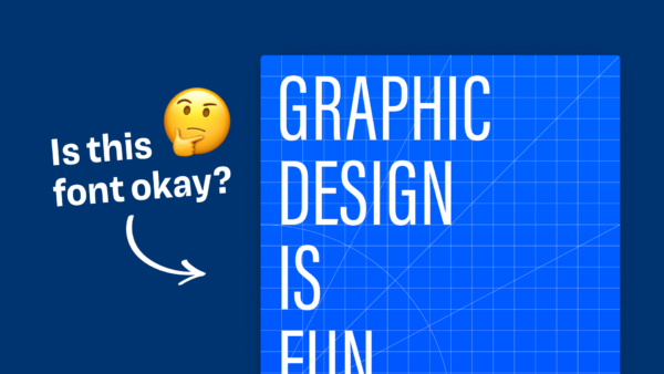
Is this font for a podcast cover okay?
2
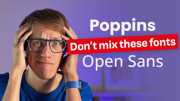
Font Pairing: A good typeface for headings
2
The Right Space Around Headings in Web Typography
6
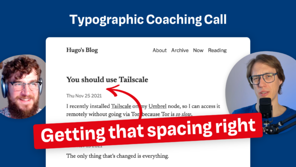
Typographic Review Call with Kev Quirk about his personal Blog
5
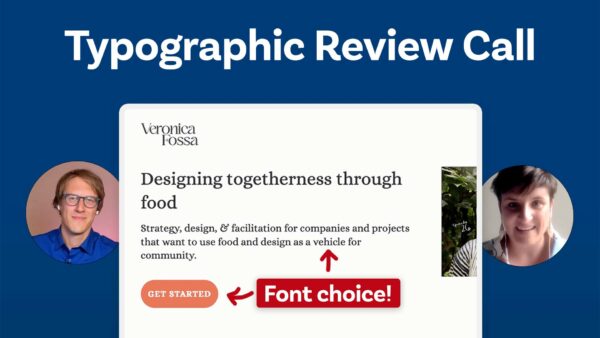
Tame that Font Size – Typographic Review Call with Veronica Fossa
10 Typographic Reviews – Pimp my Type Live #1
13
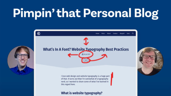
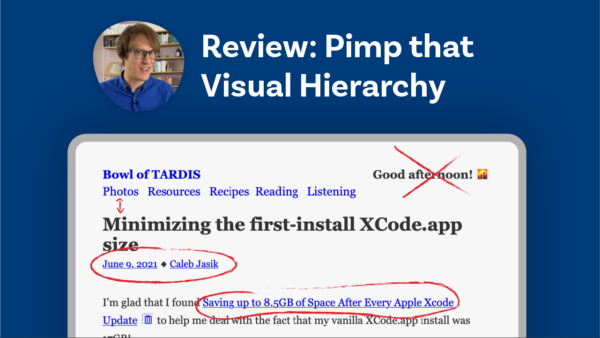
Pimpin’ the Typographic Hierarchies of a Tech Blog
2
Avoid Faux Italics – Website Review
Posts navigation
Older posts