At least for more than three lines of text. Find out why, in the typographic review of these wonderful feedback cards, created by David de Léon.
Get helpful feedback with these cards
How can you get feedback on your presentation you can actually use? David de Léon thought about that, and designed a set of cards that you can hand out to your audience before giving a talk. And since we both spoke at UX Copehangen, he asked me for my feedback on the typography of his feedback cards – quite meta, right 😉?
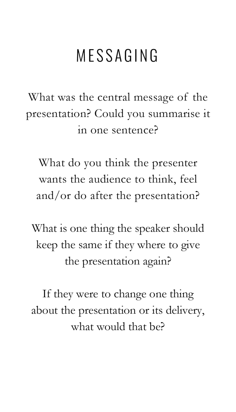
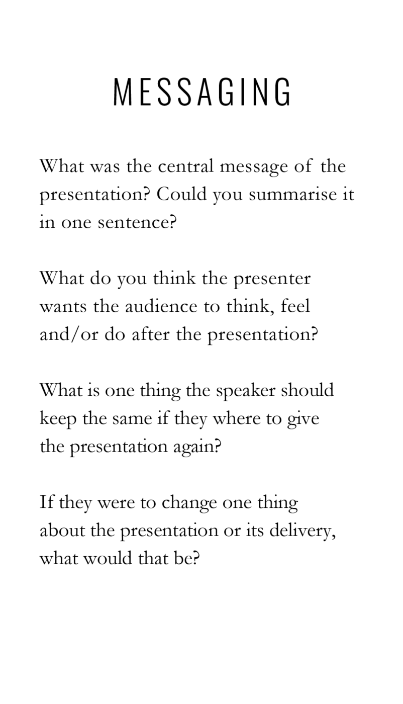
1. Left align text that goes across multiple lines
The original design looks classy, using Oswald in all caps for the headings, and Garamond for the body text. On first sight the centered text looks appealing – symmetry, you know 😉 – but practically speaking it turns into a problem. Because the beginning of a new line is always at a slightly different position, center aligned text across multiple lines is exhausting to read. My first tip is to left align it, while also setting the heading a bit larger.
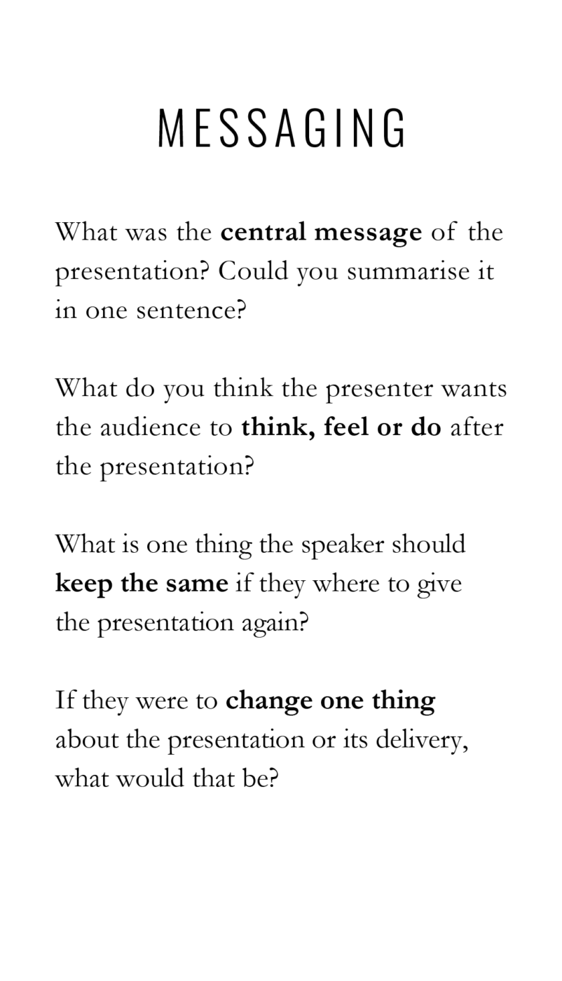
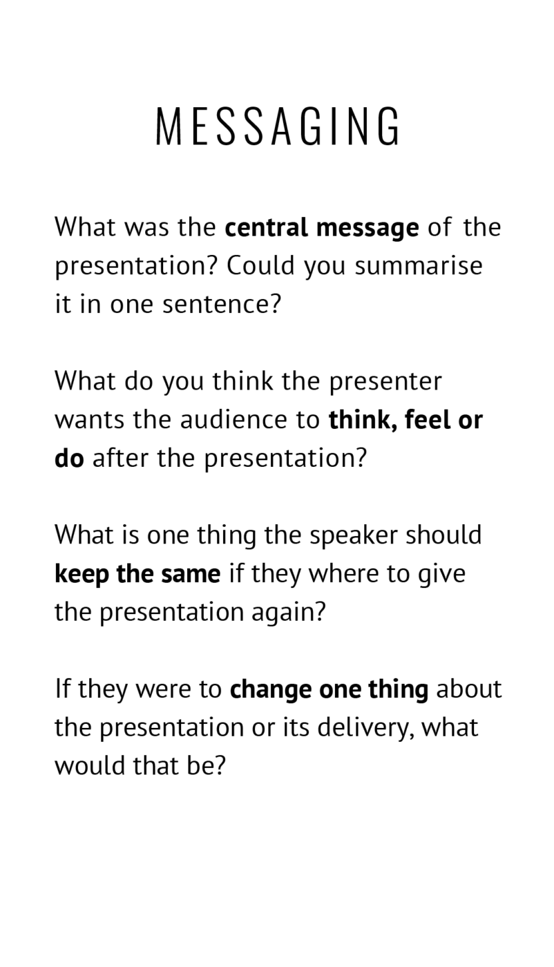
2. Improve skim reading by emphasizing text
To make cross-reading easier, I recommend setting the most important part of each sentence bold. This might make it necessary to do some rephrasing, but it also will give the cards additional structure.
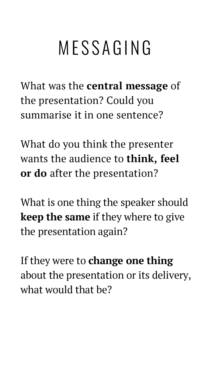
3. Use a sturdier typeface than Garamond
When thinking about the situation these cards are used in, it probably will be in a dimly lit auditorium. So to make the cards work there as well, it is better to use a sturdier typeface than Garamond. Also, something with a larger large x-height, so it does not seem that small. There are two directions we can take this:
- By using PT Serif keeps the classy vibe of the cards.
- Alternatively, PT Sans shifts the mood into something more modern.
David’s choice
After my design critique, David reworked the cards, choosing PT Serif. He used the cards in his talk “The gentle art of design feedback”, one of my highlights of UX Copenhagen 2023. Because it was so well presented, super practical and helpful. You can get most insights from it by reading David’s brilliant article, where you can also download the cards for free.
Do you want typographic feedback for your project? You can submit it here!
Love all of it, thank you! <3 I wonder about the wishes behind the decision for centred text (and its mean brother "justified"). Is it the longing for symmetry? Keeping text in control? Render text more "visual" (i.e. pretend it's not text at all)? I feel, if I understand the idea, I could help as a designer to fulfil that wish with other means.
I would say that centered text is mostly about symmetry, just like justified text, as you mentioned. If you look at old posters that use the Swiss grid layout, they often employ justified text to create a harmonious and balanced appearance. However, as Oliver points out, centered text can become problematic for readability after a few lines. This isn’t a significant issue for posters, which usually don’t have many lines of text, but I often see web design adopting this approach for the Swiss layout even when the text is longer, which isn’t ideal.
I would also argue (though I’m not sure who I’m arguing with) that centering text can sometimes be beneficial not only for creating a more symmetrical appearance but also for contrasting with other elements. For example, centering text can help draw attention to a call-to-action element in a view with many other elements. When I’m in doubt, I always choose to align text to the left. 🙂
I think the wish behind it is to appeal more classy and symmetrical.
I agree with Johan’s comment. And centered text is not genuinely bad, it’s just inappropriate for more than a few lines.
Thank you both! I only meant body text, I don’t mind justified text in headings or buttons at all! But when I see long body text on websites and in newsletters centered, I sense a strong wish for control, clarity, inner peace – like text was a BURDEN that needs to be kept in check. Then, simply left-aligning text won’t fulfil this human desire. Or is it just me? 🙂
What’s next, Oliver? No right justified text? 😁
Thanks for a great article!
Lol, better not, unless you’re writing in Hebrew or Arabic 😉.
Although I often do as you suggest (improve skim reading by emphasizing text) I usually do it in the middle of the sentence only when I cannot recast it, as when using quotes of others.
In the example you gave, highlighting key words in the middle of the sentence, your mind/eye faces the competition between being drawn to the highlight and the beginning of the sentence. I would recast the sentences. I would also recast the fourth sentence to match the construction of the third. See here.
That’s a great addition, making the bold text at the beginning of the sentence will make it even easier to skim read.
Centered type has become so common I despise centered text, now. Whenever I see centered type I want to close the website or whatever it is I am looking at right away. If i had to use centered type, I would only do like 5% of it, sometimes I go to websites and 80% of the text on the website has been centered.
Oh, I feel you, Jonathan! And you’re so right. It is appropriate for, let’s say, up to three to five lines of text. Everything longer than that is just super cumbersome to read. Let’s hope mope people will realize that 😉.