Font Pairing: A good typeface for headings
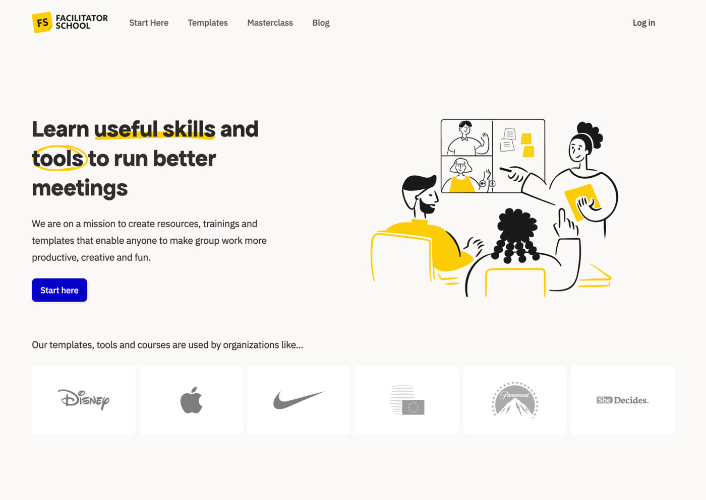
This video is a breakdown of how you can go about when picking a typeface for headings, that goes along with your branding. Daniel, co-founder of Facilitator School, shares the redesign of their website and asks what fits to the new font choice. I analyze the current design, take a look at positive examples and share with him my process how to combine typefaces. I also dig into the constriction of typefaces, leaving him with some suggestions to try out. Eventually he settles for a new typeface I react to.
The initial type choice
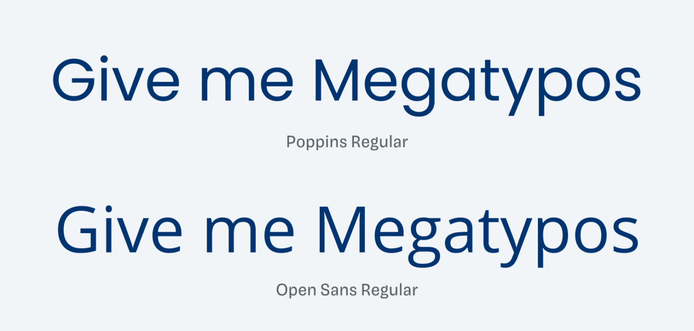
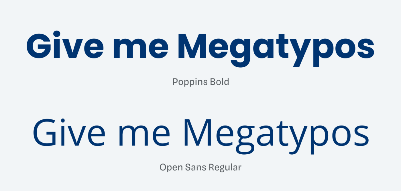
The initial type choice is Poppins for the headings, mixed with Open Sans for the other text. You know my feelings about Open Sans, nevertheless, the typographic impression is not bad, just rather common and little memorable with these very widespread typefaces.

I see the combination as problematic because these two sans-serif typefaces are neither similar when it comes to their construction, nor really different when it comes to contrast or other features (more about this in my Font Matrix article). This makes it irritating.

It more or less works okay because the different weights hide the differences that lie underneath it a little.

Daniel’s new font choice
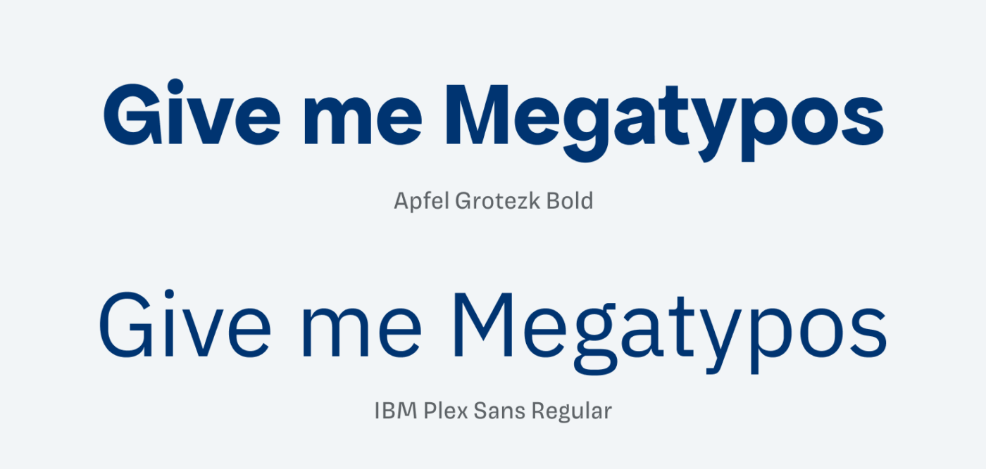
Daniel picked IBM Plex Sans as a new typeface for body text. It is also a very widely use typeface, but it definitely has a different, more determined character. He also picked it, because it is available on Miro, where Facilitator School offers templates. So they have consistent typography there. A good reminder that availability on important platforms is also a big factor when it comes to type choice.
Pimp my Type on Patreon
Get several benefits while supporting my content creation.
Join Patreon
My approach in finding a good match
1. Set the base first
You have to start with one thing, or there will be too many moving parts. With IBM Plex Sans for body text, we set the starting point of our search for a companion.
2. Do you want it to be similar or different?
Daniel’s not so sure about that. Eventually we settle for the first and more or less look for a typeface that is similar in its construction but more distinct and interesting in its features.
3. Apply it in your design and see how it works and feels
Always see how your type choice performs with your design and actual content. After the coaching call, Daniel settled for Apfel Grotezk, a quirky and interesting typeface I also recommend in my Font Friday Newsletter.

My reaction to the new typeface
A good choice! Apfel Grotezk is unique and contrasting enough for branding, but close enough to IBM Plex Sans to feel like it’s an evolution of it, exaggerating some features. It is not totally the same construction as IBM Plex Sans. But from its atmosphere, it also comes across quirky and confident, definitely less average than Poppins.

The redesign feels much more sophisticated with the new type choice. And in the blog it also performs very well, where IBM Plex Sans saves space on mobile due to its narrow proportions. On desktop though, the lines could be a bit narrower because of that. Just one or two words less would be enough (more about line length).
I’m curious, what do you think about the new type choice? Do you see the difference? Let me know in the comments. You can also submit your design for a free typographic review here, or schedule your private coaching call with me.

Absolutely true! If you ask to any IA to make a good type combination, it suggest Poppins + Open Sans! …holly… ☺️
But, if you search in Google, your article appears in the results (God, thank you!) You safe a lot of beginners designers to make a bad design.
Hugs from Madrid!
Yay, at least the SEO still performs well until search engines will be completely replaced by Ai 🤖.